AGORA Brand Identity
Brand identity for a Hackney-based community non-profit organisation I co-founded with my friends Catarina and Tom.
Industry
Non-profit
Role
Co-founder & Brand Designer
Company
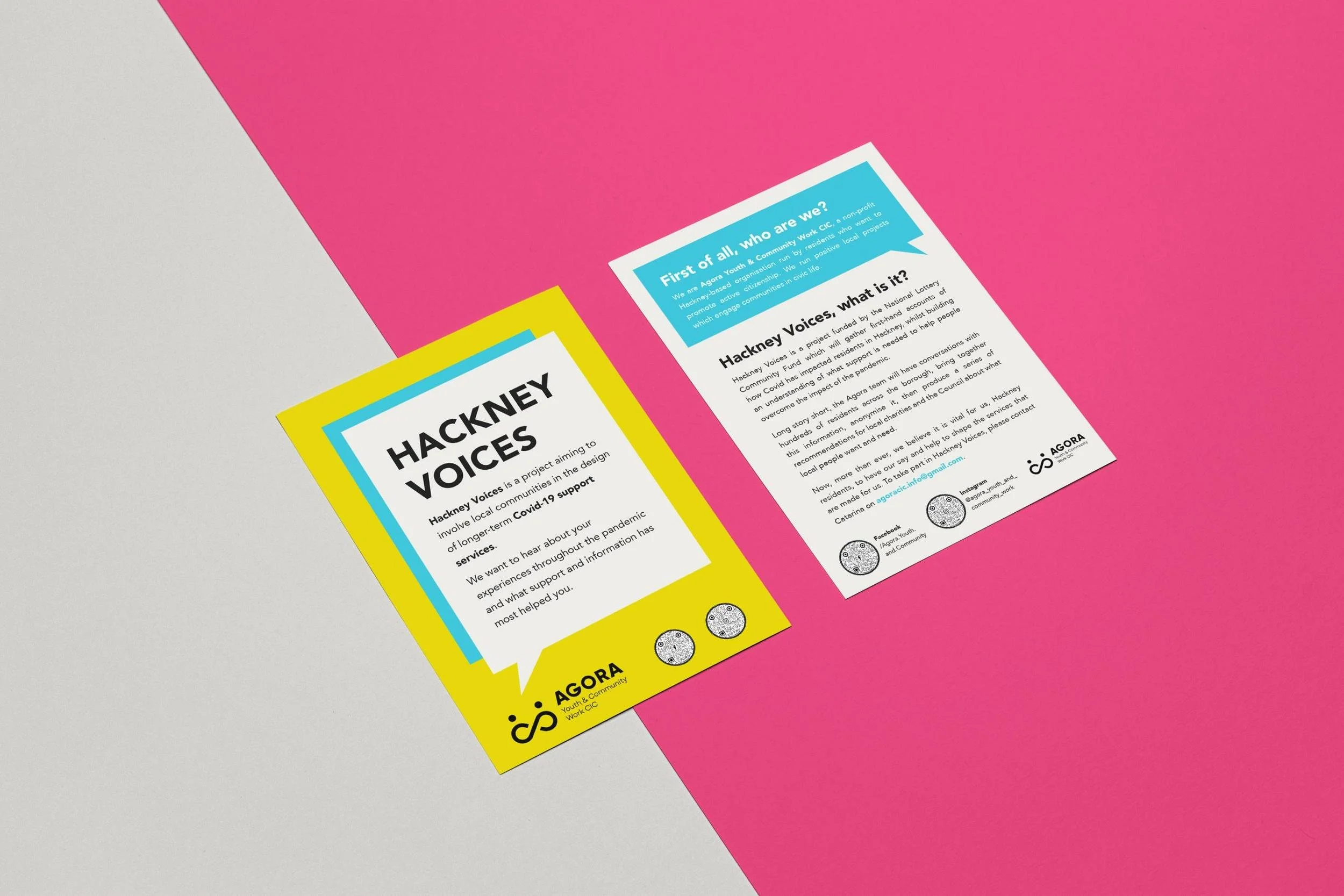
Agora Youth & Community Work CIC
About AGORA
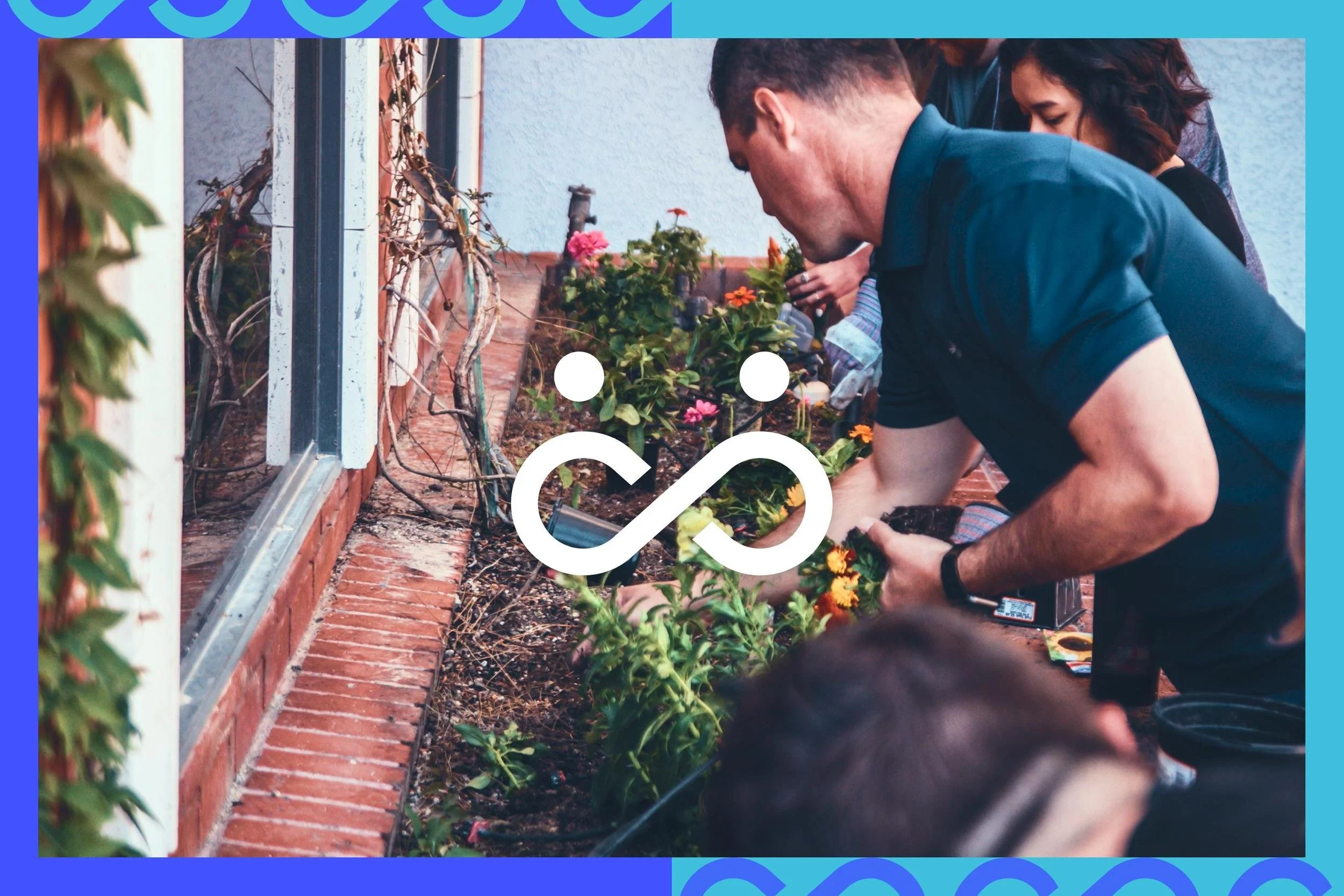
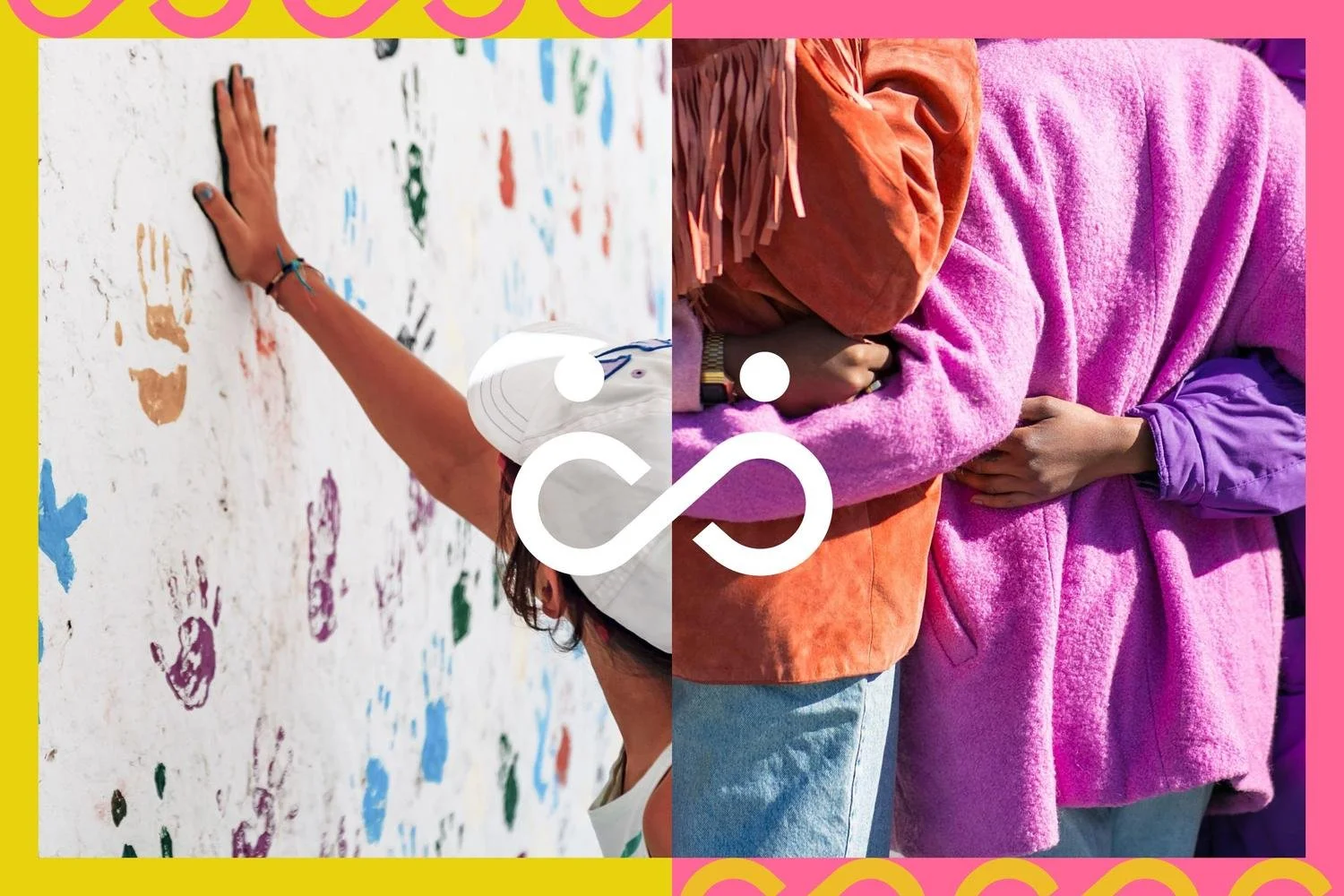
Agora was inspired by the Greek idea of a public open space: a place for people to gather, debate, and act together.
My friends Catarina, Tom, and I founded it to promote active citizenship in Hackney, giving residents a real say in their community through free events, workshops, and grassroots projects. Catarina and Tom are experienced community organisers and have a lot of experience working with vulnerable communities and reached out to me to support them with the brand and reaching out to the community.
As the brand lead, I had to create an identity that felt local and welcoming (not like a corporate charity) while also being credible.
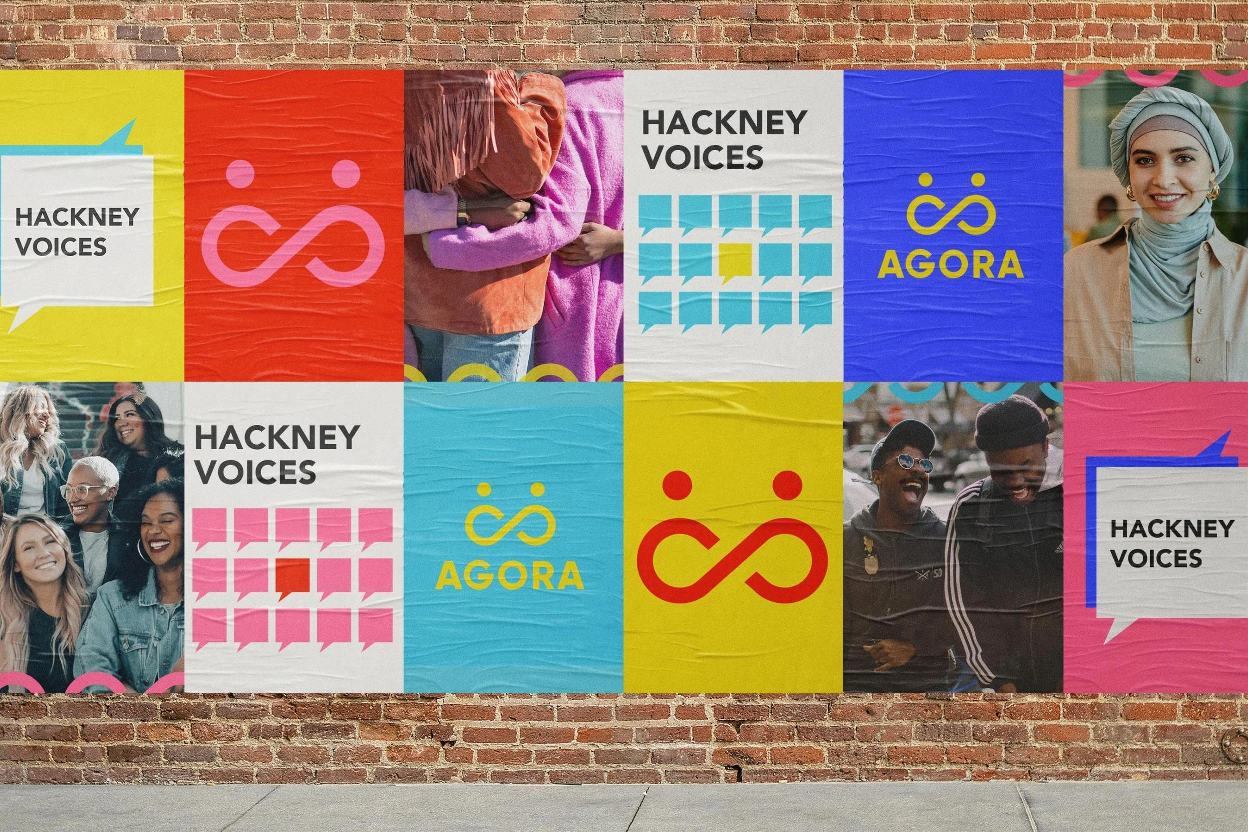
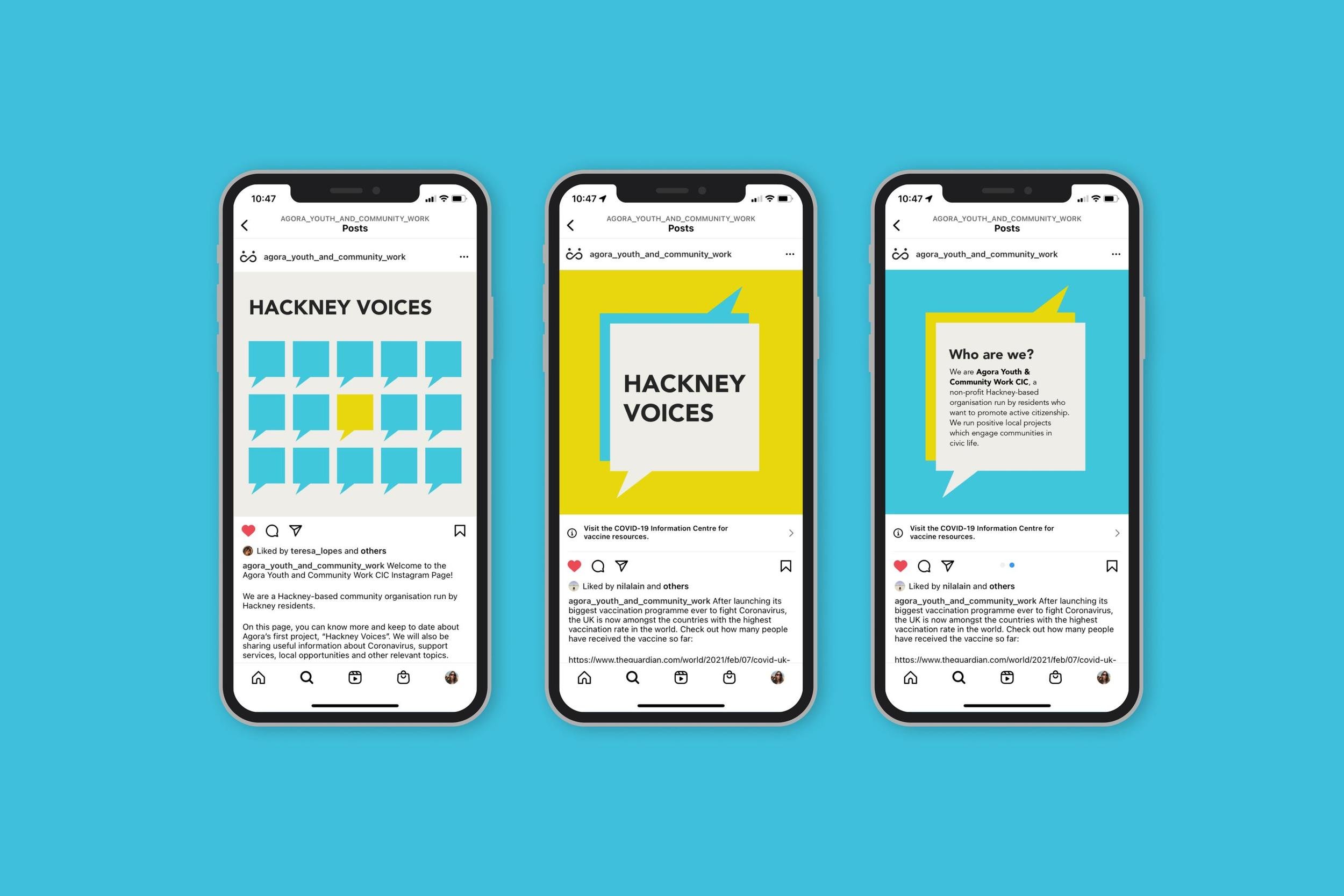
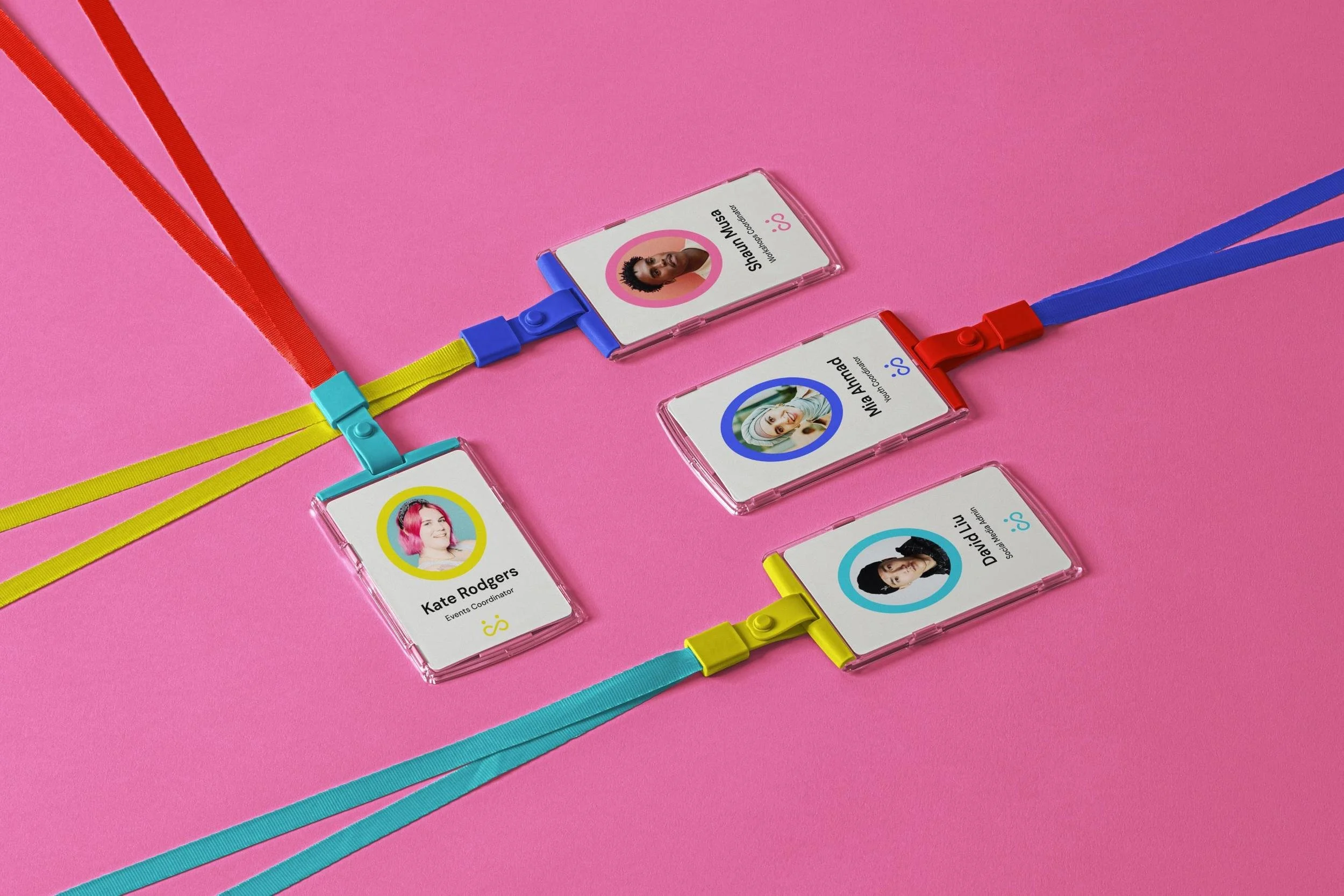
Logo
I explored a few different options initially, all inspired by Hackney’s flourishing community and connection.
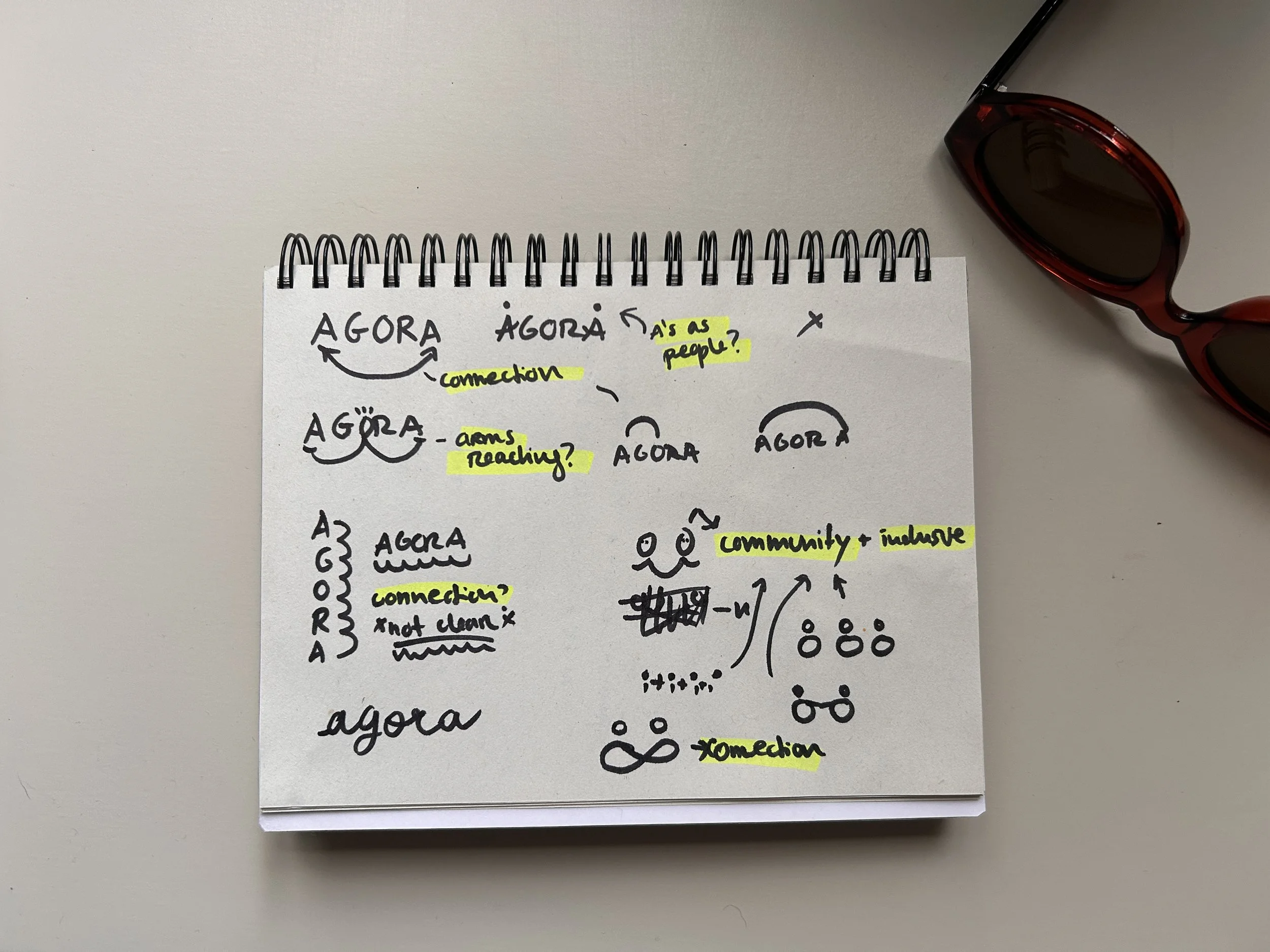
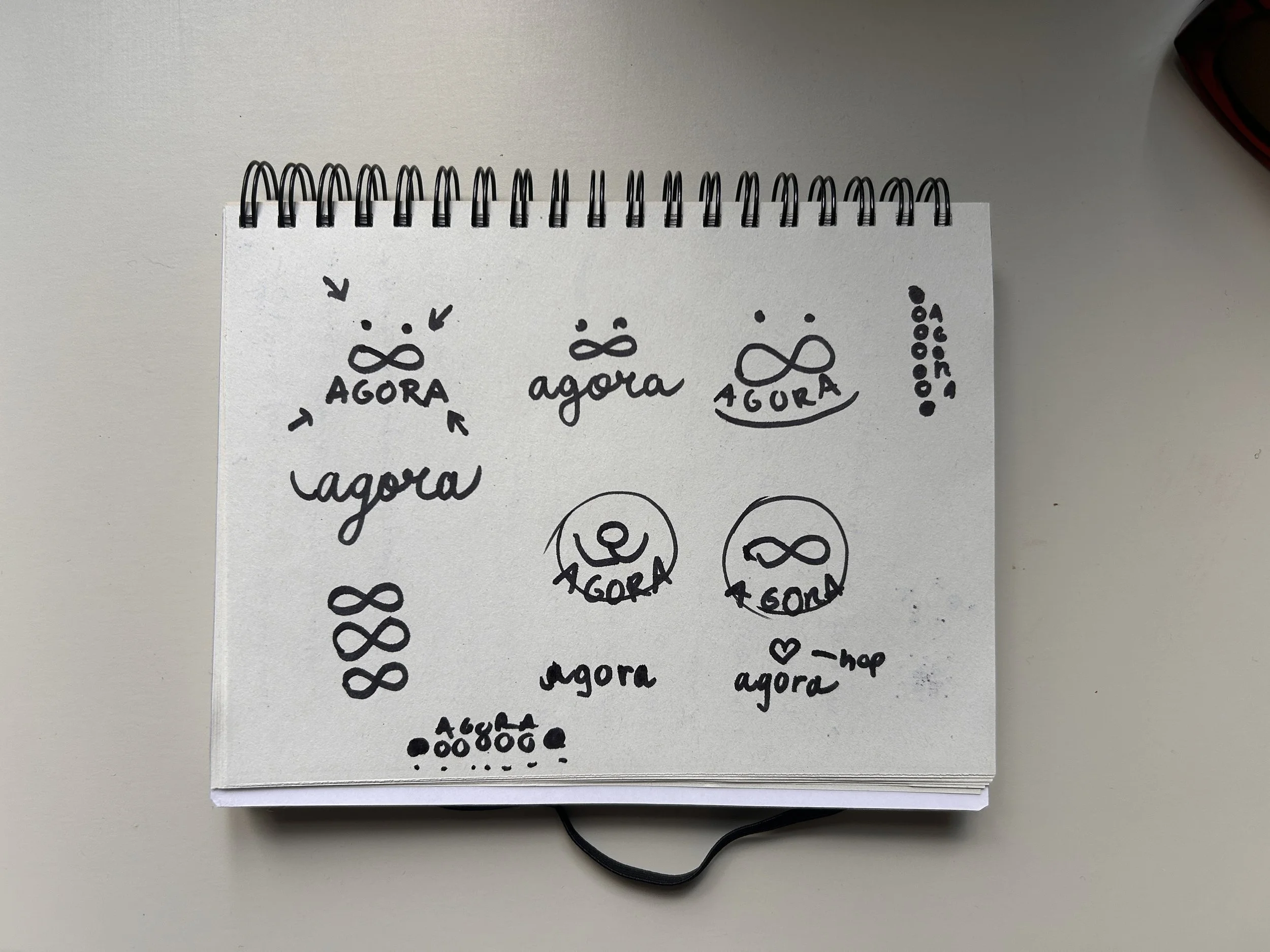
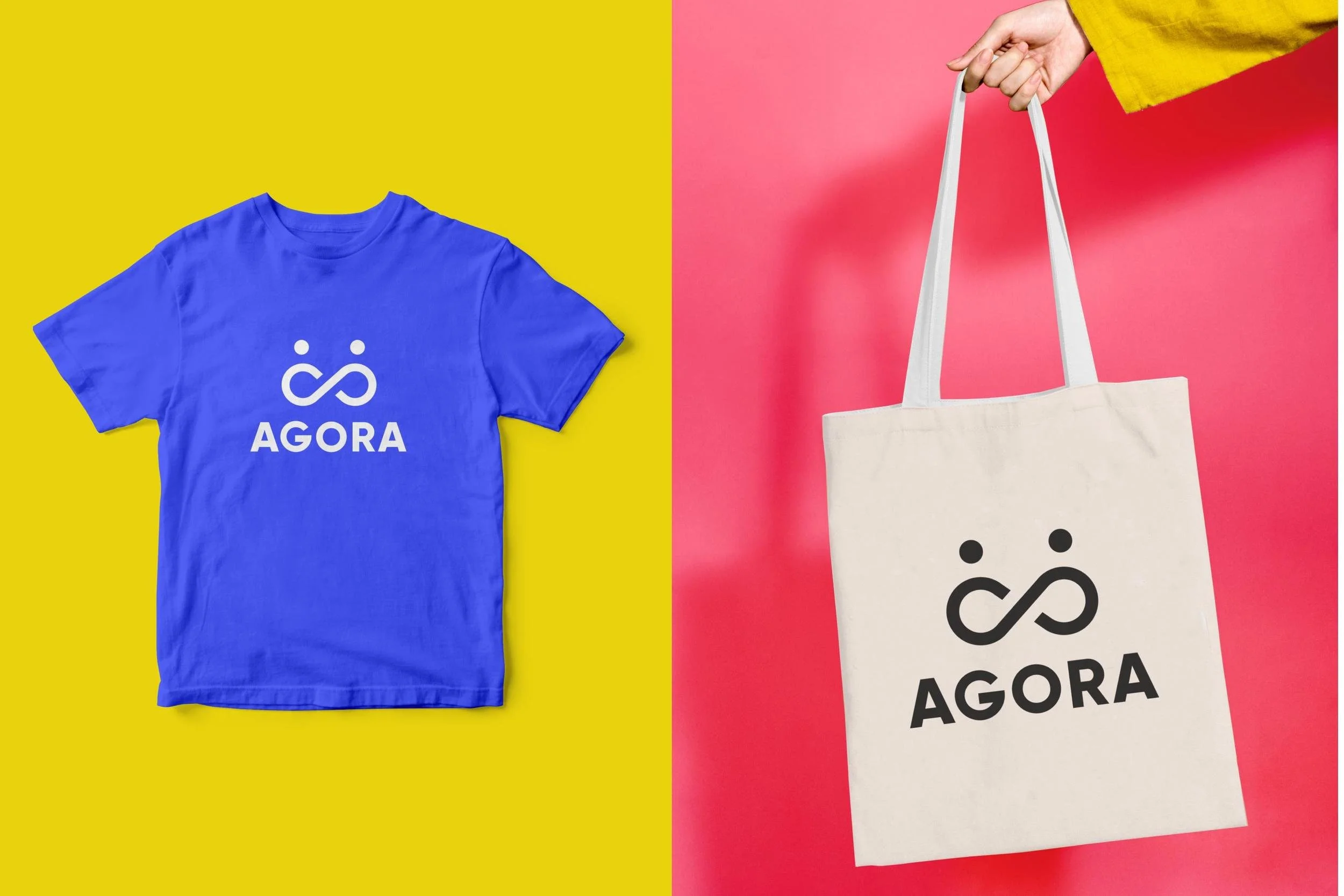
The final logo consisted on two people forming an infinity loop, giving a feeling of community, collaboration, and inclusivity.
I wanted it to be minimal enough to pattern-repeat across surfaces but strong enough to stand alone.
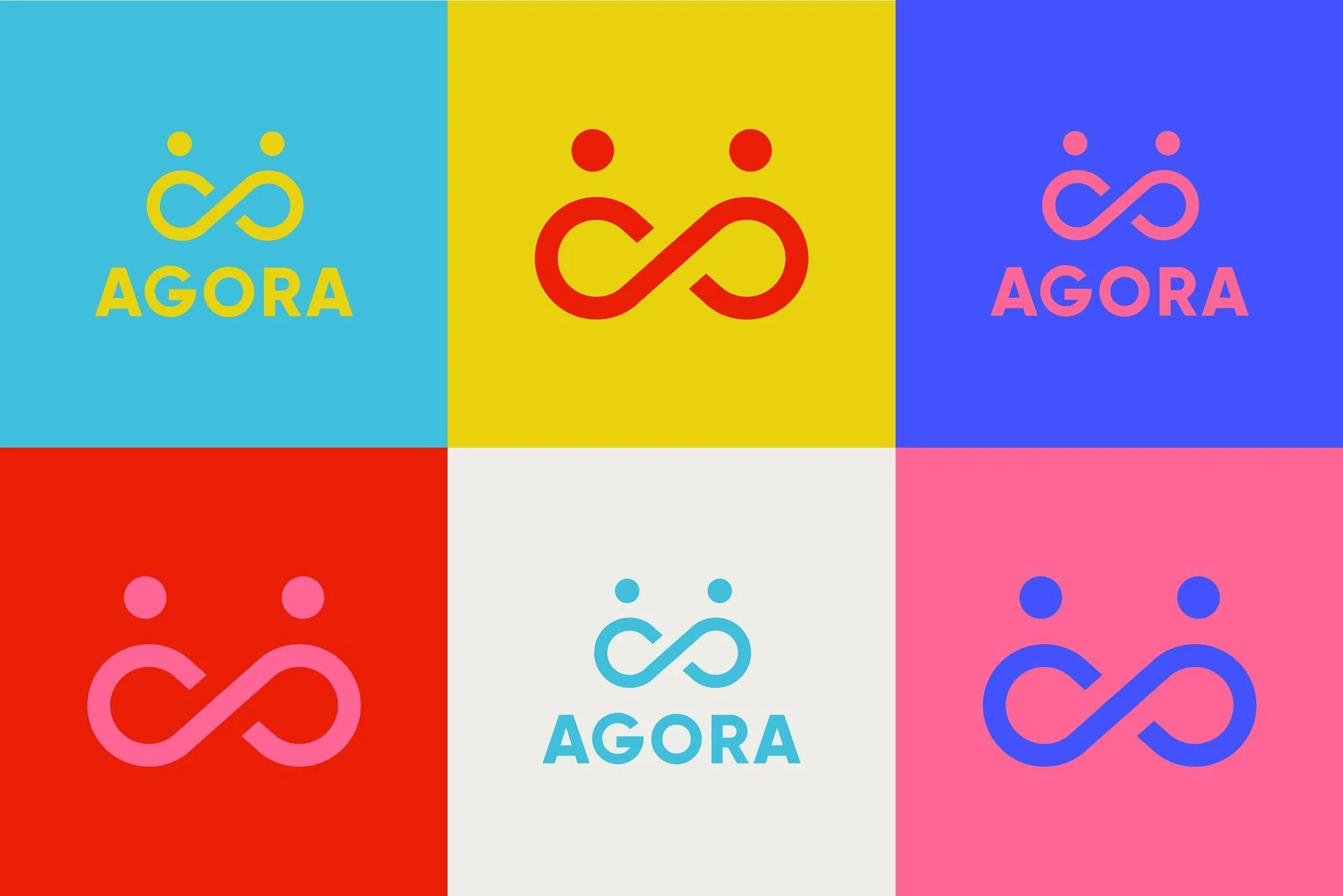
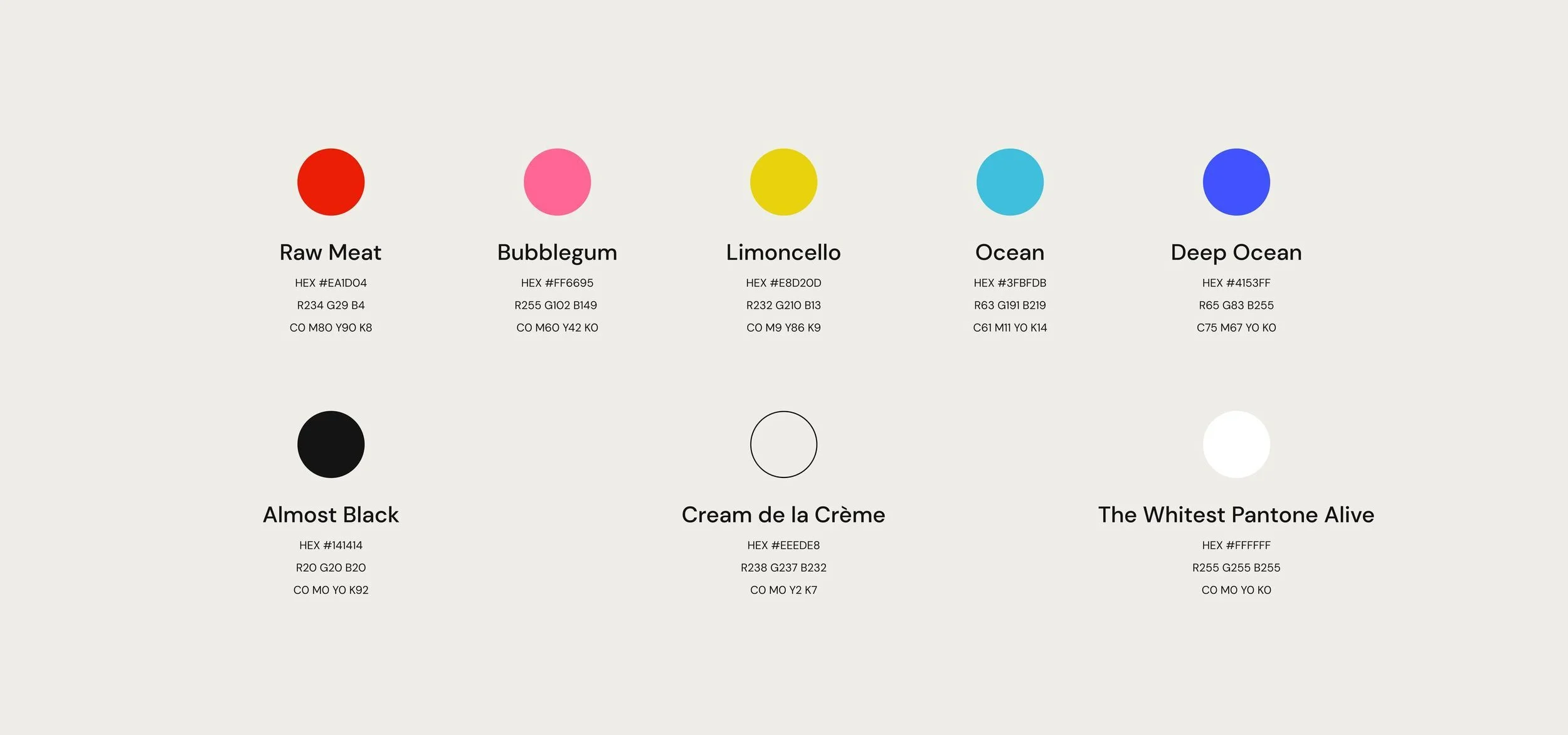
Colour Palette
For the palette I picked warm pinks and reds mixed with electric blue and yellow: fun and energetic colours, not safe and boring classic charity colours.
This was a deliberate choice to feel inviting to young people and families, not institutional.