Zaptic is a task and knowledge management tool used by factory workers, founded in 2015 by a small team of engineers.
Because of the company’s fast growth, a lot of features were introduced in a very reactive and ad hoc way which caused a disjointed product. A big part of the issue was the lack of a cohesive design system - so we decided to solve the issue.
Zaptic
Design System
Role
Lead Product Designer
Company
Zaptic
Platform
iOS
Android
Website
Industry
SaaS
Manufacturing
About this (monster of a) project
Anyone who works in product knows how daunting and difficult maintaining a design system can be, let alone creating one for a complex product from scratch. Yet, that's exactly what we did at Zaptic.
Sara and I, our small design team, began working on our design system at the end of 2021 and in less than a year, we managed to lay its foundations, introduce documentation and best practices, build processes for maintenance and development, and implement new tools to support these processes.
It all started when we decided to switch from Sketch to Figma, which forced us to recreate all our existing projects from scratch and although this was a real pain (seriously), it also allowed us to discard outdated components and start fresh. We saw this as the perfect opportunity to create our very own design system.
This case study showcases our initial process and highlights what has worked for us.

Sara and I deciding to tackle the simple task of creating a complex manufacturing SaaS platform’s design system
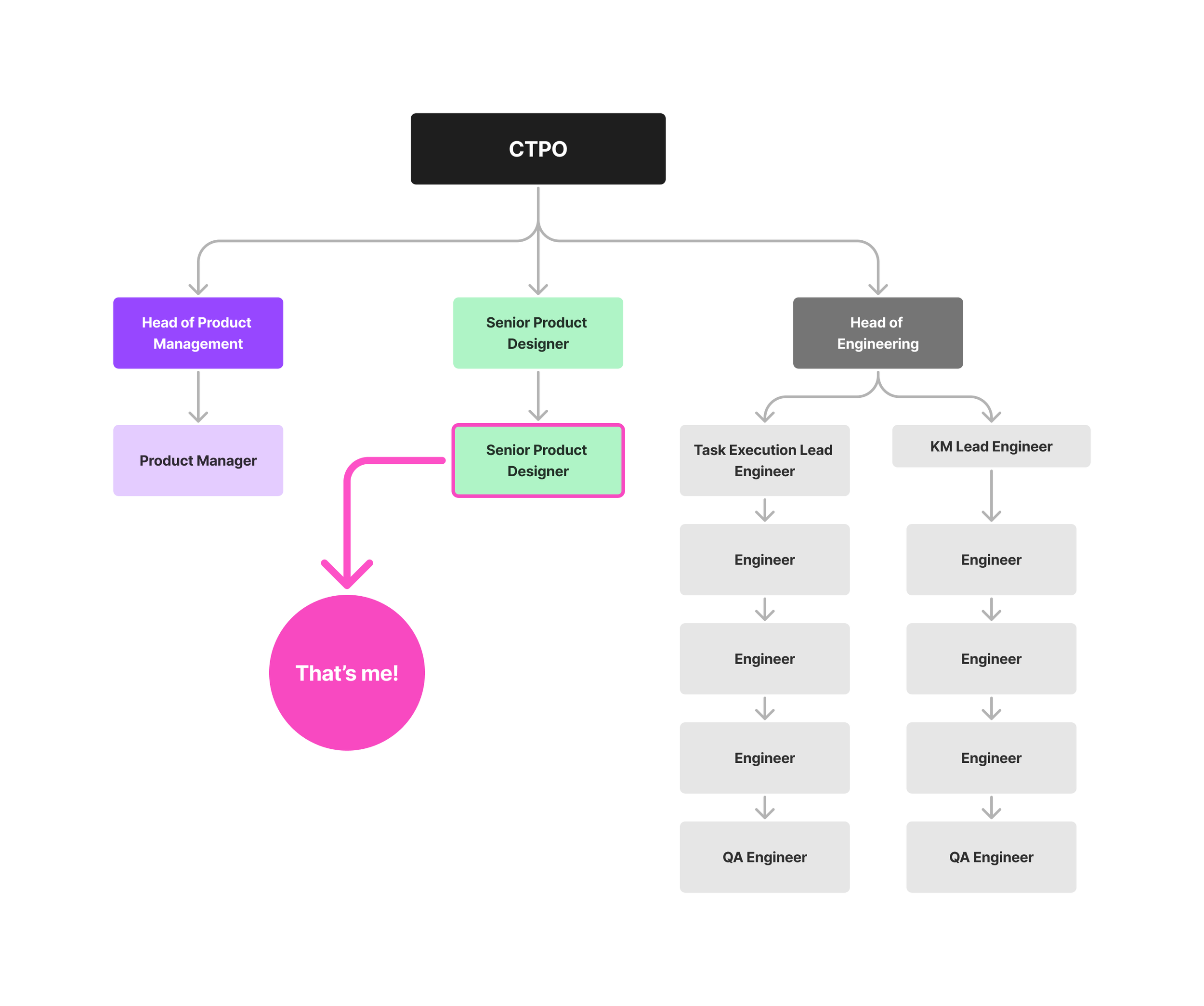
Team Structure
Our product team consisted on our CTPO and founder and was divided into product, design and engineering.
Sara and I (my design pal during this project) were equally responsible for creating the foundations of our first design system and although we were the ones initiating this process, we also collaborated very closely with Product and Engineering to bring the design system to live in a way that made sense for the whole organisation, not just design.
Why did we
create a design system?
As our product grew, it became harder to keep track of our components and inconsistencies in UI and behaviour started to surface:
Inconsistencies
We had many different colours, font sizes, grids, and padding sizes, which created brand inconsistencies.
Time wasted
Finding the right components became very time-consuming.
Poor Accessibility
Because our product grew so quickly, accessibility wasn't a core value from the start, and we wanted to fix that.
No source of truth
We needed a unified and accessible language to use across teams to bridge the gap between design and engineering. We also planned to expand our design team so we knew we needed a reference point for all designers to work from.
Inventory & Audit
Our small team of two started by conducting a full audit of the product to know exactly how many text styles and colour variations we had on both the app and the portal.
We tried using inventory tools like CSS Peeper to analyse stylesheets but due of the nature of our product, this ended up being very time consuming and not really accurate, so we decided to conduct a manual audit on our files.
We realised that our official colour palette was extremely limited and offered insufficient options for our various needs, which led to significant inconsistencies and disorganisation. →
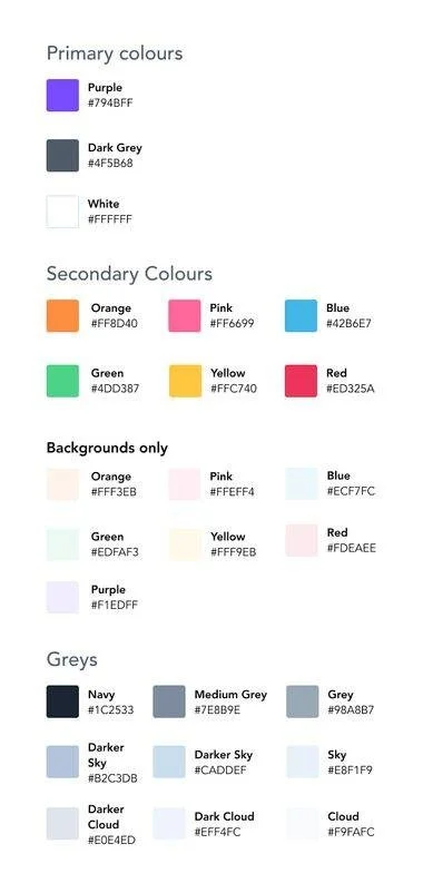
This was our very limited original colour palette. The labelling was also a big issue because we had no usage guidance.
What nightmares are made of: our actual colour usage suggested that we needed a more comprehensive and versatile palette
The components
After the initial audit, we created a new project on Figma so we could categorise all the components that made up the product.
The next step was creating a list of all the components we currently used in the product (and components we were missing) and we split the list amongst ourselves so we cold begin gathering screenshots of every component: buttons, form fields, tabs, icons, and so on.
Seeing all these inconsistencies gathered in one place was an eye opener and definitely ✨overwhelming✨ at first but it was ultimately a positive first step into tackling the monster we had created. 👹
After compiling the list, we prioritised the components based how frequently they were used and complexity. We also did a lot of research on best practices, accessibility and usage guidelines to ensure we created the best base possible for the product.
After auditing a substancial number of components and having a good idea of the work that needed to be done, I booked a couple of internal meetings with stakeholders and the rest of the product team to discuss next steps.
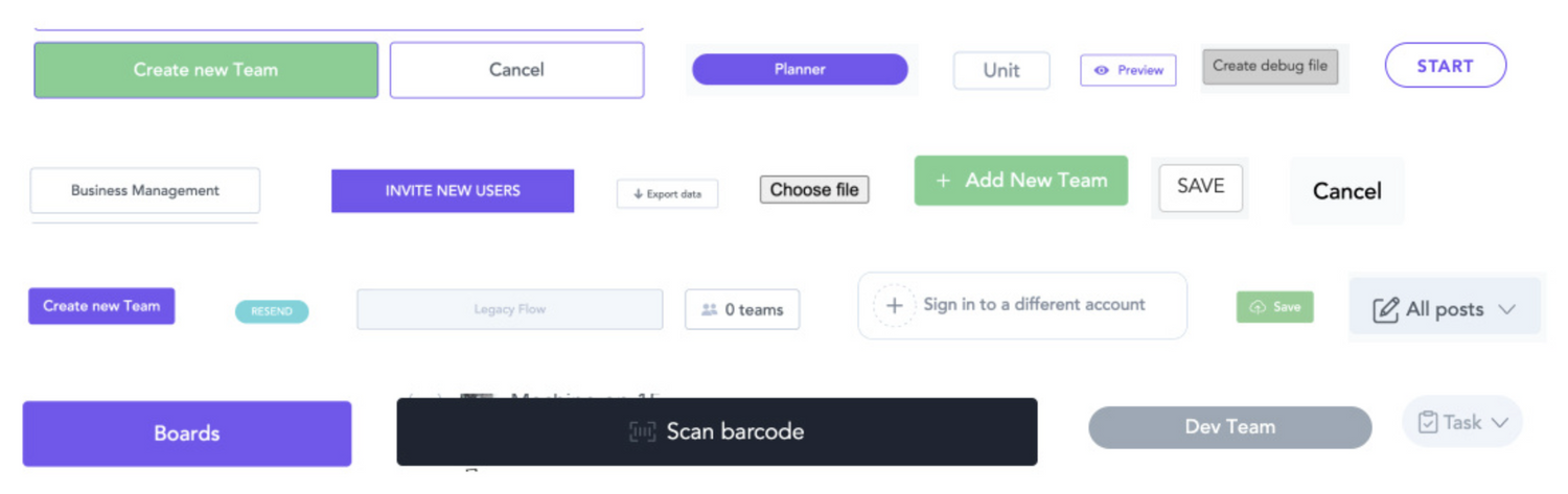
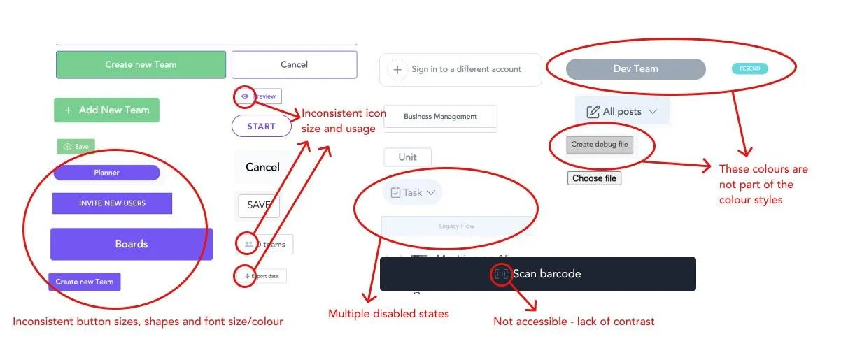
Our buttons were one of the most inconsistent component and lacked cohesively in size, colours, font and shape - as you can see.
I swear I had nightmares about this
After the never ending task of hunting and screenshotting all the variants we cold find, we regrouped and categorised and broke down all the components. This was a very important exercise because it made us realised the numerous inconsistencies most of the components had and how limiting and non-accessible they were.
Alongside creating better, more accessible components, we also had to make sure we improved the way we documented and handed over designs to engineering since this was a big part of the problem.
Buy-In
We knew from the start that developing a design system would demand extensive research, validation, and planning, but we also knew that it was a crucial step toward improving our processes and ultimately creating a better product.
We decided to set up meetings with our stakeholders, product and engineering teams, to present our findings and explain the importance of dedicating time to building a design system. Our research and audit not only helped establish the foundation for our design system work, but they also showed the other teams why a design system was crucial for the product.
After a few calls, we reached a compromise by integrating this work with ongoing feature development. This was a huge win for everyone, but it also meant that our progress was uneven, with some weeks being super productive, but other, not so much.
Despite our slow start, after a few months, the foundations began to take shape which was very exciting!
After the initial call we set up regular meetings with engineering to align on how to organise and name of components
Design Exploration
Carbon Design System and Atlassian Design System were some of the systems we discovered during our research that helped us get a sense of what we wanted to see in our own. The screenshots we took during our research provided a solid foundation for identifying what we were doing right and wrong and guided us in deciding what to keep or discard.
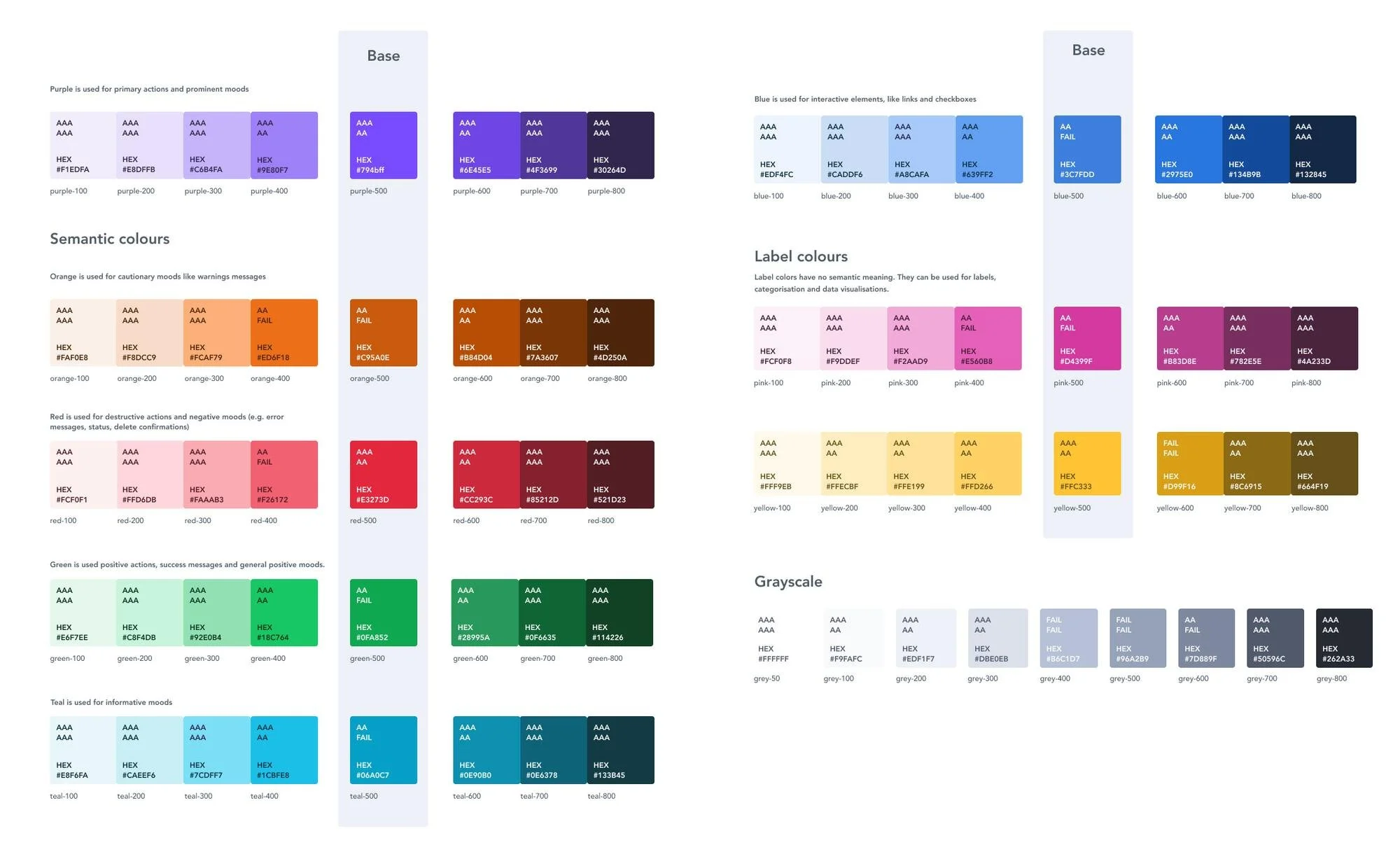
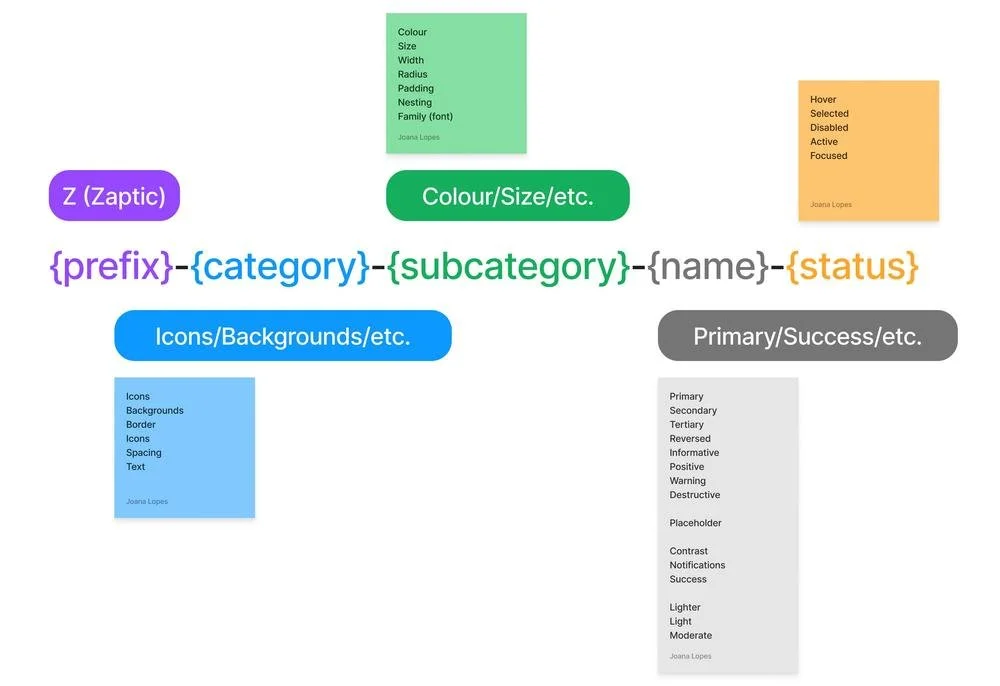
We've introduced more shades to give us more flexibility and implemented a new naming convention: each colour should now have a prefix with the colour's name followed by a numeric scale, e.g., blue-500. We also created documentation and guidelines for each colour's usage and created semantic names for accurate colour usage.
After building these foundational elements, we moved on to smaller components like buttons and icons, and afterwards to more complex blocks and elements such as our execution forms, tables, and so on.
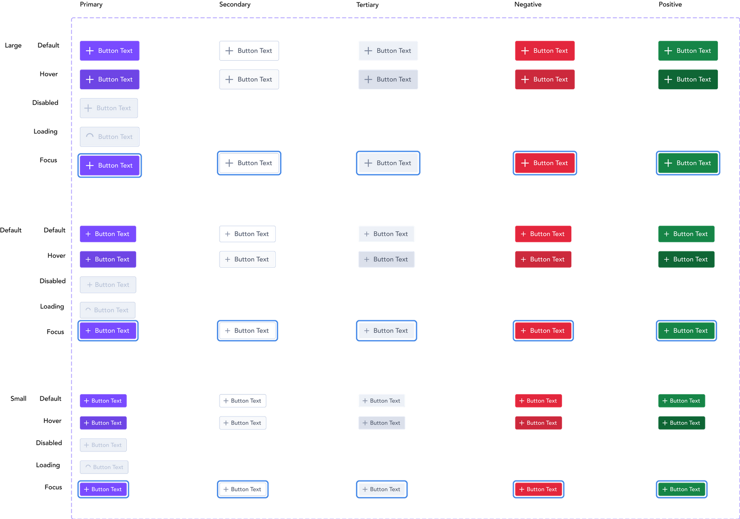
One of the most problematic components was our dreaded standard button, which is among the most used across the product but lacked structure and several essential states, like hover and focused states.
We also standardised sizes and added new types of buttons that didn’t exist before. This is how the button component looks now:
One of the most satisfying parts of this process was to finally create an organised and cohesive component for the standard button, the source of my nightmares.
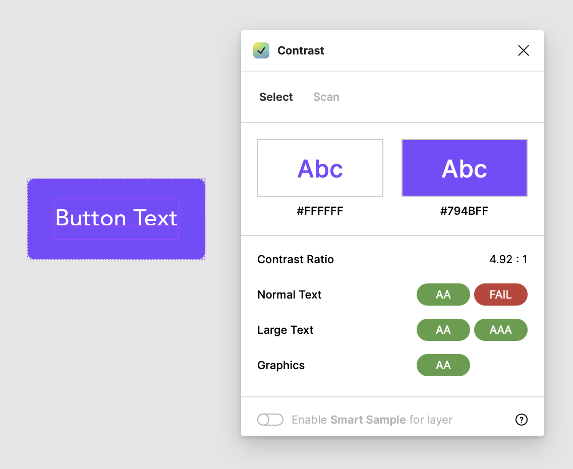
Accessibility was another key area that needed improvements so we ensured that every component complied with WCAG AA accessibility standards, making them usable for people with low vision.
We also added documentation on other accessibility areas such as keyboard navigation, interaction, inclusive language, and more.
Because we recently moved all of our files from Sketch to Figma, we had to recreate everything from scratch which allowed us to have a fresh start and remove outdated components.
We decided to start with the foundational elements of the system (and one of the messiest parts): the colour palette, text styles, and grids. Compare our old, messy colour palette shown before the new one:
This also presented the perfect opportunity to introduce tokens to our system, something we previously lacked. This proved to be one of our most challenging tasks because it required extensive research on naming conventions.
We needed to ensure these conventions made sense, aligned with the engineering team's requirements, and could be easily understood by anyone using the design system or reading its documentation.
Our process consisted on conducting an audit of all the types, states, and patterns currently in our system to better describe the tokens. We then grouped these into different categories and started to develop a naming convention that made sense for all us.
Documentation
Zeroheight
We needed a place for documentation that would be easily accessible to anyone, regardless of their team or department so we knew this couldn't live solely in Figma. After some research, we discovered Zeroheight and chose it as our design documentation tool.
Since we didn't have any brand guidelines in place and the brand revolved around the product, we decided to create basic core rules and best practices. These guidelines cover not just the design system, but also the brand in general so the marketing team can also later develop these further for other platforms.
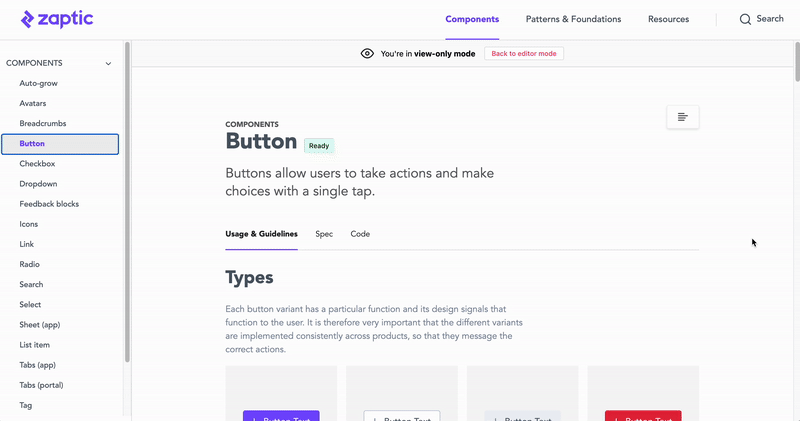
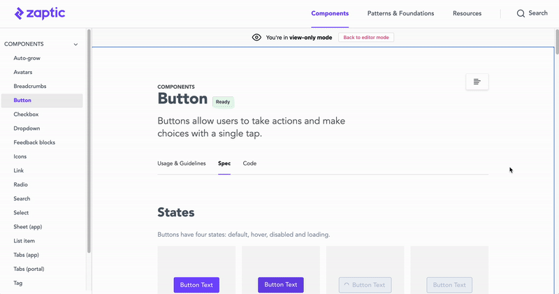
For each component, we've created three tabs: usage guidelines, spec and code. The usage and guidelines tab offers information on the component's variations, usage, and placement. Each page's specific content varies based on the component's nature.
We divided the Design System into three sections:
Brand guidelines: A guide for both the product and marketing teams. Information about accessibility, best practices, our colour palette, text styles, and other brand-level guidelines can be found here.
Components: Contains the main components that make up our design system, along with rules for usage and best practices.
Resources: Downloadable assets such as our font, logo, icons, and more.
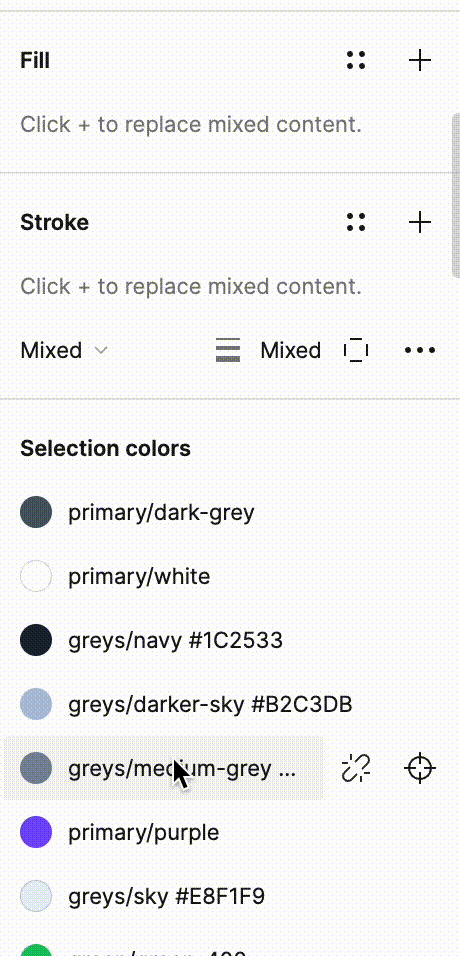
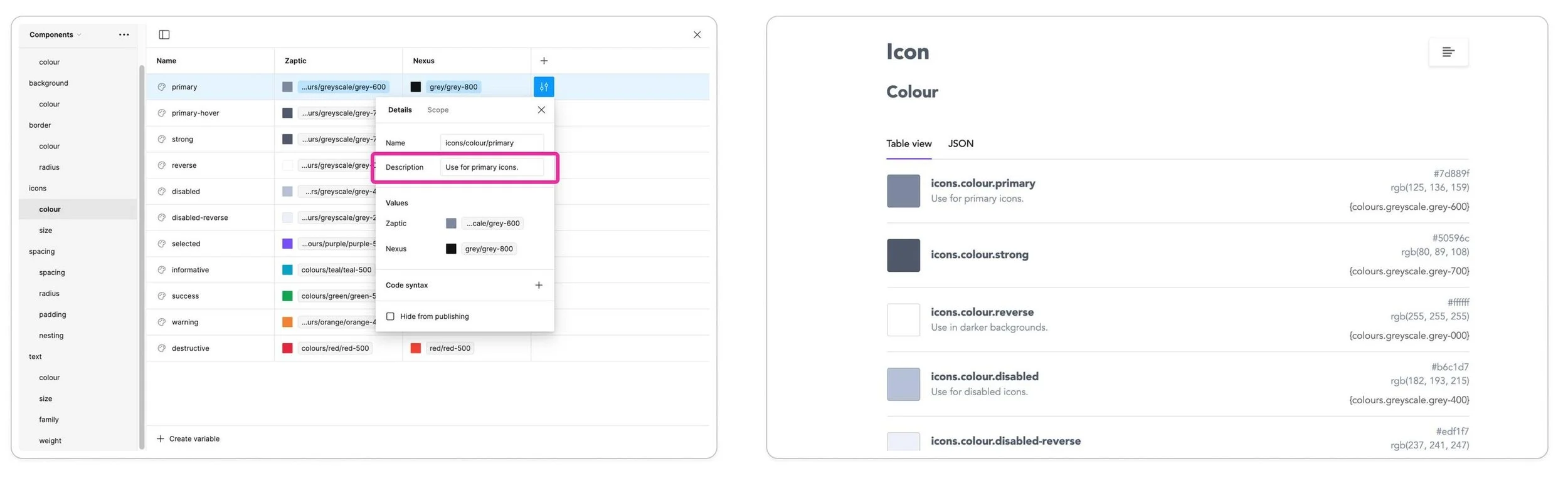
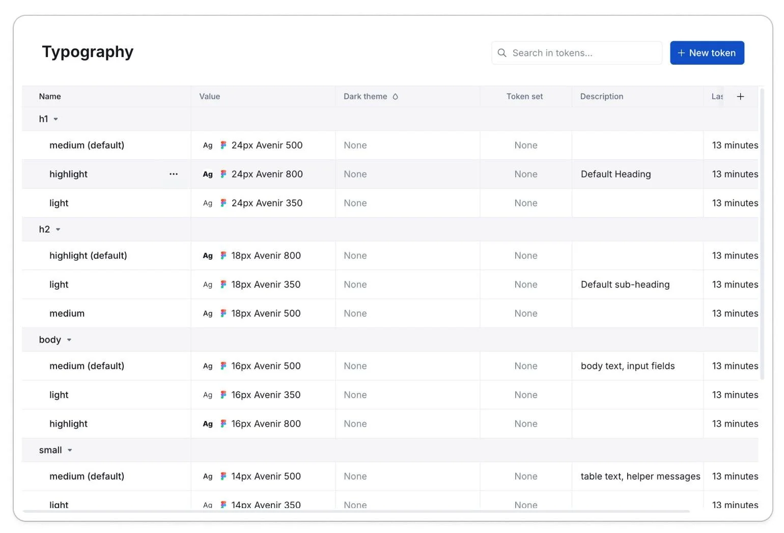
As we developed our system, we realised that zeroheight had some limitations, one of the biggest ones being that it didn't allow us to add a token description, which was crucial for communicating the token's usage. Here's an example of a token on Figma versus the same token on zeroheight:
We were also struggling with updates. Zeroheight wouldn't automatically refresh and it continued to display old components and values, forcing us to remove everything and manually upload it again which was a waste of time.
This became very time-consuming and was aggravated by the fact that Zeroheight doesn't offer page templates which meant that every time something changed in the documentation's structure, we had to manually update all the pages.
These issues led us to explore a new platform for our design system documentation. We ultimately decided to move to Supernova which looked like a more robust and complete platform, you can see the difference between the tokens from Zeroheight above and Supernova’s on the right:
Copy tracking issues
A few months after the design system started taking shape, we realised it was becoming difficult to track the copy. This created several issues:
We had a lot of duplicate copy in components like error messages and empty states.
We couldn't keep our copy up to date across all components and screens.
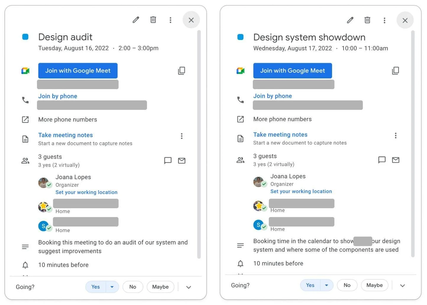
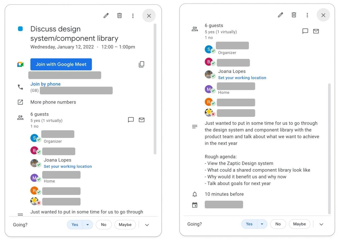
Our product was used globally, which meant we dealt with many different languages. The only way to see how a design would look in all of them was to do it manually, which was very time-consuming. This was a crucial step in our process because in languages like German, words tend to have more characters or use hyphenated compounds. These linguistic differences can significantly affect how a component looks and functions on a screen.
We can now add all the languages Zaptic supports on our data base and easily swap the text without having to manually do it.
The spec tab contains shows information like the component’s anatomy, states and tokens. Just like on the usage and guidelines tab, the content varies depending on the component.
The code tab displays code usage documentation and will be linked to Storybook in the future. This is one of the areas of the design system that still requires significant development and is currently in progress.
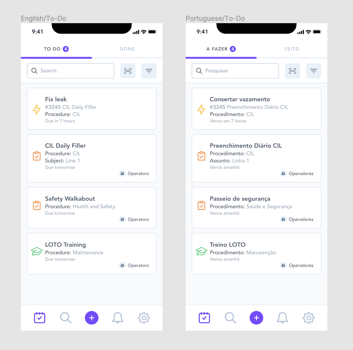
The first screen is in English and the second one in Portuguese, now imagine translating this to 19 screens in 10 different languages
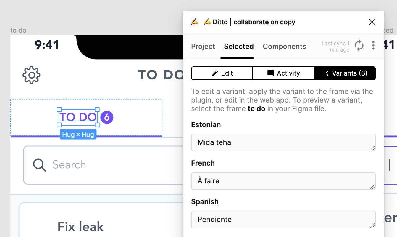
We began searching for a documentation tool specifically for copy management. Coincidentally, this was around the time of Config 2022, where we watched a presentation by Ditto, a copy management tool. Using it enabled us to create a database for all our copy and add variants, making it easy to test different languages.
Maintaining the beast
Do how do we keep our components and documentation current as the design system evolves and our needs shift?
We regularly conduct library audits and held internal meetings when we believe a component needed improvements, and during these audits we:
• Log all necessary updates
• Identify elements to remove or add
• Determine if new components were needed
We also involve the engineering team in discussions and hold regular meetings with the engineers responsible for maintaining the design system. This process ensures our design system remains up-to-date and aligned with our changing requirements..
How did we measure success?
To measure the success of implementing the design system, we tracked the team's efficiency before and after implementing some of the components.
We aimed to determine if it helped the design team reduce the time needed to design and prototype new features, and if it shortened the coding, implementation, and delivery times for the engineering team.
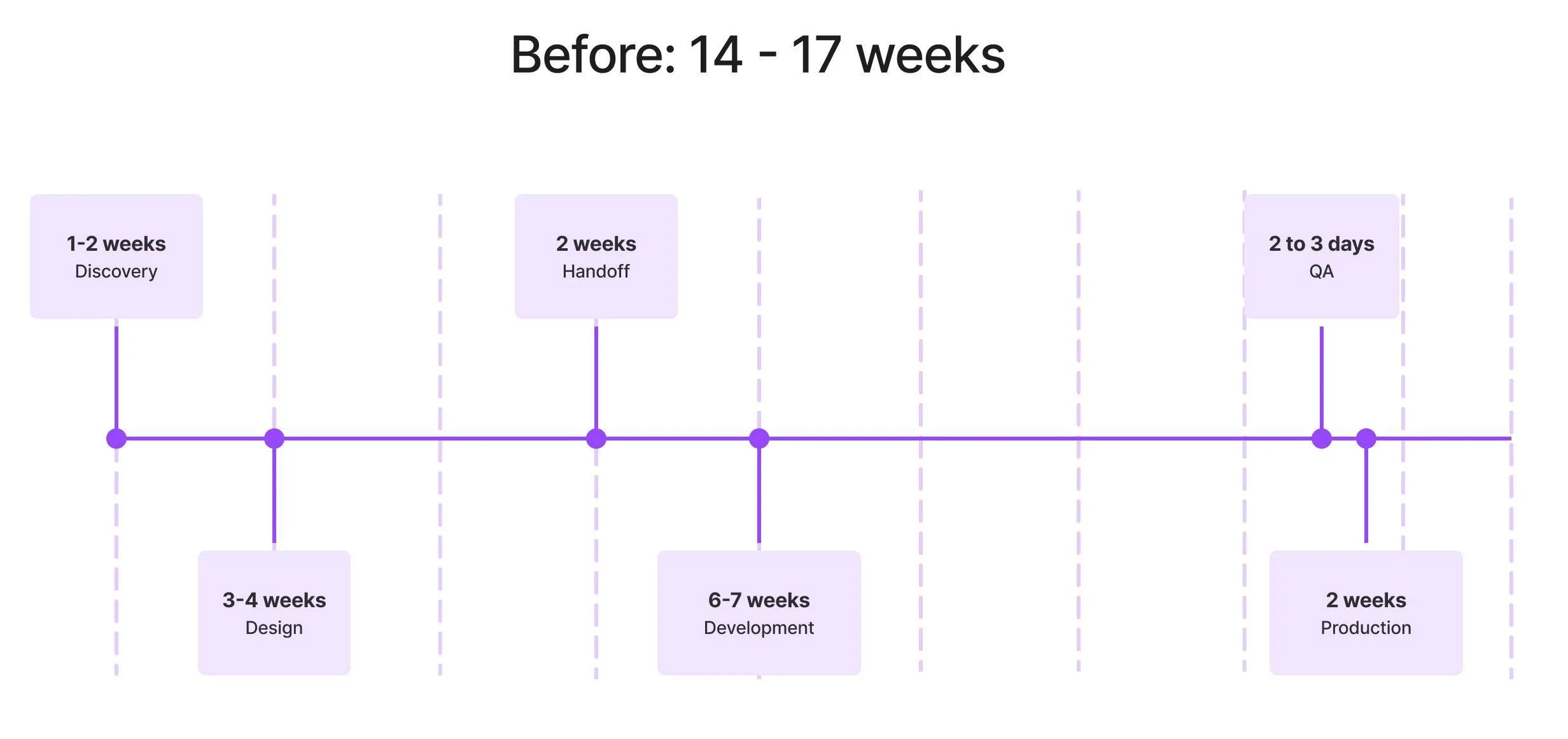
Before introducing our basic components, the engineering team was building nearly every component from scratch. This led to numerous variants of the same components, primarily due to the lack of documentation and a single source of truth for our design system.
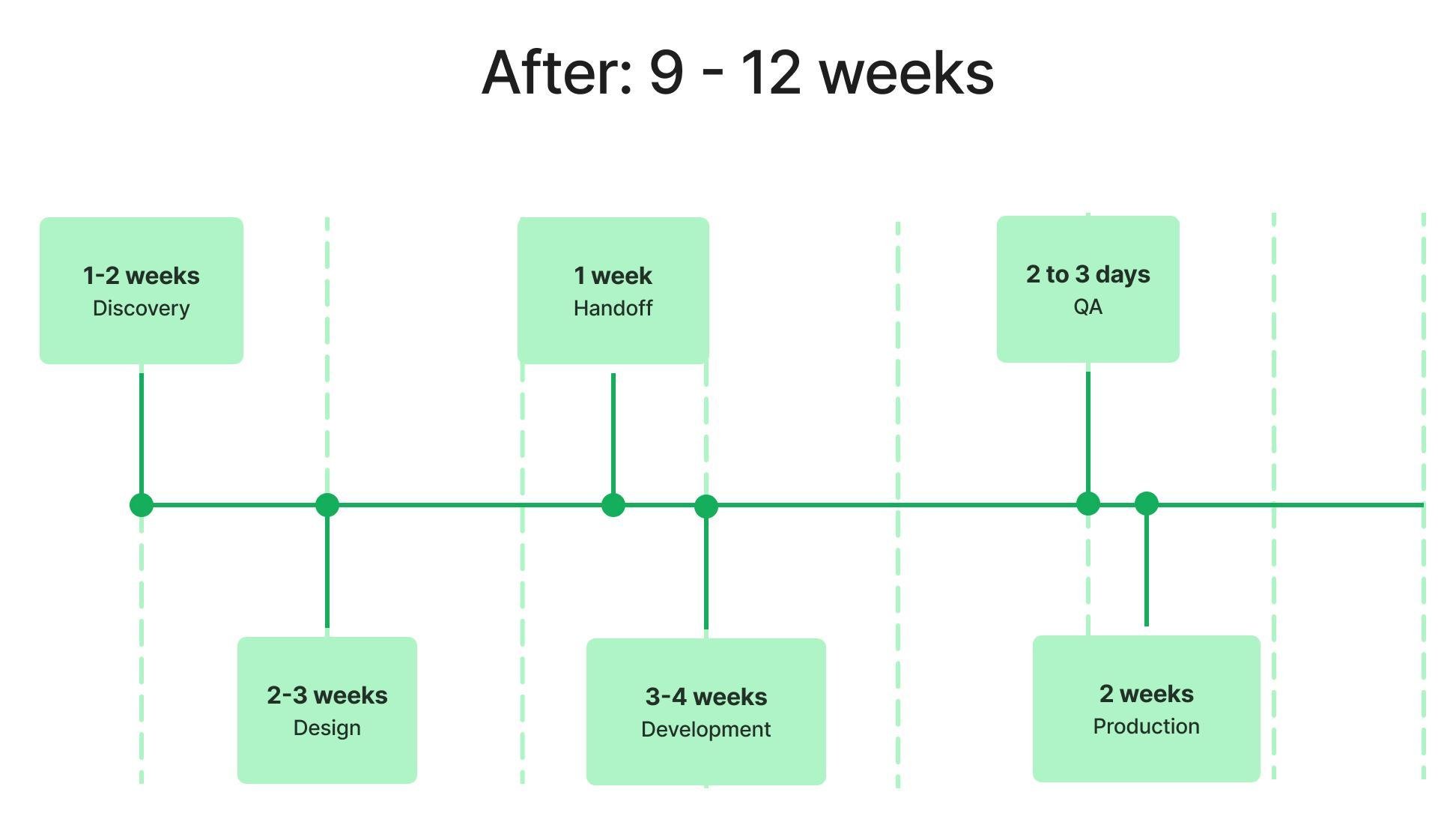
The timeframe varied depending on the feature we were working on, but on average, this is how long the entire process, from discovery to production, was taking:
Implementing the design system cut design time and improved efficiency. With a comprehensive component library, we no longer had to search or build from scratch, streamlining both solution-finding and documentation for the engineering team.
The engineering team now had a single source of truth to work from and a standardised reusable library, which previously didn't exist. This also significantly reduced their implementation time.
↓ 50%
Handoff time
↓ 50%
Development Build Time
Another positive impact was the visible improvement in UI Consistency, the reduction in bugs both due to the use of reusable components. We also saw significant progress in accessibility compliance, which is very important in manufacturing environments.
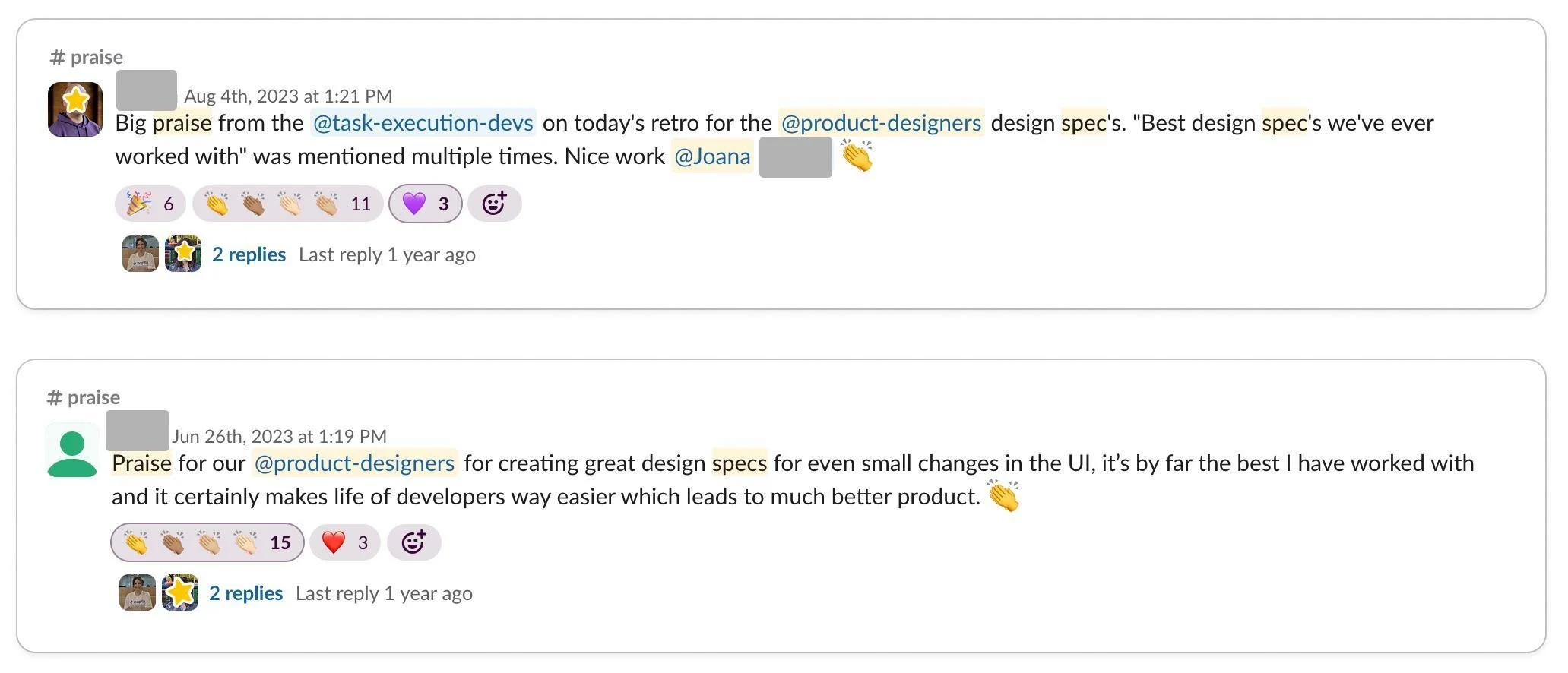
Since implementing the design system, our wonderful product and engineering teams have provided positive feedback multiple times. They've told us that documentation has really improved how we implement new features and made the teams work more efficiently which frankly makes my day and made it all worth it!
These results exceeded our expectations, demonstrating a 32.3% overall improvement in efficiency. This led to a significant reduction in project completion time and a more streamlined workflow:
↓ 32.3%
Complete Cycle Time
↓ 28.6%
Design Execution Time