Faster Reporting on the Factory Floor
Role
Lead Designer
UX Researcher
Accessibility Expert
Company
Zaptic
Industry
Manufacturing
SaaS
Platform
iOS
Android
+47%
Visitor acquisition
More users finding and reaching the report page.
+24%
Page views
Higher engagement across the board
+86.5%
Account adoption
The vast majority of accounts actively using the report
100%
WCAG 2.1 AA compliance
The report page met accessibility standards for the first time
About this project
Zaptic helps deskless factory workers take ownership of their day-to-day work and a big part of that means giving them clear, immediate access to the information they need on the shop floor.
As Zaptic's Lead Product Designer, I led the redesign of one of the platform's most-used features: the report page.
The stakes were high because this was a crucial part of how workers access, understand, and act on safety information every single day.
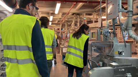
Our team’s factory visit to Henkel in Düsseldorf, where we had the chance to see worker’s daily routines - education and fun 😃
Our Team
There were two teams at Zaptic focused on different parts of the product: the Knowledge Management team and the Task Execution team. The Product Design team was independent and worked across both, which made sense given the size difference between our team and engineering. Having a designer embedded in each team ensured engineers always had a point of contact.
As the Senior Product Designer on the team, I worked closely with our PM and engineers, and I was involved from beginning to end, from research and discovery through to testing, handoff, and monitoring results post-launch.
The Challenge
One of Zaptic's key features is task execution, which includes accessing reports generated by users. Reports can be accessed from both the portal and the app, but they look very different on each platform, simply because the devices are so different.
Portal users are typically on desktops or laptops, while mobile users are on smartphones and tablets. That means the amount of information we can show, and how we show it, varies significantly between the two.
Andddd here's the catch: shop floor workers only have access to the app. They have deskless jobs where most of the time, there's no desktop or laptop in sight. Only managers have access to these devices and can check the portal.
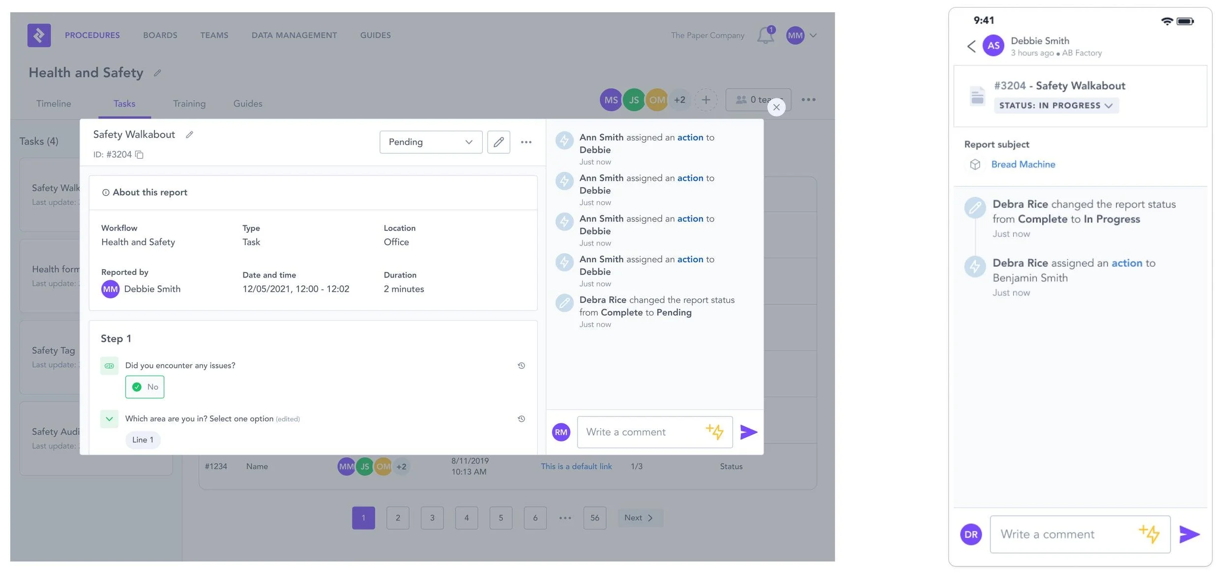
On the left, you can see a report on the portal, and on the right, a report on a mobile device with a drastically different UI.
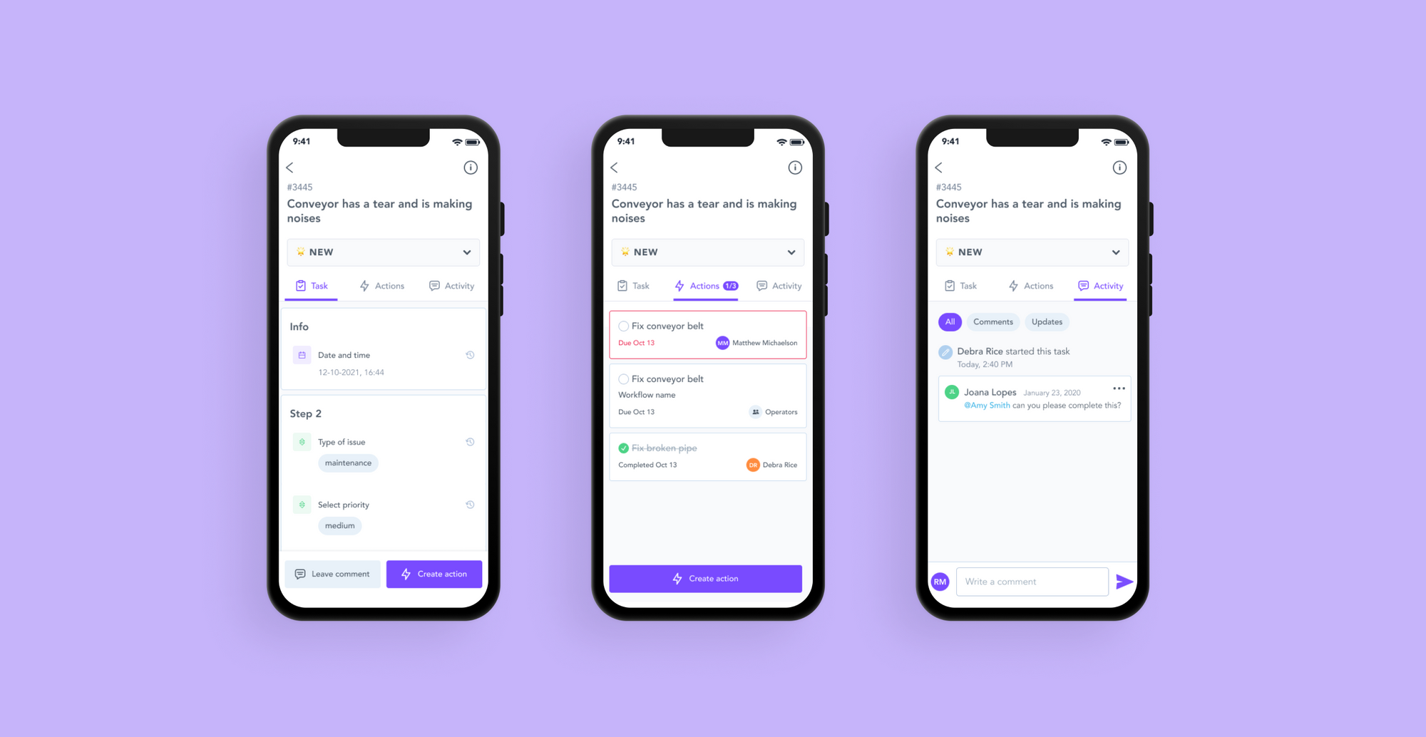
The report page on the app had two main problems.
Context loss
To view a report's answers, users had to click into the report tile and navigate to a completely separate page. This meant losing sight of everything else: comments, status, actions, audit trail, and added unnecessary clicks to an already busy workflow.
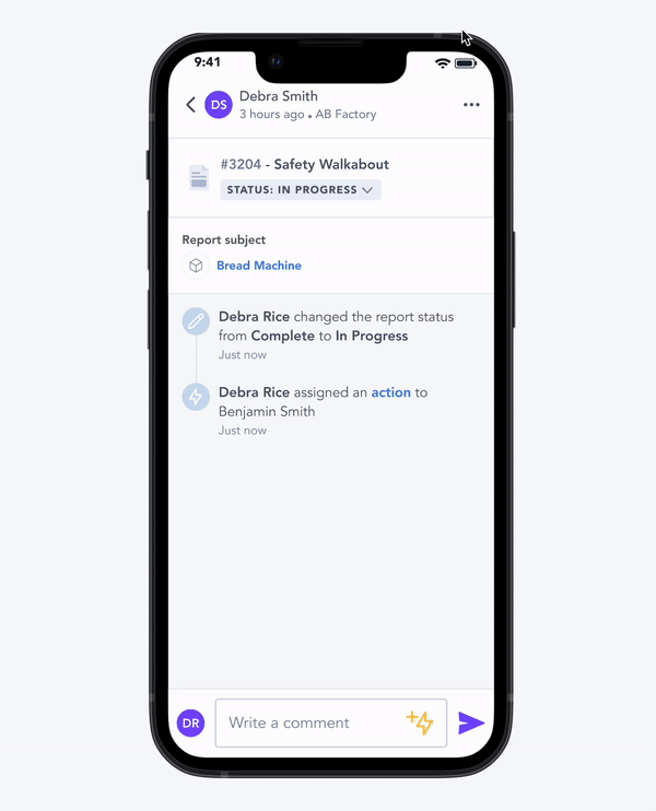
Discoverability
To create an action from a report, users had to click a lightning bolt icon buried in the comment section. Most users never found it intuitively, which meant follow-up actions on safety issues were being missed.
Because this affected such a crucial and heavily used part of the product, we were given a lot of time to research and validate properly. We knew that any significant change here could have a dramatic impact on how users interacted with the platform.
Project Timeline
Discovery
4-6 weeks
The discovery process involved client interviews, discussions with the CS team, and analysis of usage metrics.
Design + Handoff
9-11 weeks
This phase included defining scope with product and engineering, conducting usability testing, obtaining final client approval, and writing the design spec.
Development
6-8 weeks
Once handoff was complete, the engineering team took ownership of the development process.
QA
2-3 days
The QA phase, managed by QA and Design teams, focused on testing and implementing design and bug fixes.
Production
2-3 weeks
Finally, the production phase encompassed creating the QA release note, monitoring success metrics, and drafting design improvements.
User Personas
Operators
Shop floor operators are responsible for manufacturing a company's products. They collaborate closely with R&D to ensure new designs can be built, tested, and maintained profitably. Their tasks are typically structured and repetitive, often leaving little time to complete them, Zaptic is part of their daily routine.
They care about
What they need to do during their shift
What was done during the previous shift
Following up on issues raised
Checking instructions they might need to follow
Line Managers
Line managers are manufacturing supervisors. They manage staff and ensure production lines run smoothly. Their focus is almost exclusively on internal operations.
They care about
Managing worker productivity
Assigning tasks to the right people
Ensuring the team understands daily targets and responsibilities
Verifying that issues get resolved.
Discovery
Client & Internal Discovery
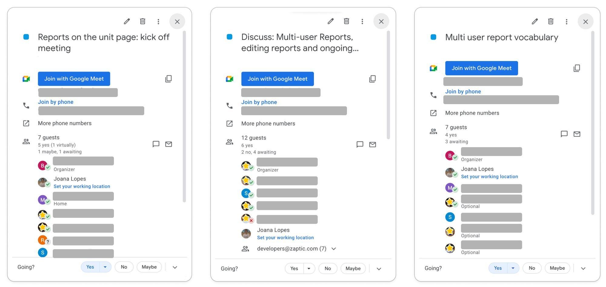
Our discovery process was built around direct conversations with our clients and Customer Success team, who provided feedback on the current report pages.
We ran numerous calls with diverse users and case studies to make sure we covered as many use cases as possible. These conversations gave us a clear picture of the gaps in the product.
Some of our discovery calls with Customer Success and clients
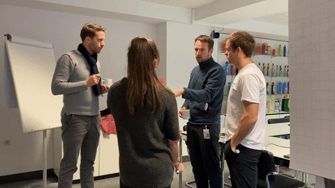
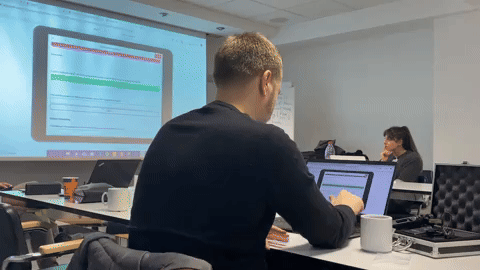
In Person Workshop
We also had the opportunity to run an in-person workshop with factory workers in Manchester, which gave us a clear understanding on how they used reports and how we could make them more efficient for them.
The discovery calls and the workshop gave us a really good overview of the worker's daily struggles and issues facing reporting.

Usage Analytics
I also used Pendo to dig into usage metrics.
We wanted to understand how long users were spending on the report page, where they navigated to afterwards, and where they came from before landing there. I firmly believe that understanding behaviour is just as important as talking to users directly.
Although we were specifically targeting the report page on the app, we measured user behaviour on both the portal and the app, so we could properly evaluate the solution after shipping.
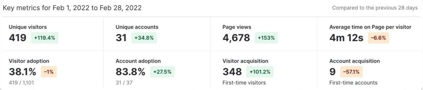
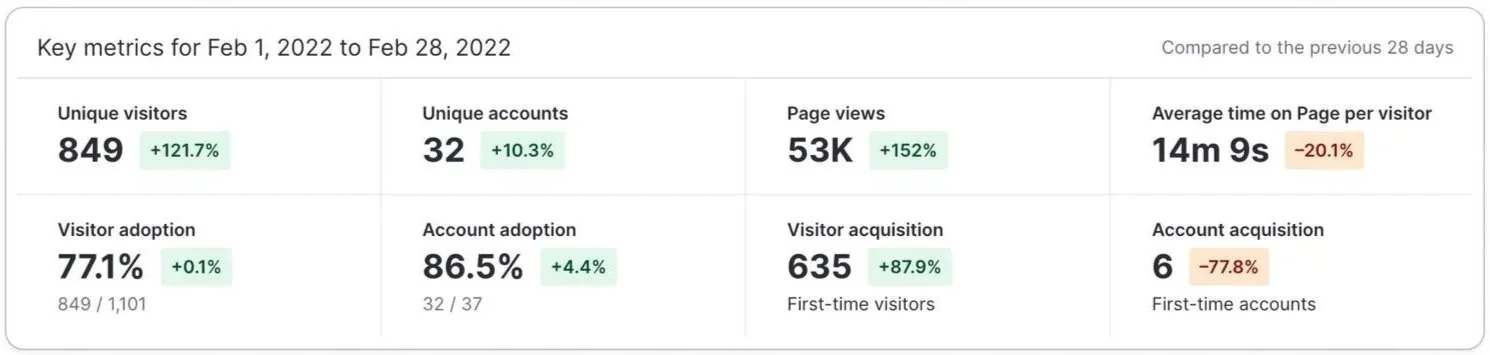
Metrics for the report page on the portal
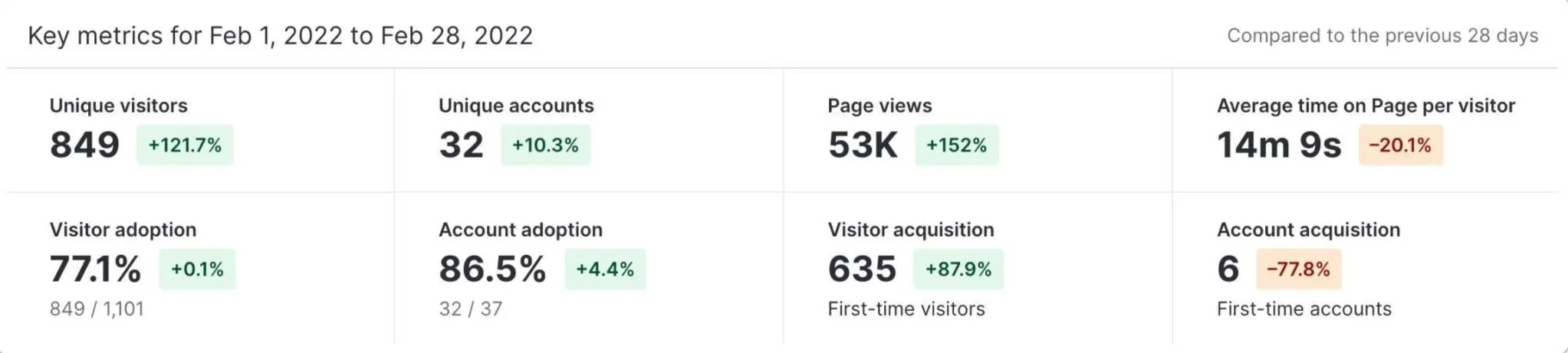
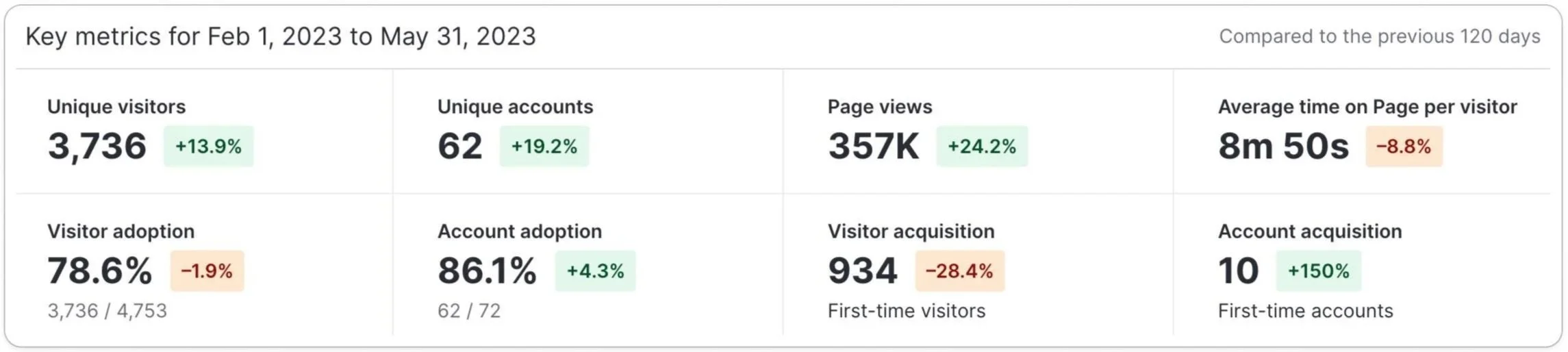
Metrics for the report page on the app: As you can see, the number of page views is significantly higher due to the larger user base on the app side.
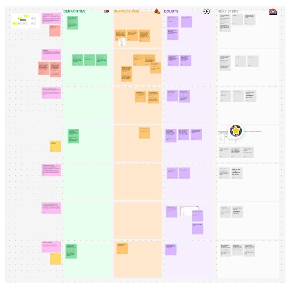
CSD Matrix Session
After analysing all the data, I ran a CSD Matrix session with the team to lay out everything we knew, assumed, and still needed to find out. This gave us a shared overview of the problem and helped us align on how to move forward.
Wireframing
To tackle the issues, we explored two concepts.
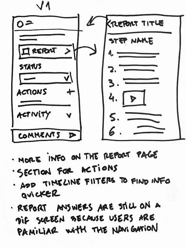
The first concept stayed closer to the existing design.
Users still had to click into the report tile to check answers, but actions now had their own dedicated section on the page, and filters were added to help find information more easily on the timeline.
The goal was to test whether we could fix some of the pain points by changing as little as possible.
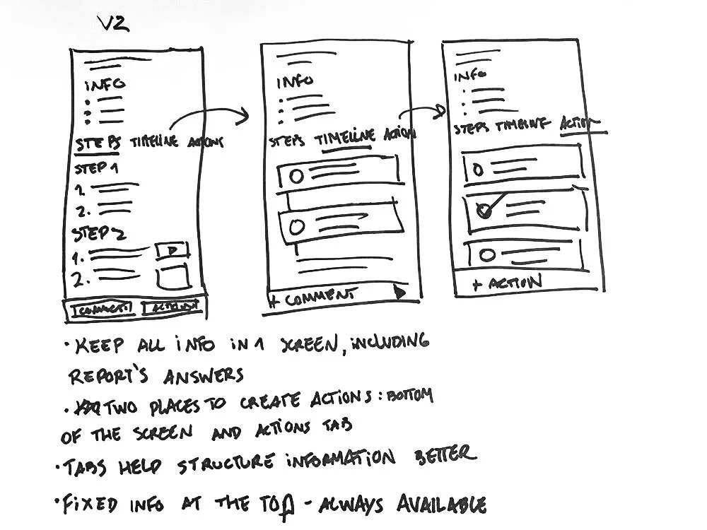
The second concept was a more radical redesign, introducing tabs to organise the report content more effectively. These tabs served multiple purposes:
They displayed report answers directly on the screen
They provided a dedicated space for actions
They allowed for additional context like the report's author and the procedure that initiated the task
This layout significantly improved information hierarchy and accommodated content that simply couldn't fit on the previous screen.
Usability Testing
& Validation
To make design decisions based on real behaviour rather than assumptions, I ran A/B usability tests based on the two wireframe options. We sent two versions to some of our customers through Maze, which let us observe how they navigated each screen and found information.
First option
Second option
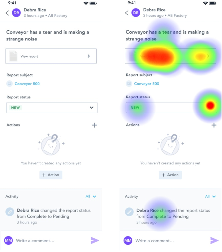
Although most users easily found the report answers and the create action button in both versions, there was a clear consensus that tabs improved navigation and made information much easier to discover.
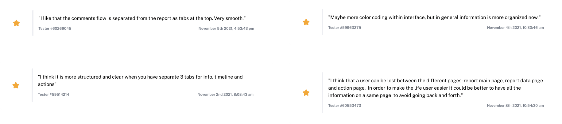
After carefully examining the results, we ran several calls with clients to validate the designs and get their sign-off.
We also held discussions with major stakeholders including the engineering team, implementation specialists, and customer support, gathering as much diverse feedback as possible before moving forward.
The Solution
User testing made one thing clear: people loved the tabs. They made finding actions and comments faster, improved the page's information structure, and users appreciated seeing report answers immediately on landing with no extra clicks needed.
The new report page now has different tabs for different content (tasks, actions and activity) on the report without making users navigate outside of the primary screen.
Report answers
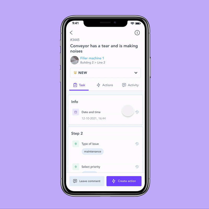
The report answers are now displayed directly on the report page using the new tab layout. As the user scrolls down, the header compacts into a sticky version at the top, giving users more screen space without losing context.
Users can now see the report’s answers as soon as they land on the report page
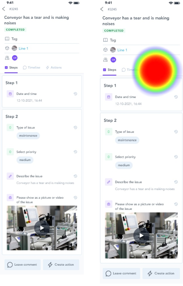
Creating actions
Creating actions is now possible from both the answers tab and the actions tab, making the feature much more visible and independent from the comment section. Clicking "Create Action" opens a sheet rather than a full new screen, keeping users anchored to the report.
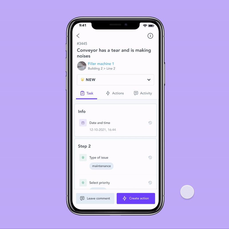
Users can now create actions directly from the main page or from the new actions tab
Report information
Things like report ID, creation date, task type, and contributors, are now accessible via an info icon at the top of the report.
Clicking it opens a sheet with all the details, keeping the main view clean without hiding anything important.
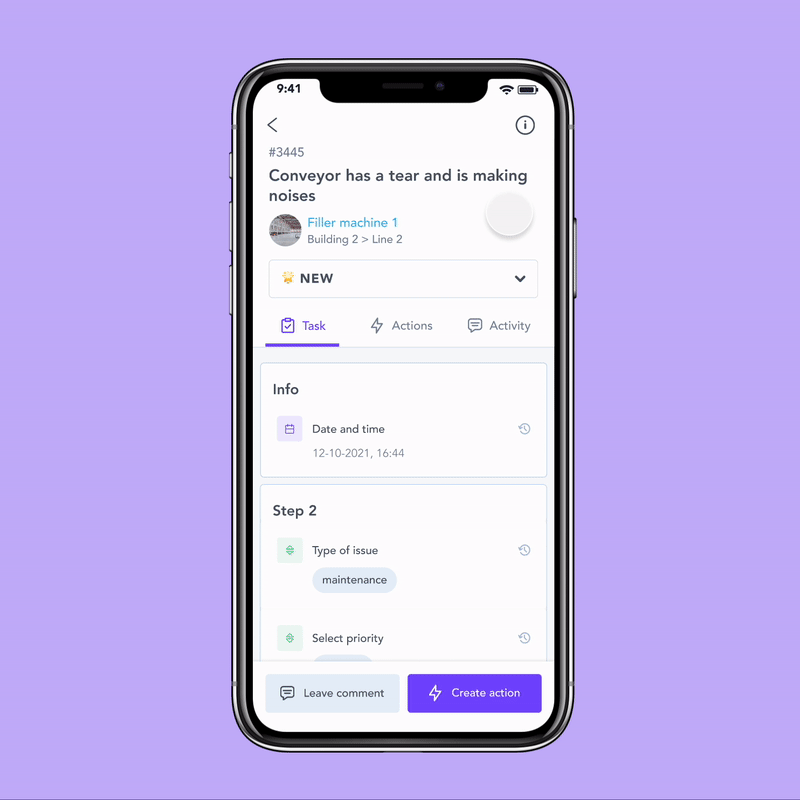
Information that was previously only available on the portal is now also accessible on the app
Impact
The release took longer than planned: urgent fixes kept pulling engineering and design resources, which also meant some metrics weren't clean comparisons, since the client base had grown significantly by the time we shipped the new report page.
The number we cared about most told us what we needed to know: users were spending less time hunting for information. Clearer navigation, answers surfaced on the page, and a structure that finally made sense — it all added up.
+47%
Visitor acquisition
More users finding and reaching the report page.
+24%
Page views
Higher engagement across the board
+86.5%
Account adoption
The vast majority of accounts actively using the report
100%
WCAG 2.1 AA compliance
The report page met accessibility standards for the first time
Metrics for the report page on the app - before and after
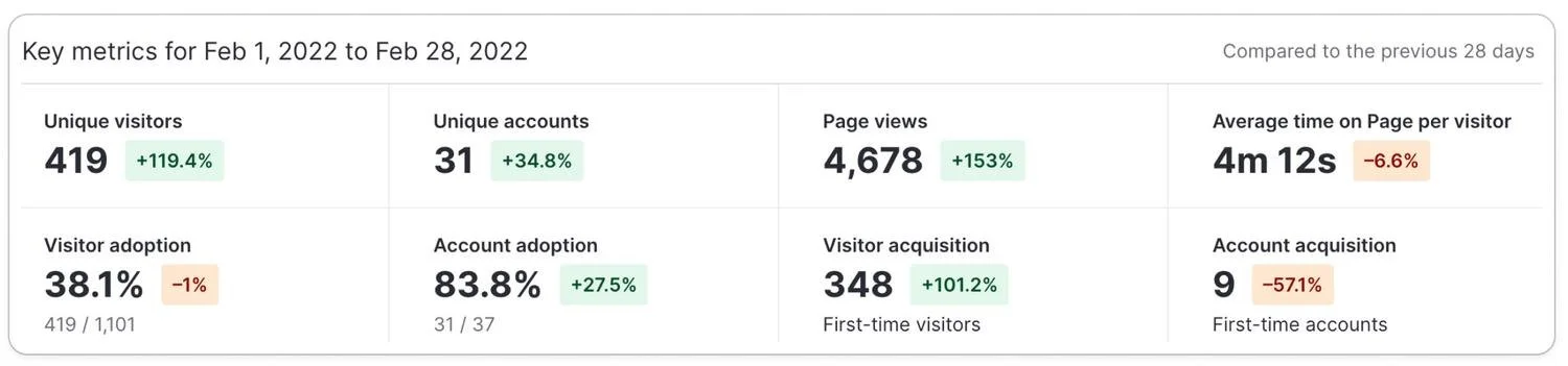
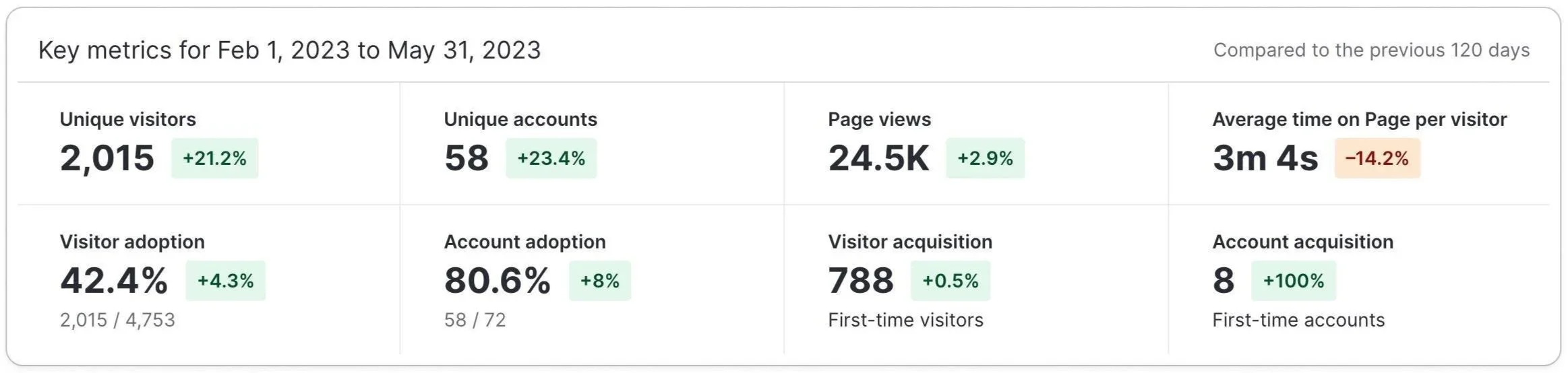
Metrics for the report page on the portal - before and after
The drop in average time on page was the number we were most excited about - users could now find what they were looking for faster.
Report answers are right there on the page, actions have a dedicated space, and the tab structure makes navigation feel natural. Less time spent searching means more time actually doing the work.
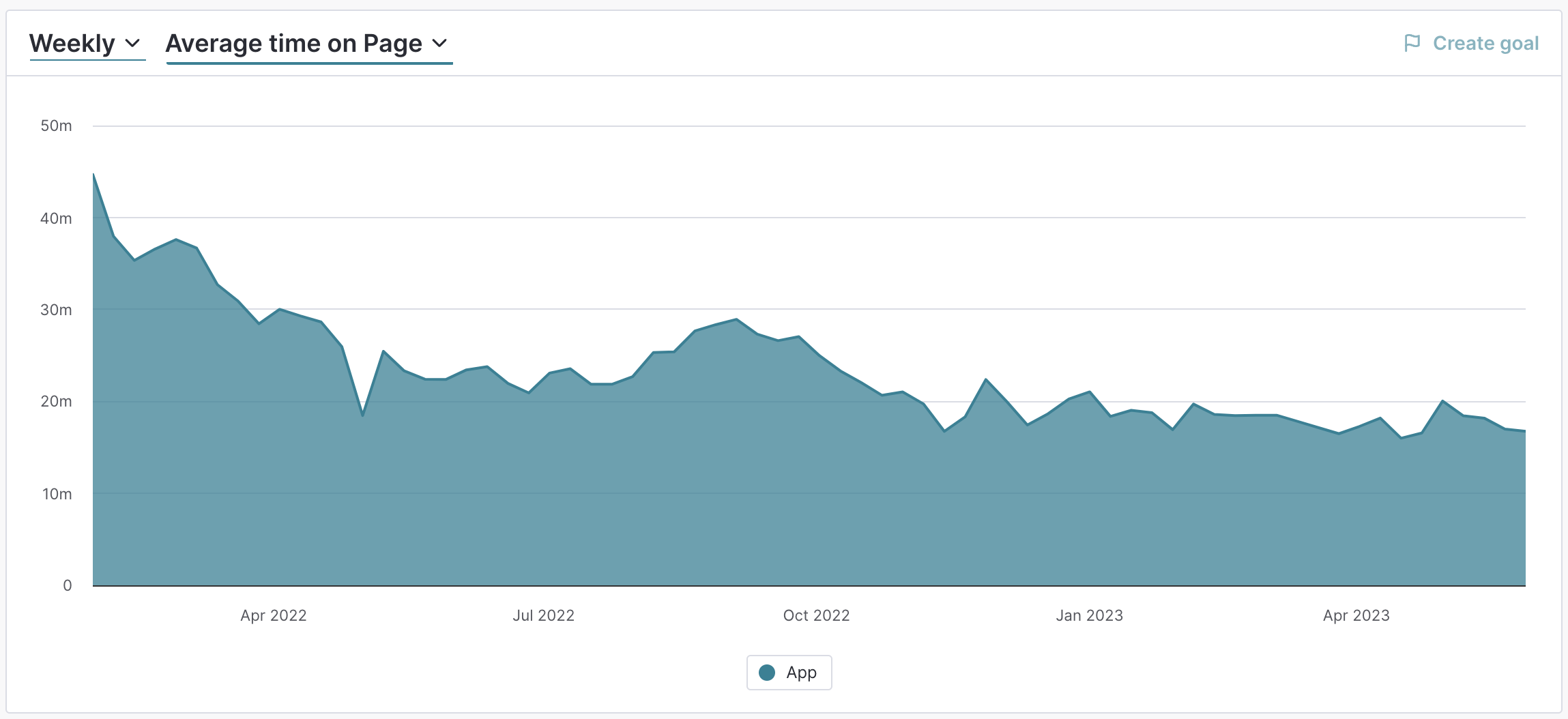
Average time spent on the app’s report page over time
Challenges and learnings
One of the biggest challenges was presenting a large amount of information intuitively: this is a dense, information-heavy page, and getting the hierarchy right took a lot of iteration. We also needed onboarding support from the Customer Success team to help users understand the new layout, since this was such a familiar part of their daily workflow.
Resource allocation was another hurdle. Due to the size of the product team and the volume of more urgent features coming through, this work was put on hold for months at a time which was frustrating, but honestly, the extra time gave us more space for validation and discovery than we'd originally planned for, which had its benefits.
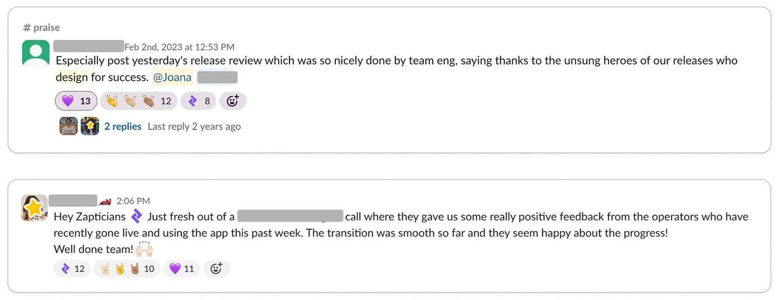
Overall, the feature was a success. The positive feedback we received was a great sign that users were genuinely engaging with and enjoying the new experience, and seeing that drop in time-on-page was a really satisfying way to know the design was doing its job. 🎉