Making Factories Safer with Actions
Role
Lead Designer
UX Researcher
Accessibility Expert
Company
Zaptic
Industry
Manufacturing
SaaS
Platform
iOs
Android
Power BI
100%
Adoption
The new feature was well received across all accounts, leading to full adoption.
£12k
Saved in material waste
Monthly material waste savings from faster, more efficient issue resolution
20+
Minutes saved
Avg. 20-minute time savings per accident
-15%
Safety incidents
Reduced safety incidents through faster defect reporting, improving worker safety
About this project
Zaptic helps deskless factory workers take ownership of their day-to-day work, and a big part of that means making sure safety issues never go unchecked.
One of Zaptic's core features, Actions, allows workers to log issues as follow-ups from safety inspections, but there was an issue: workers had no way to raise an issue on the spot without a report attached. Turns out, that's how most problems get found, not during formal inspections, but mid-shift, during a production run, when something just doesn't look right.
Without a direct way to report these moments, workers started creating dummy reports just to raise an urgent action. The side effects was managers' dashboards filled up with misleading data, issue response times slipped by 22%, and workers were left with no way to track what they'd flagged.
As Zaptic's Lead Designer, I led the research and redesigned the workflow from scratch. I was ✨very excited✨ to work on this project because of its real-life impact and what was at stake.
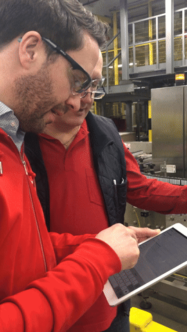
Our team’s factory visit to Henkel in Düsseldorf, where we got the chance to see workers do their job on the shop floor
Our Team
Our lovely team had three product departments: Product, Design, and Engineering, each with a Head reporting to our CTPO. The engineering department was split into two teams, each supported by a PM and Designer. At the time, I was Head of Design.
As the lead on this project, I touched pretty much every part of it, from running client interviews and digging into usage metrics, to defining the solution, prototyping, and making sure everything landed smoothly with engineering. I also worked closely across product, engineering, and our CS team to make sure the decisions we made worked for everyone involved.
That’s me on the top right corner
The Challenge
What are actions?
Zaptic's core functionality allowed factory workers to create Actions, urgent issues that required immediate attention. Originally, they were designed as follow-ups to completed inspection reports, and helped maintain safety and operational standards across across the factory floor.
The issue with Actions was that the feature was originally built on the assumption that all urgent problems came from formal inspections when in reality, a lot of issues got spotted during walkthroughs, casual observations, or team meetings, situations that do not involve reports. One of our key clients was the first to flag that there was simply no way to raise a safety concern without “pretending” it came from an inspection first.
“I can see defective products coming off the line, but can’t log them until I’ve pretended to inspect the floor. By then, we’ve wasted thousands in materials.”
The Dummy Report Workaround Issue
To address urgent safety concerns, workers had no choice but to generate meaningless "dummy reports" as a workaround. This inefficient process forced busy factory staff to navigate through five unnecessary screens just to report a simple hazard.
Even after jumping through these hoops, the original reporters had no way to track whether their submitted actions were being addressed, creating a black hole of accountability where safety issues disappeared without resolution.
This lack of visibility delayed responses by 22% according to plant audits, and left managers sifting through fake reports to find real problems.
These dummy reports also flooded management dashboards with irrelevant data, burying critical safety information and transforming a technical limitation into an operational bottleneck that compromised both efficiency and safety response times.
Here’s a real life example:
During a production run at one of our client's factories, operators noticed inconsistent filling levels, a potential quality defect requiring immediate inspection. The workers had to take the following steps:
File a generic “Cleaning/audit” form unrelated to the actual defect
→
Submit the form and generate a dummy report
→
Assignees receive a notification but there's no centralised tracking for action creator
Create a new "Check Filler Machine" action attached to the dummy report
→
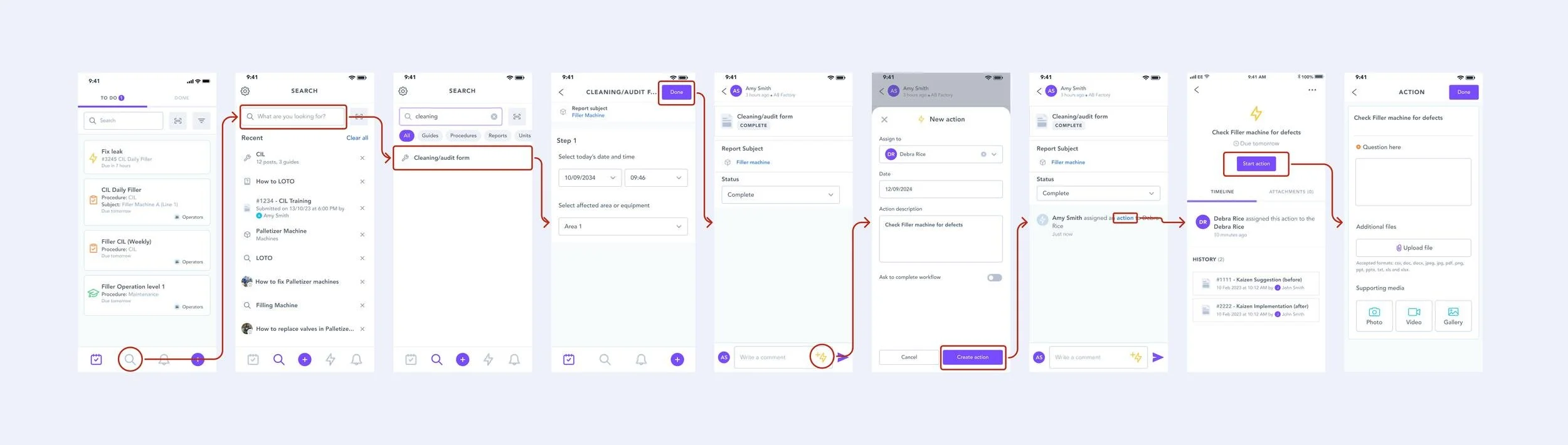
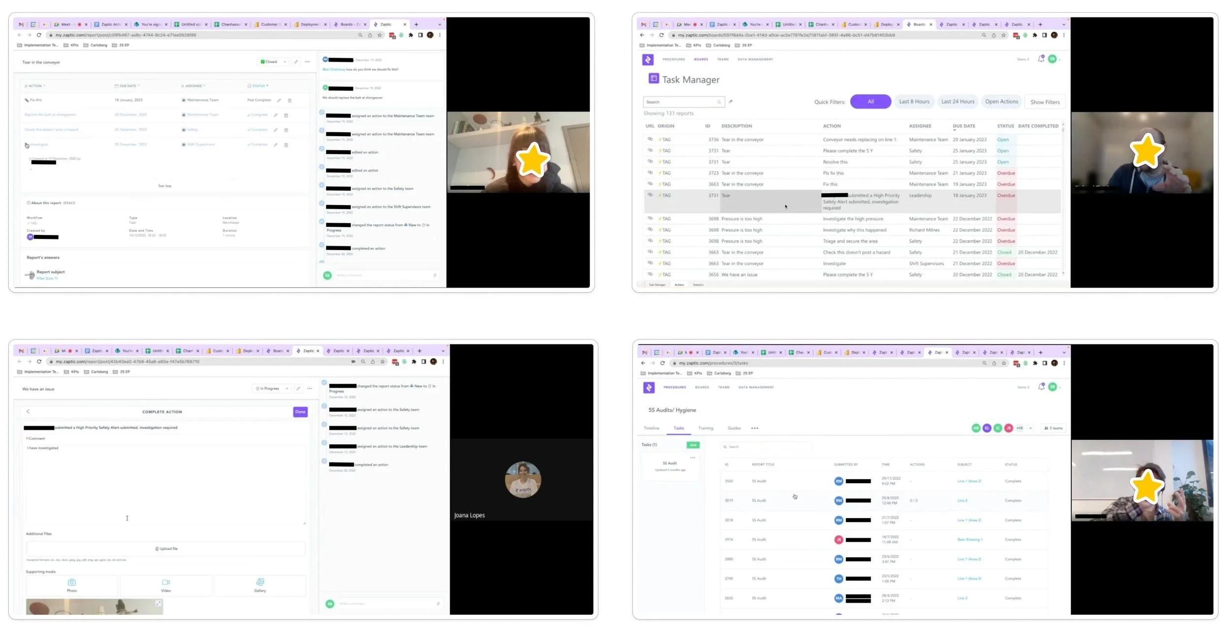
This is an example of a creation of a follow-up action created from a report.
The Consequences of this process were 22 minutes lost per incident on average, 0% visibility into action status after assignment, creation of dummy reports that clogged management boards and a risk of producing defective batches of product.
No overview visibility
Another critical issue was the lack of visibility for shop floor workers, who only had access to the mobile app. Power BI boards with comprehensive action information existed, but were limited to managers, effectively excluding the people closest to the problems from managing them.
As a workaround, line managers displayed these boards on screens on the factory floor so actions could be tracked in real time. But portal access remained restricted to managers only, leaving operators with no way to manage a comprehensive list of their own actions.
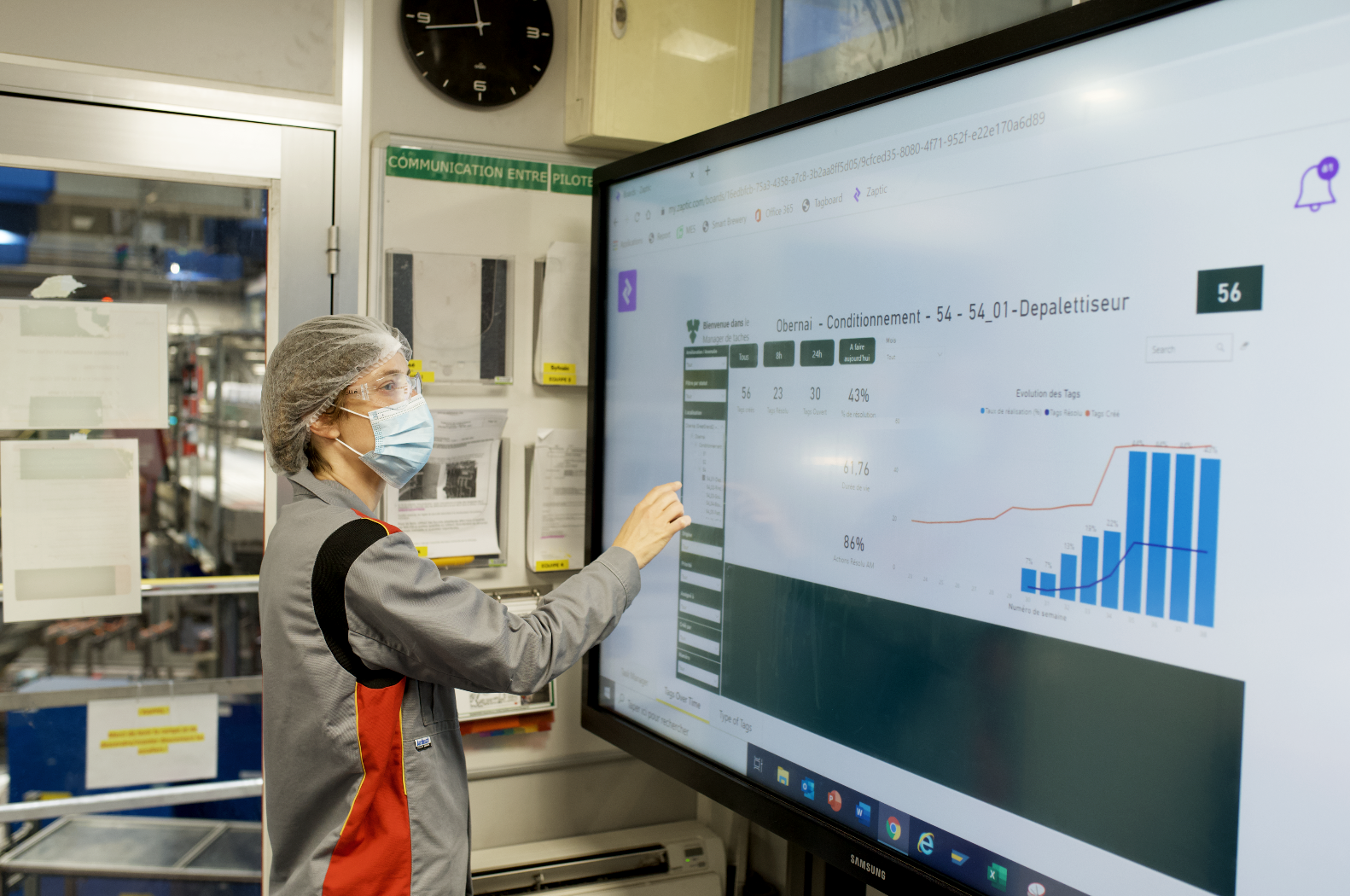
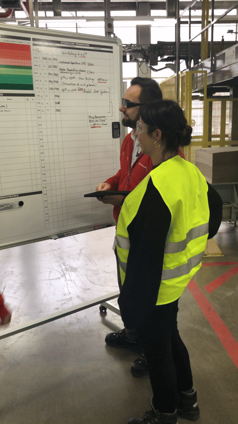
One of the managers at Carlsberg was kind enough to show us one of the Power BI boards they use to track actions during our visit to their factory
Project Timeline
Discovery
1-2 weeks
The discovery process involved client interviews, discussions with the CS team, and analysis of usage metrics.
Design + Handoff
2 weeks
This phase included defining scope with product and engineering, conducting usability testing, obtaining final client approval, and writing the design spec.
Development
3-4 weeks
Once handoff was complete, the engineering team took ownership of the development process.
QA
2-3 days
The QA phase, managed by QA and Design teams, focused on testing and implementing design and bug fixes.
Production
2-3 weeks
Finally, the production phase encompassed creating the QA release note, monitoring success metrics, and drafting design improvements.
User Personas
Operators
Operators are the main mobile app users. Decoupling actions from reports streamlines their workflow by eliminating the need to create a report first.
They care about quickly creating actions, assigning them to themselves or others to ensure tasks are completed efficiently.
Safety/Compliance
Following protocols while minimising process friction
Biggest Challenge
Creating urgent actions mid-task without disruption
Primary Focus
Speed and simplicity
Line Managers
Line Managers needed real-time visibility of all actions, especially open ones, to maintain smooth and safe factory operations.
Their priority was tracking operator-completed actions and monitoring pending items.
Safety/Compliance
Auditable action trails for regulatory compliance
Biggest Challenge
Identifying critical actions among hundreds of daily task
Primary Focus
Visibility and accountability
Discovery
Field trip to Obernai 🇫🇷
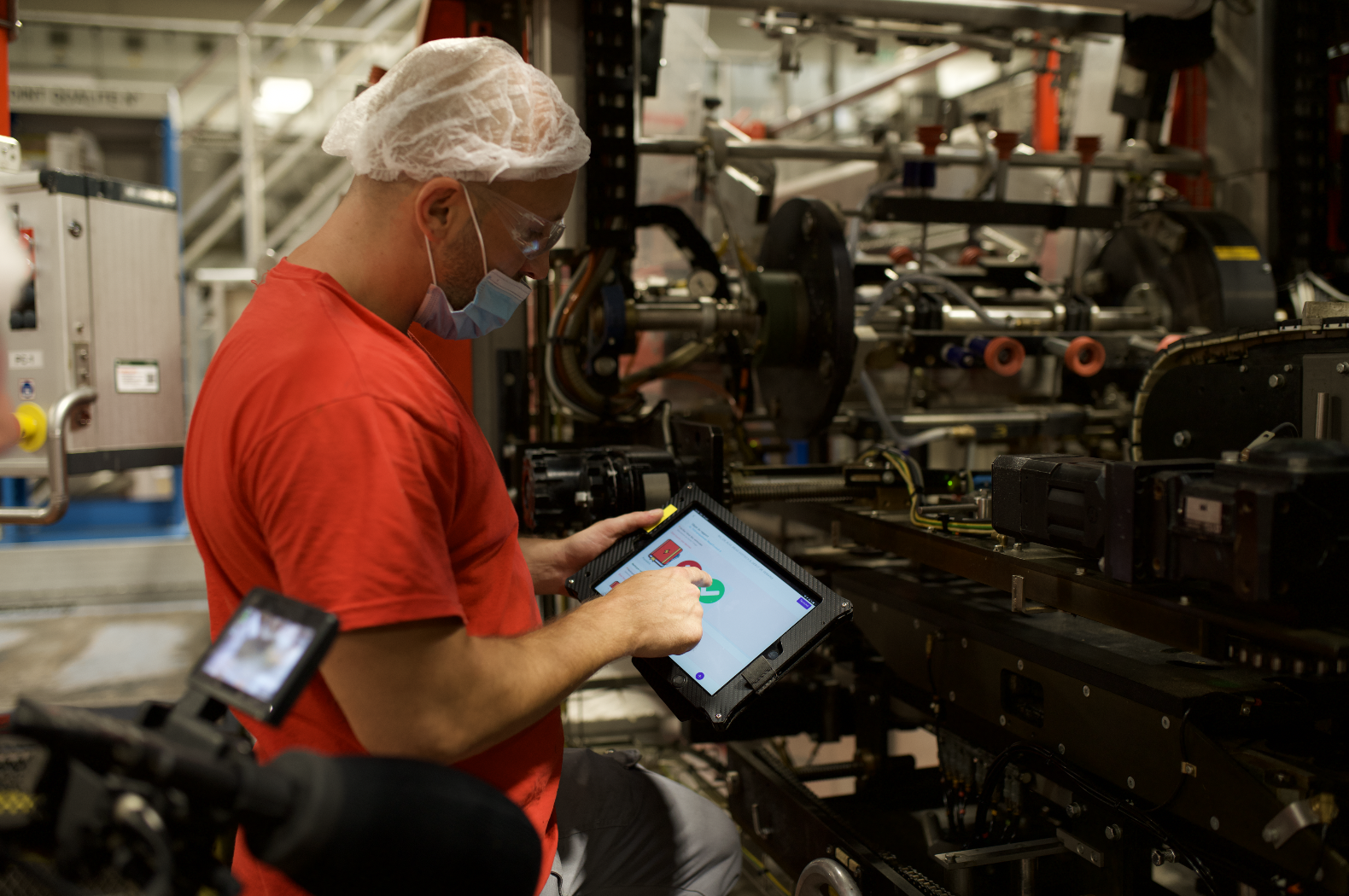
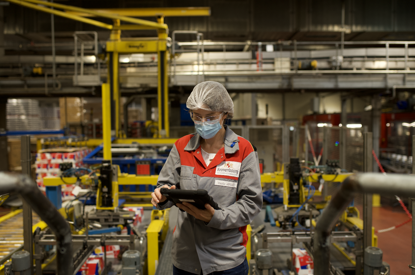
This was one of those rare projects where we had the chance to do real field work and speak directly and shadow factory workers to understand how they used the app.
We spent two days in Obernai, France at Kronenbourg, one of Carlsberg's factories, speaking to both shop floor workers and managers, which gave us a solid understanding of their day-to-day responsibilities and roles.
This visit was crucial for understanding how we could improve actions for them.
It was also just really lovely to have face-to-face discovery for once, something that doesn't happen nearly often enough. And we also had some beers after 🍻
Behind the scenes of our visit - we used this opportunity to learn more but also to film a case study which was also very fun. That’s me in yellow 🌝
Client & Internal Discovery
Though we were lucky to be able to talk to users face-to-face, I also spoke with other clients to better understand the challenges of creating actions from reports from others perspectives. The goal was to gather as much information as we could to have the best overview possible of everyone’s challenges.
We collaborated closely with our Customer Success team, who worked directly with our clients, and held several discovery calls and brainstorming sessions to support us.
Censoring my lovely clients’ and colleagues' names and faces to protect their anonymity.
Usage Analytics
I analysed usage metrics in Pendo to understand how often and in what ways users were creating actions, focusing on the number of visitors to the actions page and the user paths taken to create an action.
These insights revealed that users were following overly complex journeys to create actions, either by generating a new report first or navigating through multiple steps in the to-do list just to reach the action creation page.
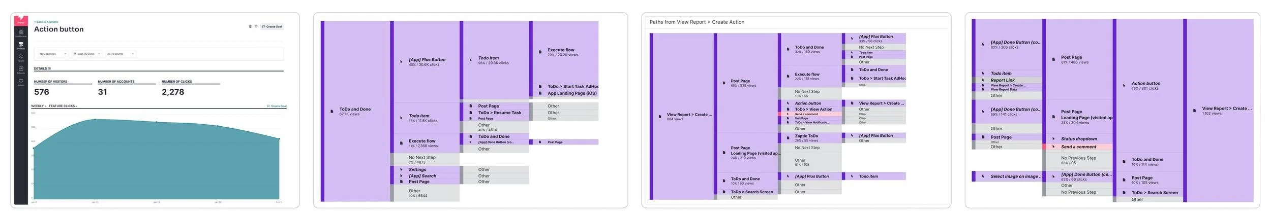
Pendo metrics on number of visitors on the page and paths taken by users to create actions.
Journey Mapping
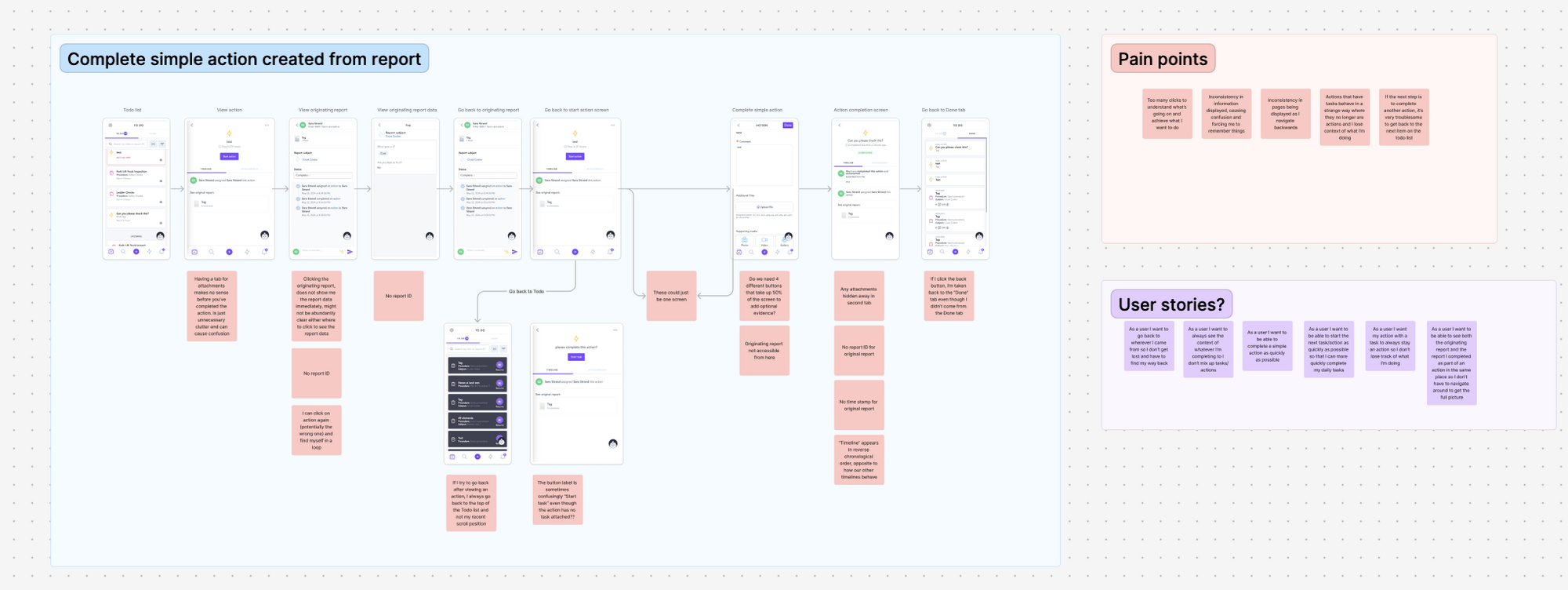
To visualise these friction points, I mapped out the full user journey. This helped us identify key pain points and clarify the user stories that needed addressing.
The user journey mapping helps us visualize the number of screens users navigate and identify the pain points we're addressing.
CSD Matrix Session
I also led a CSD Matrix session with the product, engineering, and CS teams where we laid out everything we knew, assumed, and needed to find out about the feature, surfacing several critical pain points from the user journey mapping.
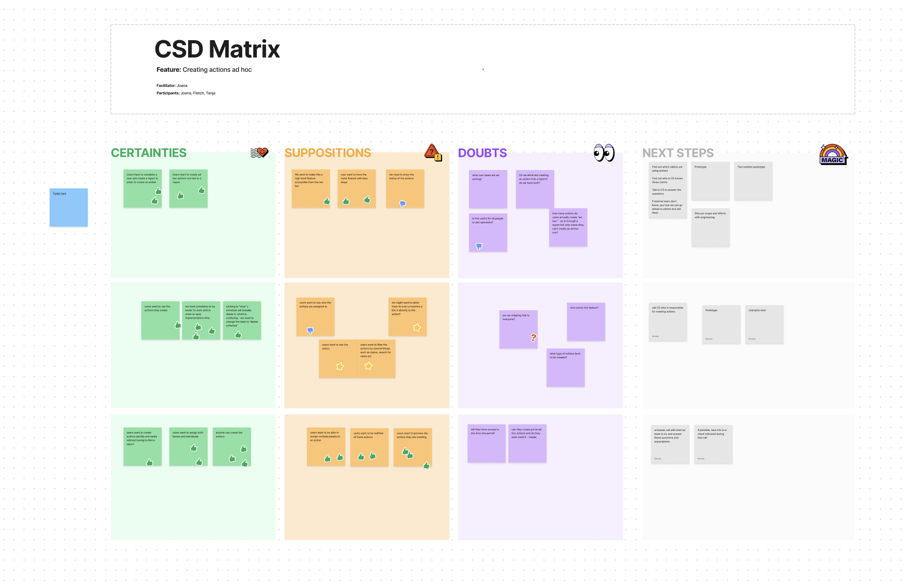
I do love a good CSD Matrix.
Hypothesis Validation
Before wireframing, we had another session with the CS team to validate our hypotheses and address outstanding questions, ensuring our design direction was grounded in real user needs.
Censoring my lovely colleagues' names and faces to protect their anonymity, again. :)
Wireframing
During the discovery and wireframing process, the following was considered:
Should we move the actions icon from the comment bar on the report? If moved, how would users still create actions linked to reports without losing key functionality?
Could Power BI boards serve non-workflow actions? This could help managers, but wouldn't improve accessibility for operators using the mobile app.
Should actions be shown on user pages or procedures? This would increase visibility for managers but not for shop floor workers who don't use the portal.
Where do we show actions that are not related to workflows? We explored locations like the procedure timeline, the to-do list, or introducing a new dedicated page for actions.

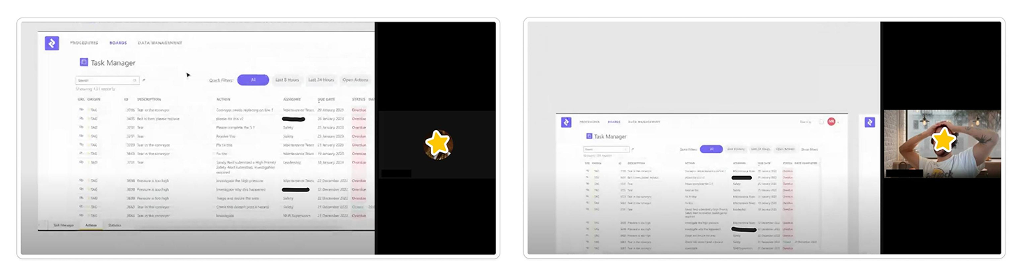
Usability Testing & Validation
Despite the pressure to ship quickly, I prioritised validating our hypothesis by running internal testing and client sessions. I created quick prototypes and tested them in live sessions with colleagues from various departments and a small group of clients who had voiced frustrations with the current process.
What was tested:
How easily users could find and use the new Actions button in the bottom navigation
Whether the form felt intuitive, especially since it mirrored the familiar report-based action form
Every participant found the new button easy to locate and the overall process far more intuitive. They were also very excited about the prospect of a dedicated Actions page, which made it easier to track actions and their statuses, strongly validating our core assumption.
Final Validation
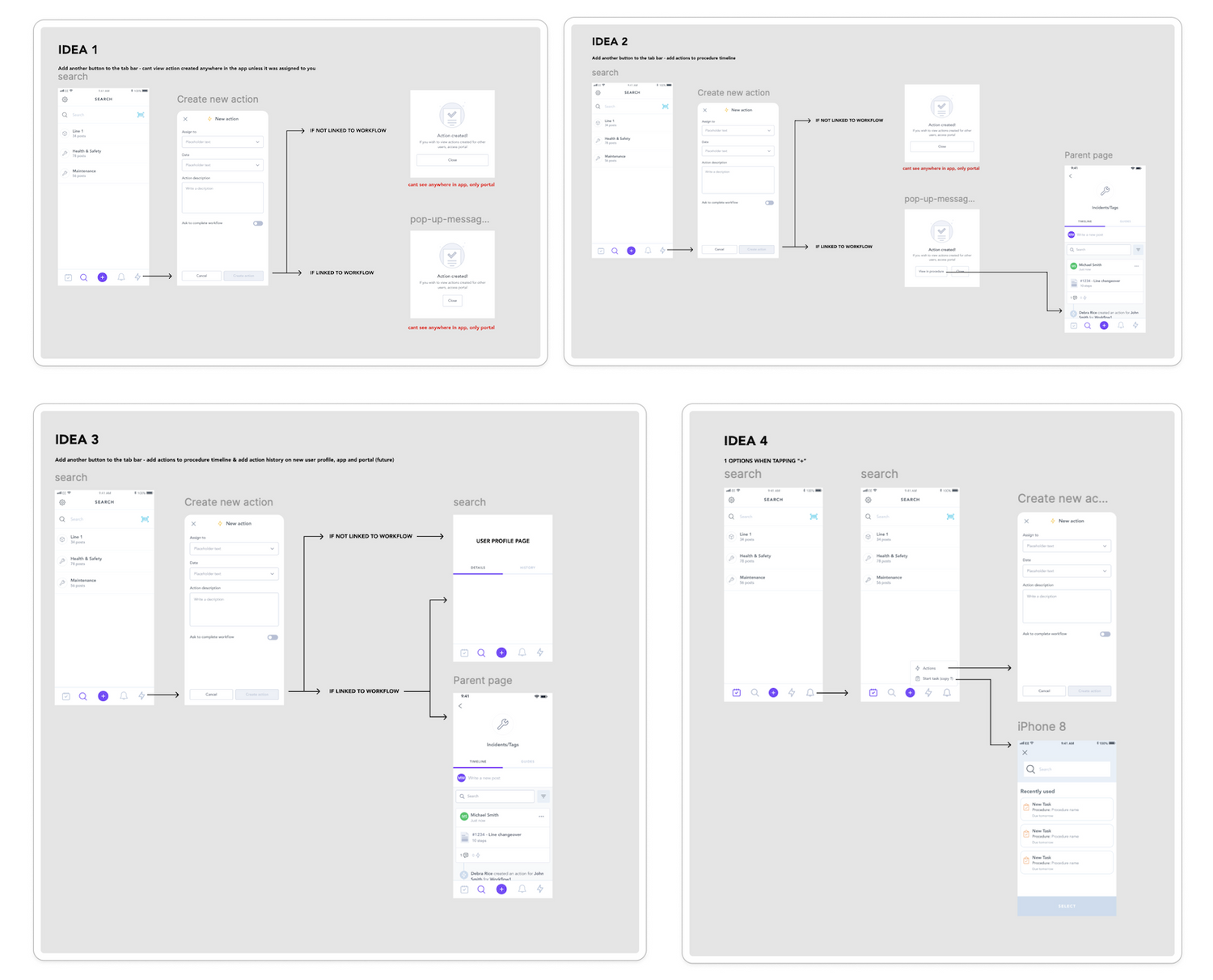
The different options proposed in our usability testing exercise.
To further de-risk the approach, we ran another round of validation with our Customer Success team to ensure all known client concerns were being addressed.
We also had a more technical call with Engineering to confirm scope, manage trade-offs, and ensure we could deliver the MVP within the client's requested timeline.
Censoring my lovely colleagues' names and faces to protect their anonymity, once again. :)
The Solution
For Operators
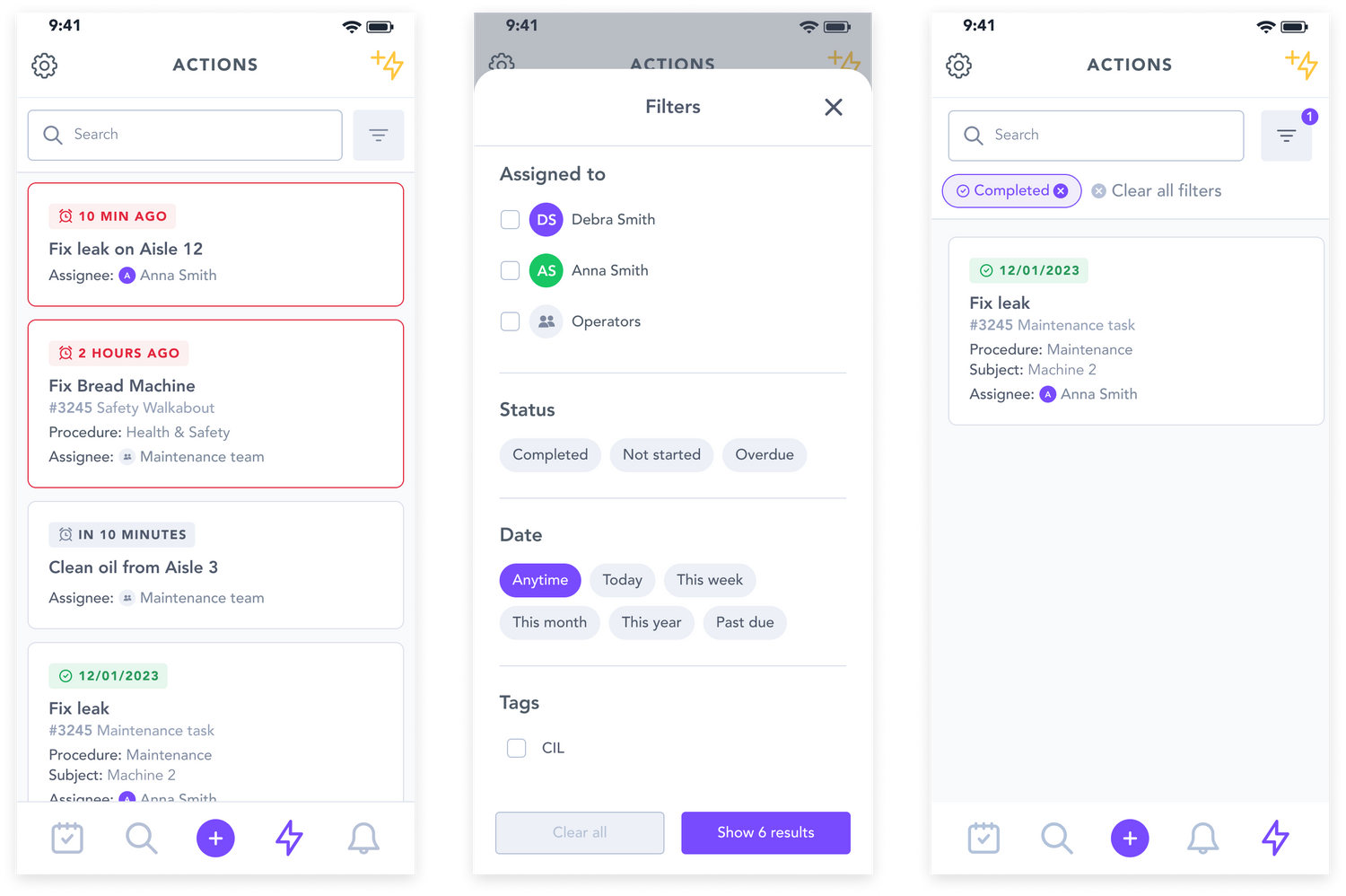
A New Dedicated Actions Page
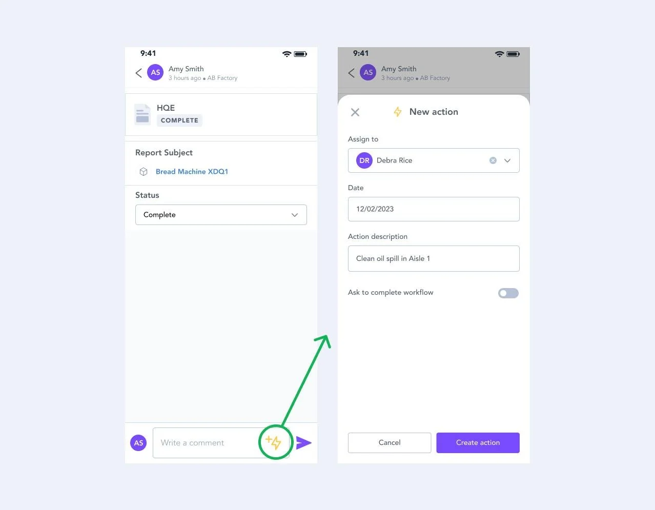
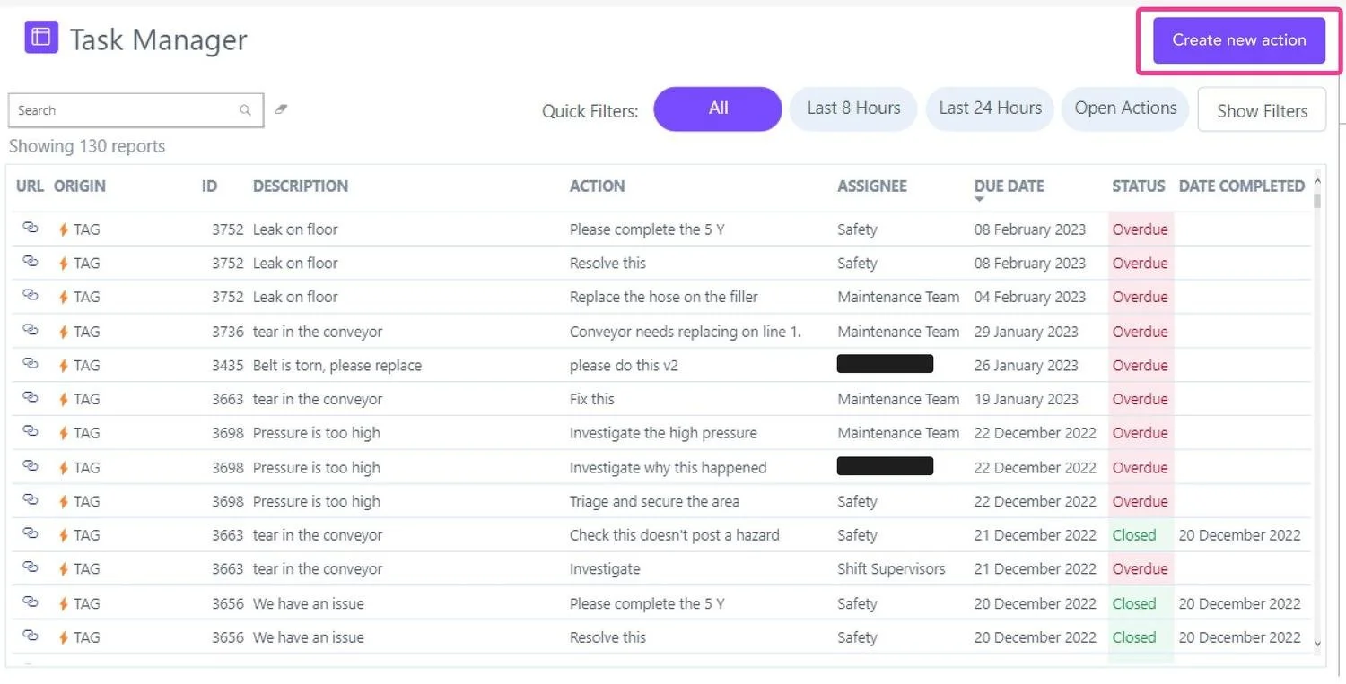
The solution was to introduce a new "Actions" page on the bottom navigation bar, accessible at all times. This ensures users can quickly navigate to the Actions page regardless of where they are in the app.
This new page also has a "Create Action" button which users are already familiar with, since it's identical to the one on the reports page. This consistency in design and functionality helps maintain a cohesive user experience.
The new Actions page and the action creation form now allow users to create ad hoc actions.
The creation of this page enables users to see all actions for the first time, which became crucial with the introduction of actions not linked to reports. Users can now view the statuses of their actions, helping them manage pending, upcoming, and overdue actions more effectively. By presenting this information in an accessible format, users can better plan their workload, allocate resources, and ensure timely completion of assigned tasks.
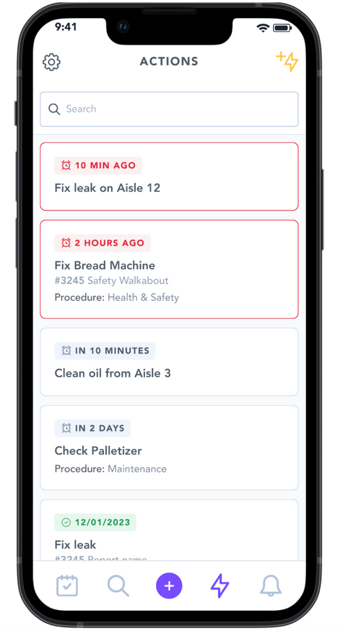
Users can now view all the actions they've created, along with their current status.
For Line Managers
Portal Access
While the primary focus was empowering operators, we also ensured managers using the web portal could create ad hoc actions. Power BI boards already displayed all site actions, so we simply:
Added a "Create New Action" button to the top of the board
Maintained a consistent look and feel across mobile and web interfaces
This allowed both operators and managers to create and manage actions efficiently, regardless of their platform.
Managers can now also create ad hoc actions from the power BI boards on the portal.
Impact
This project’s goal was to create a seamless, sustainable, and scalable platform that merged buying and selling whilst reinforcing Loopi's commitment to circular fashion and community. My focus became:
100%
Adoption
The new feature was well received across all accounts, leading to full adoption.
+12k
Saved in material waste
Monthly material waste savings from faster, more efficient issue resolution
20+
Minutes saved
Avg. 20-minute time savings per accident
-15%
Safety incidents
Reduced safety incidents through faster defect reporting, improving worker safety
-91.5%
Dummy Reports
The creation of dummy reports dramatically decreased
Behaviour Shift
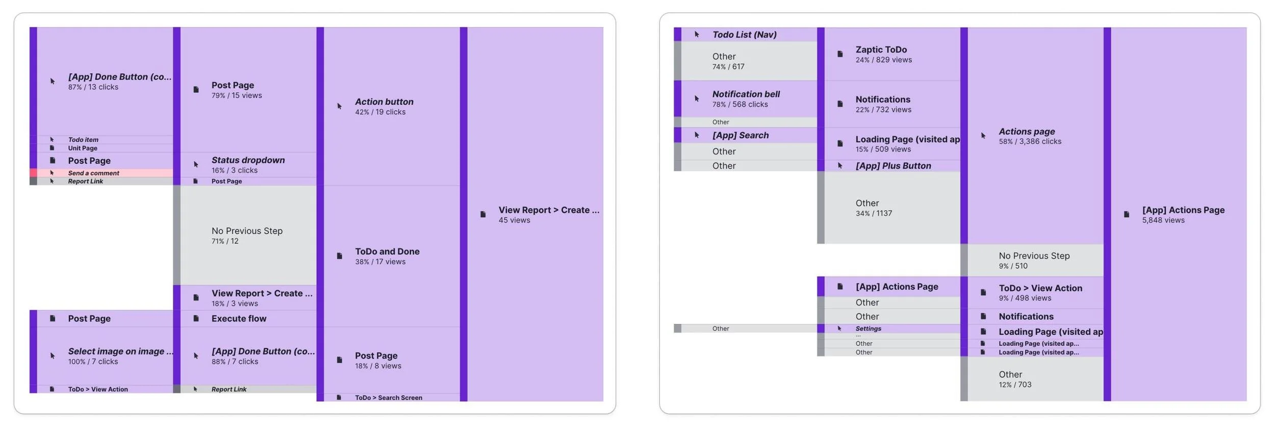
The new "Actions" page successfully reshaped user behaviour, becoming the primary method for both creating and managing actions and eliminating 100% of dummy reports. While some users still initiate actions through reports, this now represents a small minority, validating the need for a dedicated page.
Action Creation: The majority now originate from the new Actions page
Action Management & Overview: Frequent use for tracking past actions
User Path Shift: Reports are no longer the primary method for action creation
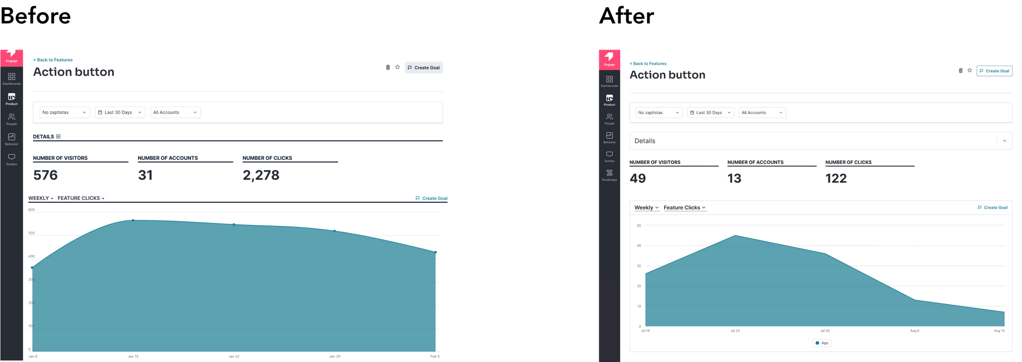
Since implementation, the number of visitors and clicks on the actions in report pages has drastically reduced which supported the fact that users did need a more efficient way to create actions.
On the left, you can see the current path and page views for actions on reports. On the right side, you can see the corresponding information for the actions page.
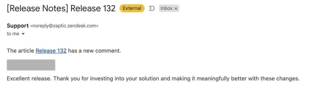
Client & Internal Feedback
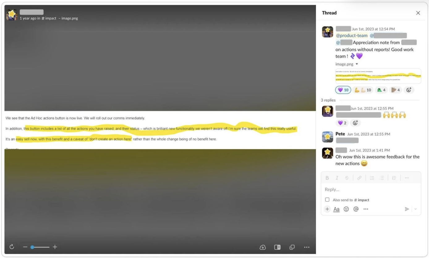
The feedback from our clients was very positive, showing great engagement. We don't always hear back from clients, so this response told us they were really satisfied with the solution we delivered.
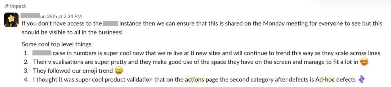
We also received a lot of positive feedback internally with team members sharing results in Slack, celebrating metric milestones, and colleagues across the business requesting access to see the results for themselves.
Challenges & Learnings
We hit a few bumps along the way: Power BI limitations affected the portal experience for managers, and tight deadlines meant features like filters and assignee details had to be pushed to a future phase. But I honestly had a blast working on this! 💖
What started as "hey, let's just add a button!" turned into something much more exciting, giving factory workers tools and visibility previously only available to managers. Here's what made this project special for me:
We questioned everything: We kept asking "why?" until we found solutions that made sense for everyone.
We balanced speed with quality: Shipping quickly couldn't come at the expense of creating yet another clunky workaround.
Our Customer Success team was amazing: Their direct line to users kept every decision grounded in what actually mattered on the factory floor.
In the end, the most rewarding part was seeing how our design gave factory workers more control over their daily work. It wasn't just about making a digital version of paperwork, it was about making people's jobs better!
Some of the feature we had to deprioritise such as filters and overview of assigned users.