Rebranding Sustainability
Role
Lead Designer
UX Researcher
Company
Go Thrift/Loopi
Platform
Website
Industry
E-commerce/B2C
+200%
Increase in page views and on-site activity
Users now engage more deeply with the platform
+60%
Growth in organic search traffic
SEO efforts and improved discoverability were working
+28%
Boost in conversion rates
The new streamlined experience has reduced friction and abandonment
100%
WCAG 2.1 AA compliance
Every component meets accessibility standards, with improved contrast, focus states, touch targets, and semantic structure to support all users, including screen reader users.
About this project
Loopi (formerly Go Thrift) is a second-hand fashion marketplace committed to sustainability and circularity.
I joined as their first and only designer with only 3 months on the clock, two founders with opposing visions, and a platform that needed rebuilding from the ground up. There was no design system, no processes, no handoff standards, and no shared direction on where the product was going.
My job wasn't just to design but also to figure out what good design even looked like in the business, how to establish the foundations for it, and then actually deliver a fully redesigned platform.
Sounds exciting? Absolutely. Stressful? Also yes!

Me at the beginning of this project
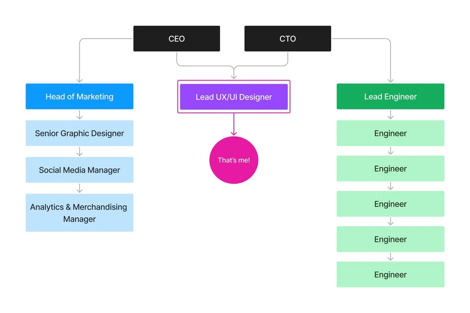
Team Structure
I worked closely with our CEO and CTO to ensure business alignment and established cross-team collaboration with the marketing and engineering teams.
A few weeks after I joined, Amie, our Senior Graphic Designer and my design pal, came on board and although we focused on different areas, it was great to have another designer to exchange ideas and collaborate with.
The Challenge
Go Thrift had solid values and great intentions but their website experience was fragmented and had major issues that were holding them back:
Split experiences
Buying and selling lived on separate platforms, creating friction and discouraging users from engaging with both sides.
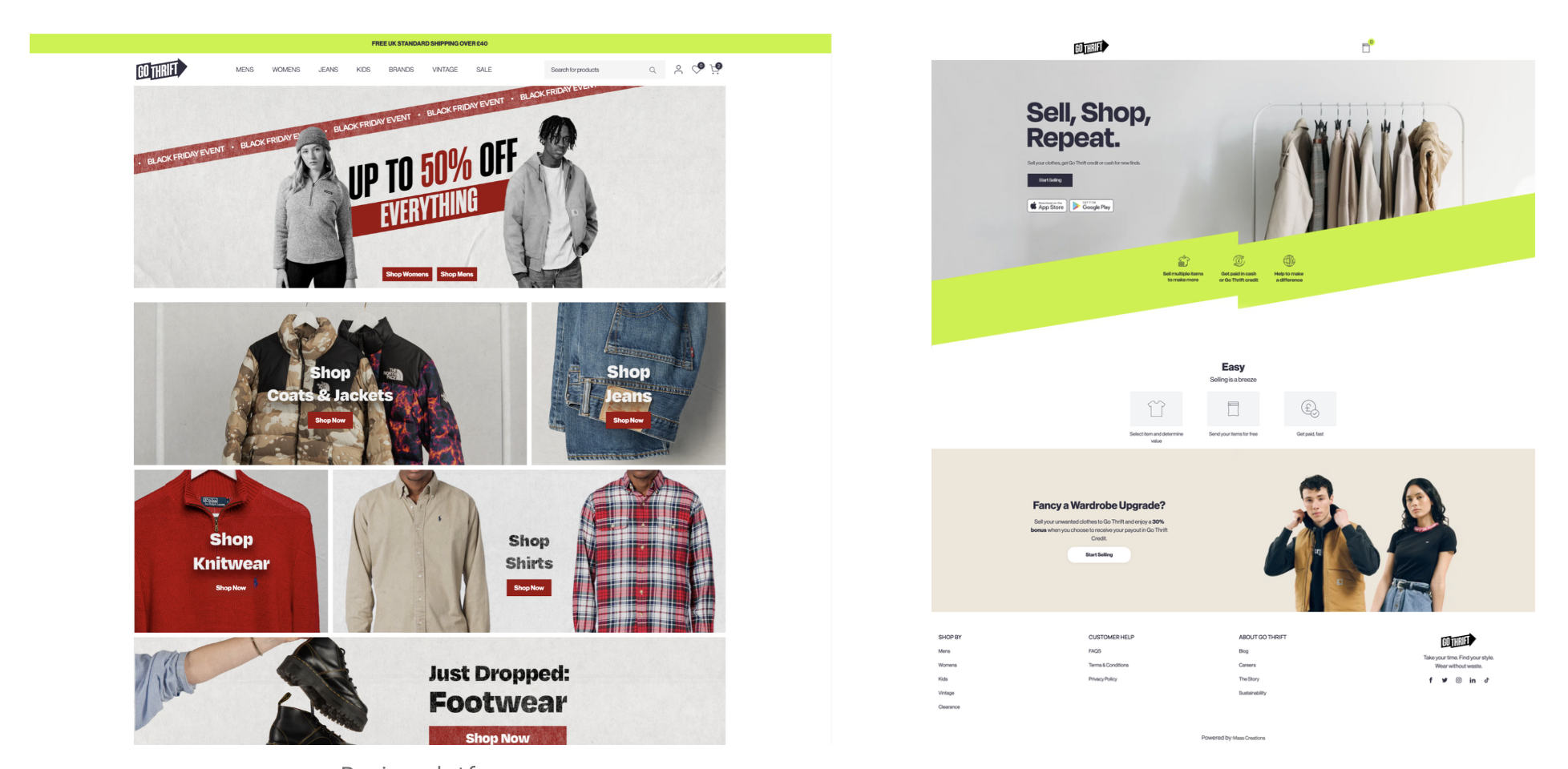
Selling and Buying platforms
Chaotic navigation
Poor categorisation, non-dynamic filters, clunky search, and confusing layouts led to high abandonment rates.
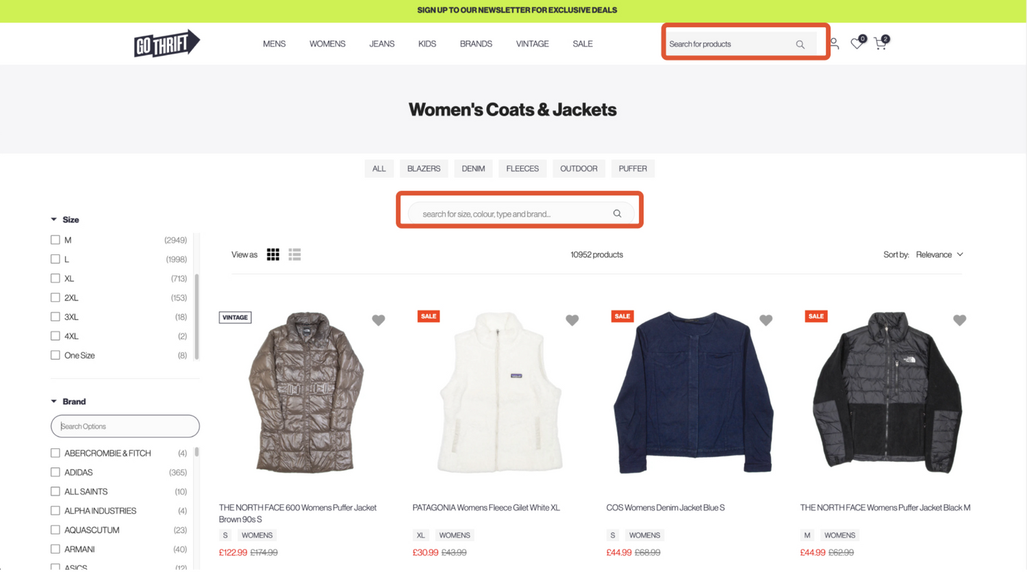
The search options were confusing and the filtering system broken
Weak Branding
The design struggled to stand out in a very competitive market or communicate sustainability, despite this being a core value for their community.
Go Thrifts’ brand was flat and pretty forgettable
Limited Scalability
The platform was exclusively focused on clothing with no room to expand into other categories.
The constraints were equally challenging:
We had a tiny team with minimal resources
We only had basic Google Analytics data available
We had just 3 months from start to launch
The Goal
This project’s goal was to create a seamless, sustainable, and scalable platform that merged buying and selling whilst reinforcing Loopi's commitment to circular fashion and community. My focus became:
1
Unite the experience
Merge the buying and selling websites into one cohesive platform that encouraged users to engage with both sides
2
Improve the navigation
Streamline the navigation, search, and filtering to help users find what they need more efficiently - which is crucial for second-hand shopping
3
Sustainability + Inclusivity
Embed sustainability and accessibility throughout the journey, not as afterthoughts but as fundamental design principles
4
Make it scalable
Establish a scalable foundation and design system that could expand beyond clothing into new product categories
Beyond the product
Besides the focus on the product product itself, I had to establish the entire design foundation in the company by building workflows between design, product, marketing, and engineering, introducing the team to UI/UX principles, and setting up tools to track metrics and collaborate properly. No biggie ☠️
Getting the team on board
To kickstart the process, I organised meetings with the engineering team to share my previous experiences working cross-team and implementing design systems (like Zaptic's) and asked how they'd like to collaborate.
Since they had no prior experience with design systems or working with an in-house designer, they were happy to follow my suggestions.
We gradually introduced new processes and tools, making sure everyone felt comfortable with the workflows.
The feedback was overwhelmingly positive: proper design processes meant better collaboration, clearer communication, and stronger documentation. The engineers particularly loved Figma's Dev Mode (as do I 🤓).


Figma
For me and for the engineering team (who'd only worked with Adobe XD hand-offs before).
Notion
For tracking components, their statuses, relevant links, and assigned engineers.


Claude
For helping me analyse data and synthesise user feedback quickly, which freed up time for design decisions and validation.
Supernova
For design system documentation, tokens, and code connection with engineering.
Regular design reviews and usability testing
With stakeholders, internal teams, and external testers for continuous alignment and feedback.
Content Square
For behaviour analytics, heatmaps, and session recordings to understand how users actually interacted with the platform.
Discovery
Aligning the founders
First things first, I had to resolve something fundamental: the two founders had genuinely conflicting views on how the platform should work, particularly around the selling experience, and both were letting personal preference guide decisions rather than user needs.
Without alignment, any design work would have been built on unstable ground, and we'd have wasted time and resources we simply didn't have.
We had a lot of these but it was ultimately worth it
The Data
Our Google Analytics revealed three distinct user groups with different motivations:
Senior professionals (late 30s–50s): Value-driven, focused on quality and practicality
Millennials (late 20s–late 30s): Trend-aware, tech-savvy, driven by sustainability and ethics
Gen Z (students and young professionals): Price-conscious, deal-hunting via apps and social platforms
My initial assumption was that our users would be mostly Gen Z and Millennials: turns out I was wrong. This was a solid reminder of why data matters and why working from assumptions is risky.
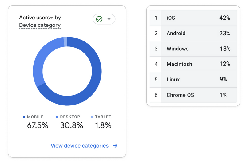
The device data showed a clear preference for mobile with iOS and Android dominating, reinforcing the need to prioritise mobile optimisation.
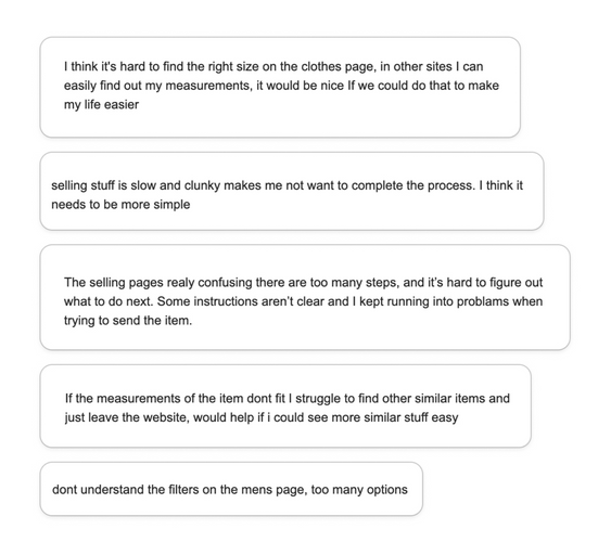
User Feedback
The analytics showed me what was happening, but I felt like I also needed user feedback to understand why to design a product that actually worked.
I sent feedback requests to some of our top users via email and the responses confirmed our assumptions:
The selling flow was confusing and complex
Navigation and filters blocked users from finding relevant products
The product detail page lacked clear information hierarchy
The second-hand marketplace
As an avid second-hand lurker (and shopper 🤭) I was already familiar with several platforms such as Vinted, ThredUp, and Vestiaire Collective, but I decided to dig deeper into their user journeys and features to understand what made them stand out in the market. Here’s what I found:
Clear visual hierarchy
ell-organised product pages with prominent CTAs, unlike Go Thrift's cluttered layouts
Dynamic filtering
Most platforms adapted to show relevant results instead of Go Thrift's static filters that created dead ends.
Photo-taking + Image recognition
ThredUp, Vinted and others auto-filled item details instead of requiring manual entry like Go Thrift.
Seamless cross-selling
Platforms with buying and selling integrated both seamlessly, with most offering smart notifications for price drops and new matches.
AI-powered search + Recommendations
Most platforms offered personalised suggestions, saved searches, size preferences, and related suggestions.
Before jumping to designing and solutionising, I decided to facilitate alignment and went back to the data so I could reframe the conversation around what users actually needed. Helping two founders see the product through the eyes of the user wasn't easy and took time we could have spent designing, but it was probably the most important work on the entire project.
Once aligned, I started digging into the data and user feedback to validate assumptions and challenge any ideas where necessary.
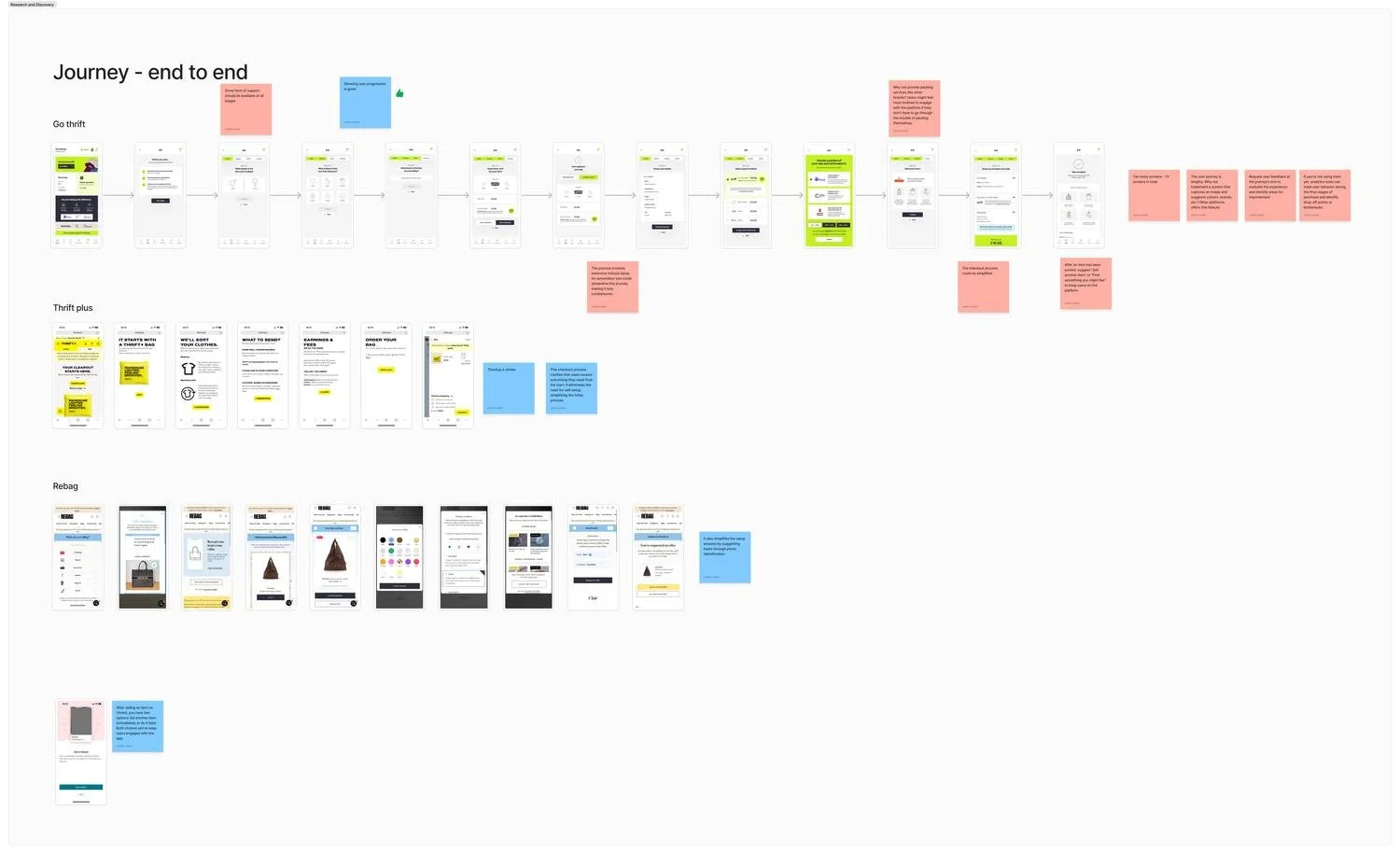
User journey mapping of Go Thrift and some of their top competitors
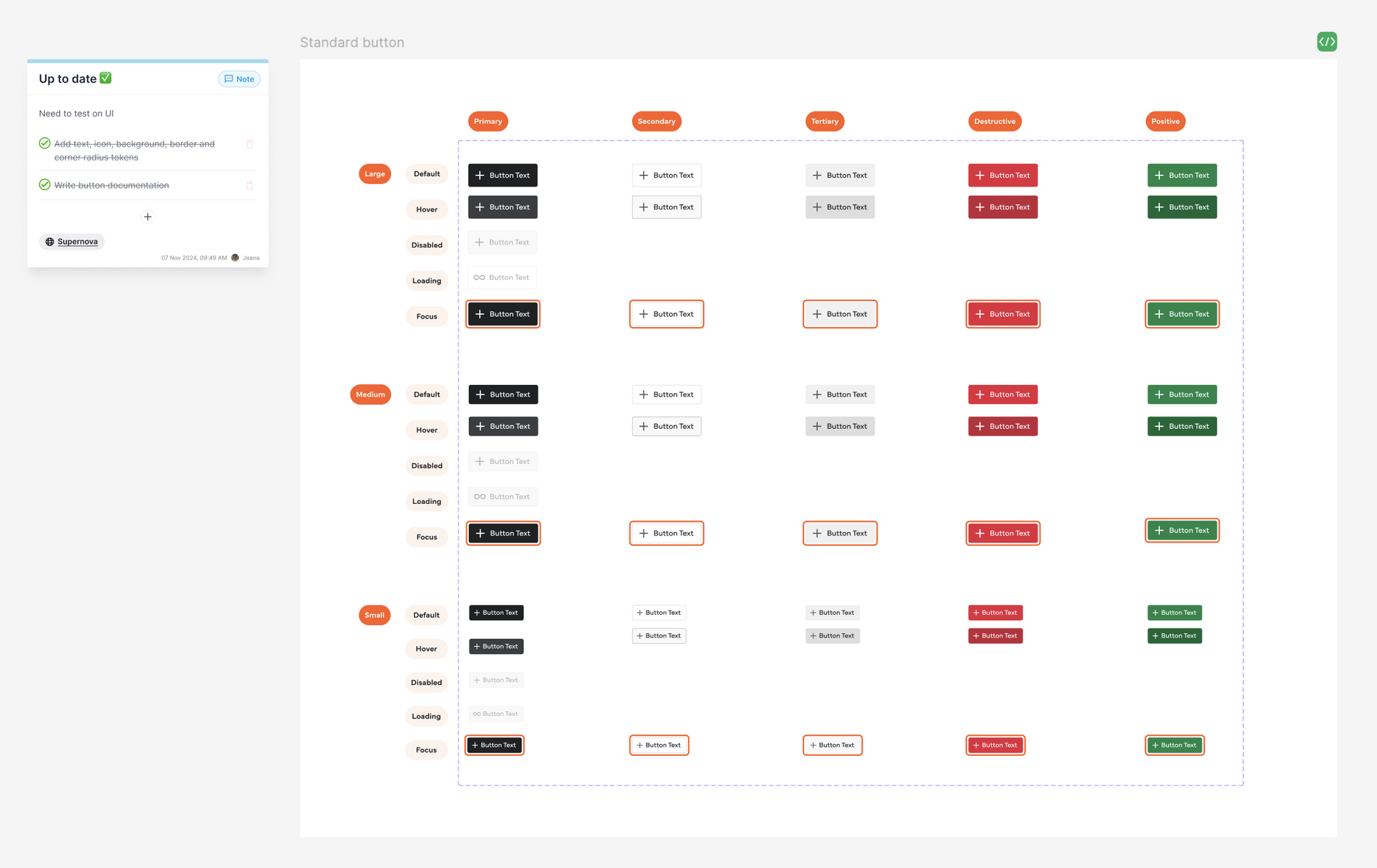
The Design System
Building the design system was one of the first things I tackled, which isn't the conventional order I do things, normally you'd do discovery, wireframes, and visual exploration first, then build the system, but this project had three constraints that made doing it early the right call.
Working alone on a 3 month deadline, rebuilding from scratch a system afterwards simply wasn't an option for this project. Early foundations kept engineering unblocked and the rebranding decisions our Graphic Designer worked on alongside the website could evolve quickly — without it, both would have been a mess.
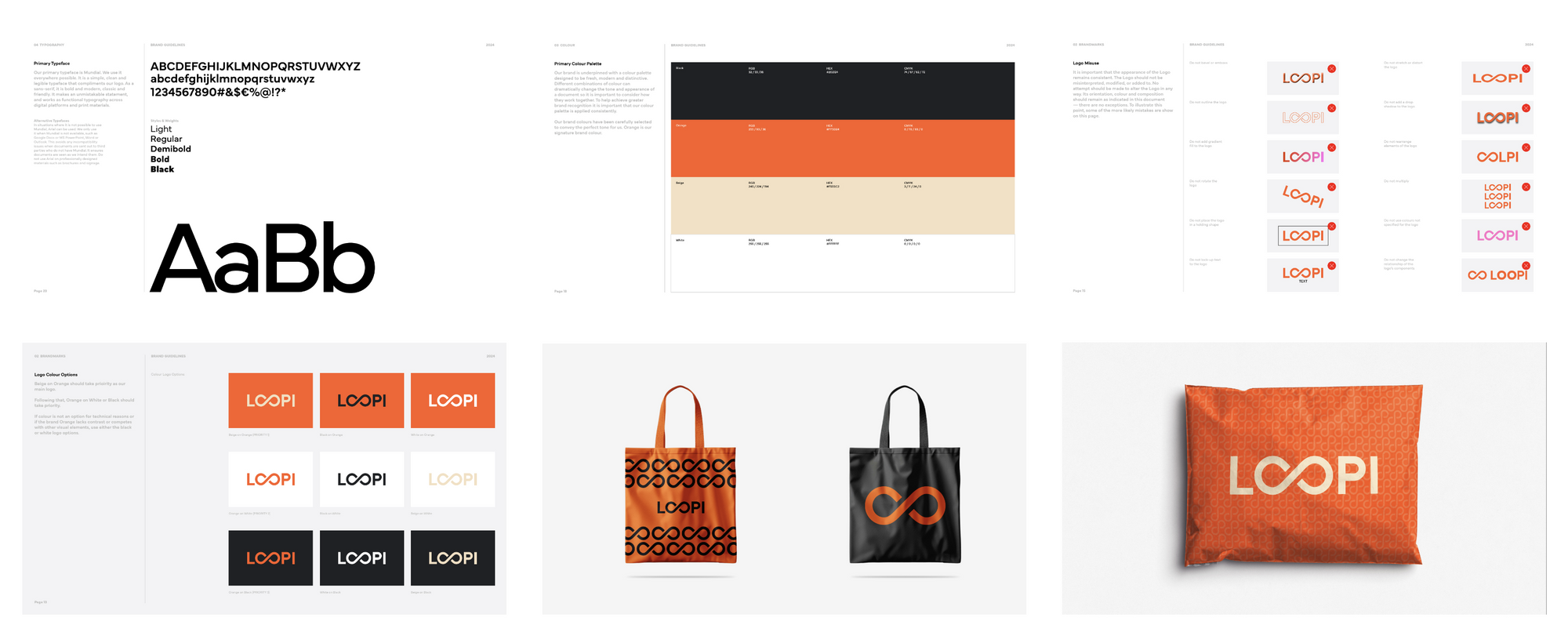
The initial brand guidelines, which were designed by an external studio before I joined, covered logo and colours but lacked UI/UX considerations.
Visual accessibility
Given our tight timeline, I had to be ruthless about what to build first. I prioritised components that were blocking engineering: if the team couldn't build without it, it came first, everything else was documented as a future phase.
I started with the colour palette which expanded the existing brand colours for WCAG AA accessibility compliance.
I also had to make deliberate decisions about when to use orange (our primary colour) sparingly to avoid confusion with warning states.
From there I built outwards: buttons, inputs, dropdowns, cards, navigation, and the other foundational components that everything else would be built from.
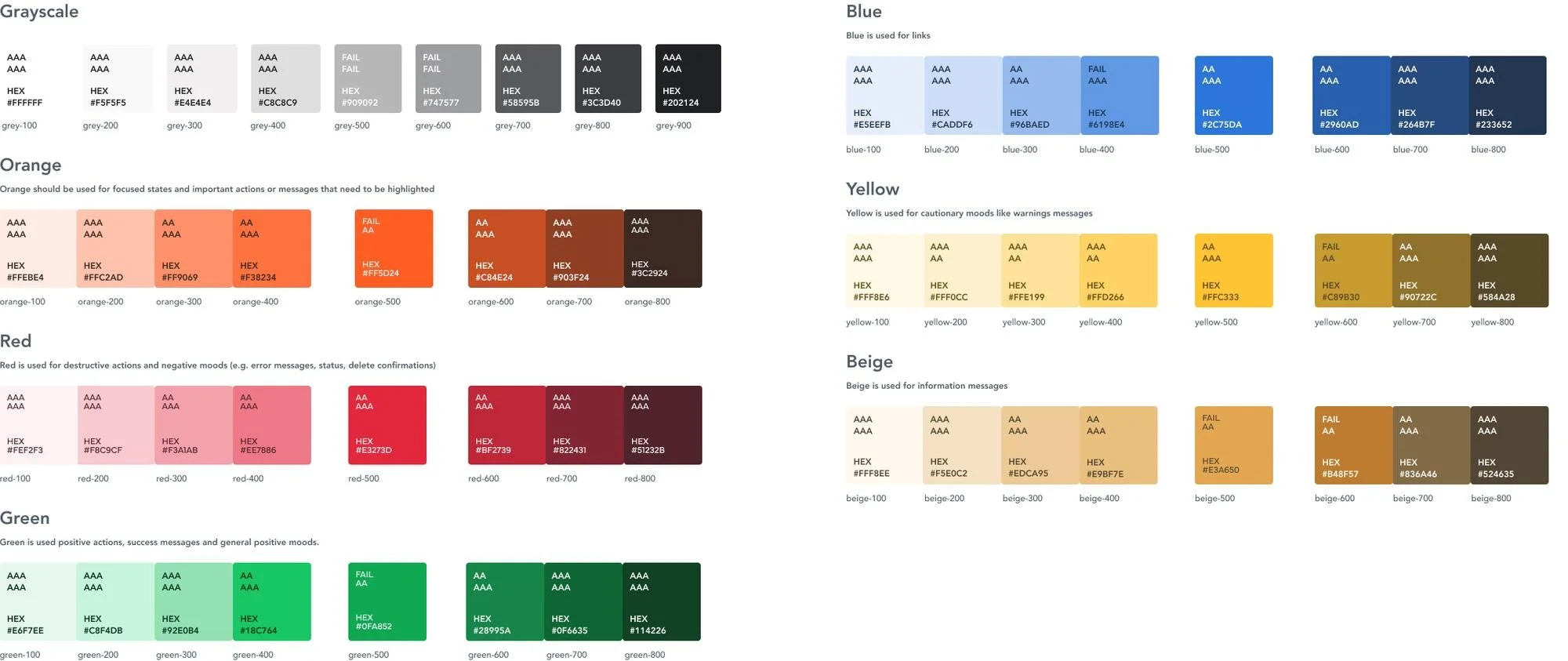
This was the final colour palette I chose after a lot of research and accessibility testing
Interaction and content accessibility
Accessibility was built in at component level from the start, not added later. Every component had focus states for keyboard navigation, logical tab order, proper touch target sizing on mobile, and clear visual hierarchy to avoid overwhelming users. I also ensured heading structure worked for screen readers and that alt text was in place across all images.
By launch we had 50 components, which made building screens significantly faster than it would have been otherwise. When changes came out of testing, having a component library meant updates could be done quickly and efficiently rather than having to fix the same thing across dozens of screens manually.
An example of how I organised the components
Maintenance and tracking
I managed the component backlog personally, tracking status and documentation in Notion and connecting everything to code via Supernova so engineering had a single source of truth.
Handoff was done through Figma annotations and written specs, with documentation links attached to each component.
I also held regular catch-ups with the engineering team throughout - they'd never worked with an in-house designer before so this was extra important. I introduced the process gradually, showed them how Dev Mode worked, and framed everything in terms of what it meant for them: fewer revision cycles, clearer specs, less back and forth.
Their feedback was that it fundamentally changed how they worked, and that they were really happy to finally work in a collaborative environment.
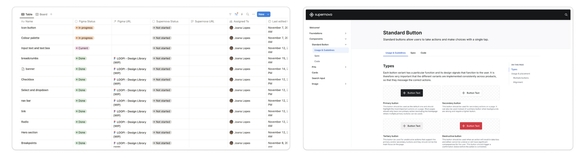
The Notion and Supernova pages... that one day will hopefully all be labeled “Done”!
The Solution ✨
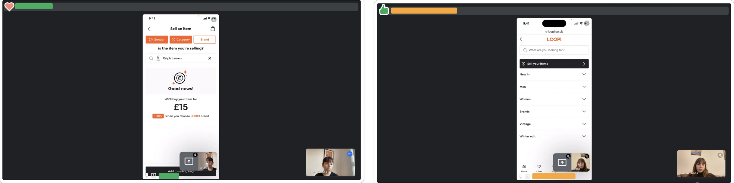
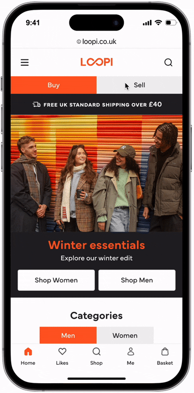
1 - Unified Navigation
So… how could I fix the buying and selling issue, specially on mobile where the screen space is very limited? I explored three navigation approaches:
A dynamic button that changed based on which section you were in,
Hiding "Sell" under a menu (which risked burying an important feature)
Adding buy/sell tabs at the top
After testing internally and with some of our top users, the buy/sell tabs options won: the feedback was that they made switching between sections intuitive whilst creating a cohesive, unified platform feel.
I gave users the option to navigate via tabs, the bottom nav home icon, or the menu list. Both buy and sell pages also feature bottom banners for cross-navigation.
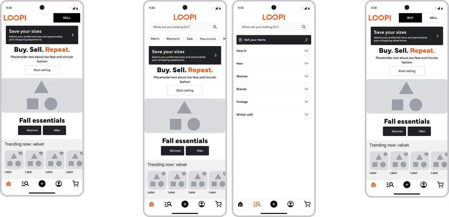
The three options I explored for the buy/sell sides
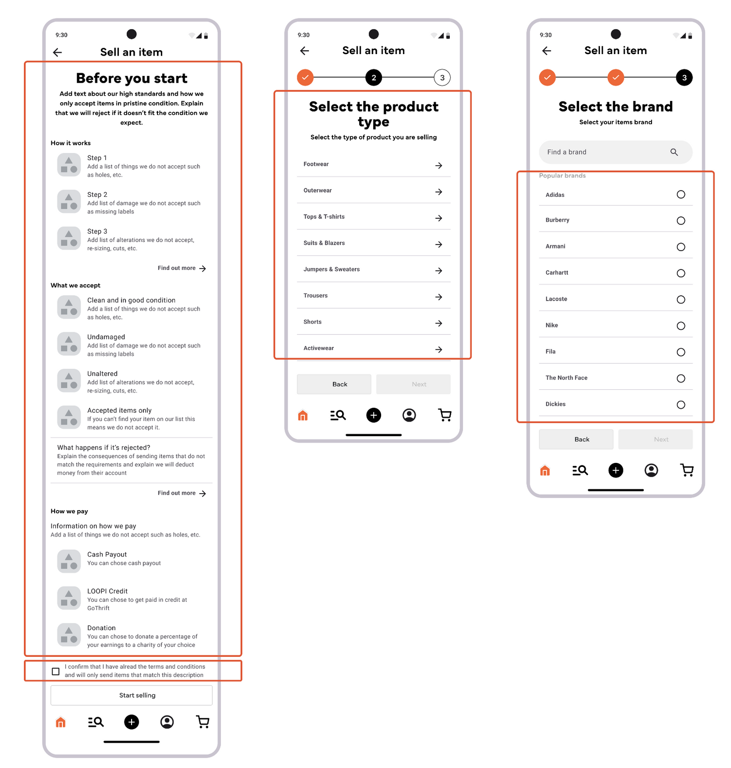
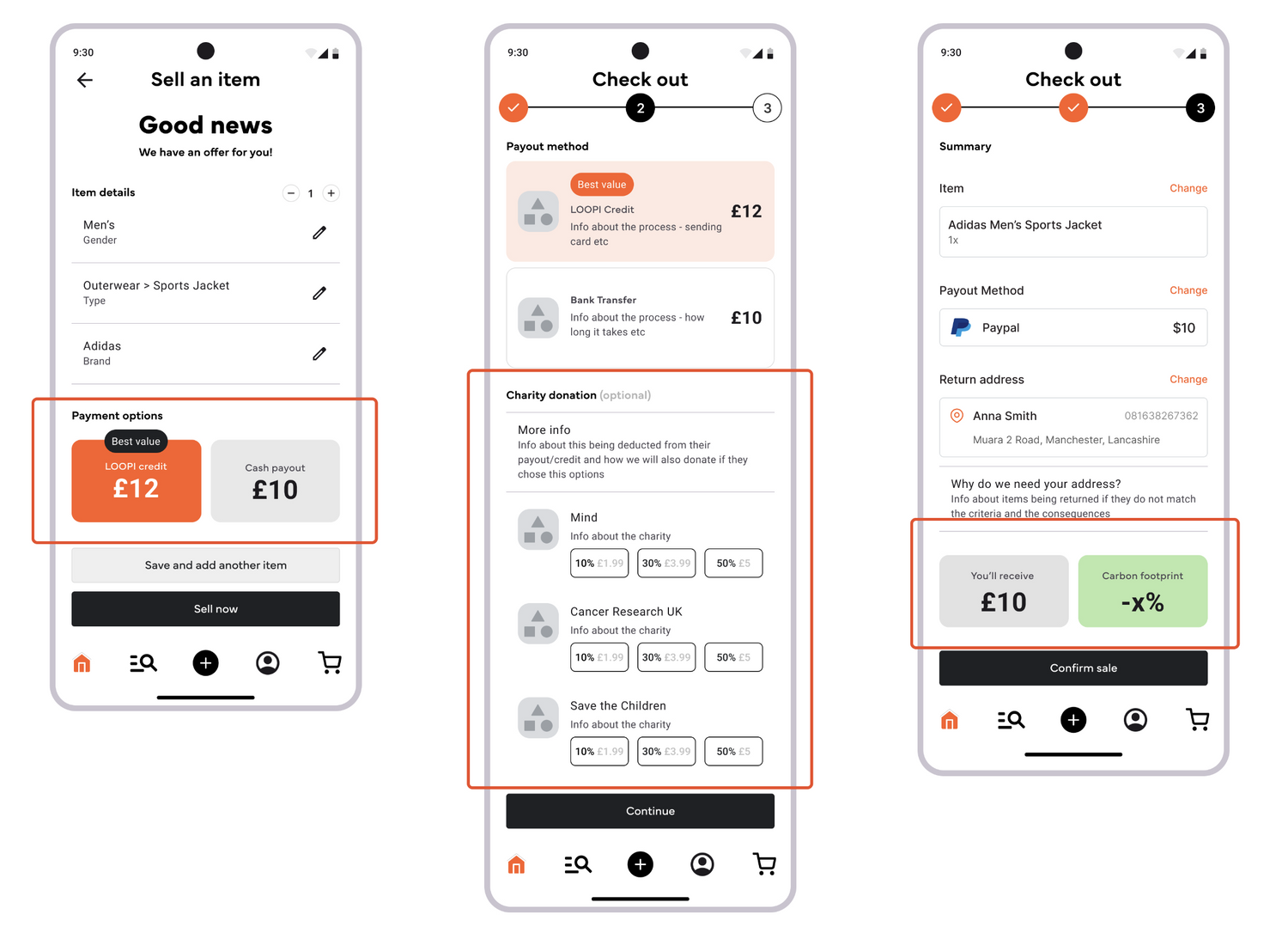
2 - Streamlined Selling Flow
The original selling flow was long, cumbersome, and had a high drop-off rate.
Photo-taking would've undermined Go Thrift's fast and accessible listing principle (no photography required) and their pricing system, which relied on manual brand/gender/item selections to generate offers. Rebuilding that logic in the time frame we had wasn't feasible, so I focused on optimising every other step:
Replaced clunky category modals with clean, navigable lists and added popular brand suggestions with disclaimers about accepted brands.
Redesigned gender selection with inclusive imagery (added unisex option for future).
Added environmental impact messaging throughout, showing users the CO2 saved and water conserved by selling their items, making sustainability tangible and rewarding
Simplified the offer screen to prioritise price, split payout and donation steps for clarity, and fixed the price summary to the bottom for better visibility
Accessibility win: Category icons were reintroduced after testing showed they improved clarity and reduced hesitation.
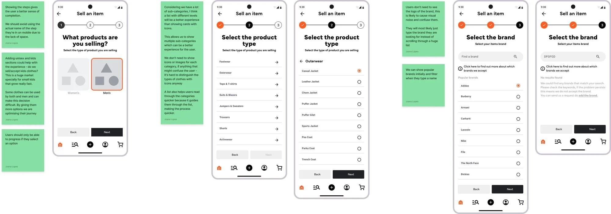
The initial selections users have to make to get an offer on their items
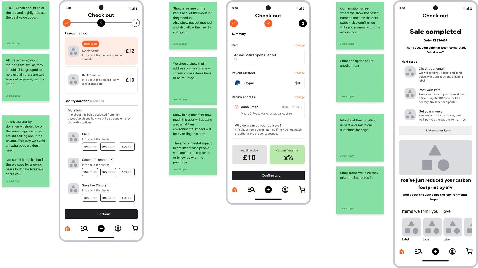
The final screens of the selling flow where users see the final price, sustainability impact, and a summary of next steps (all of which were previously missing).
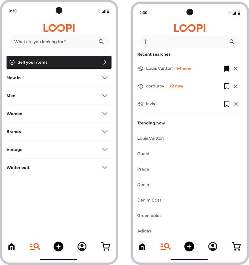
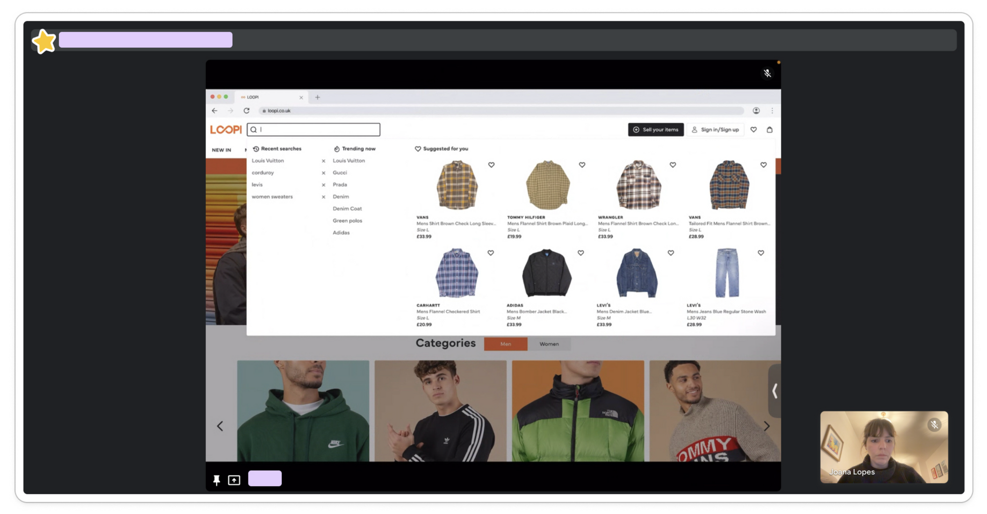
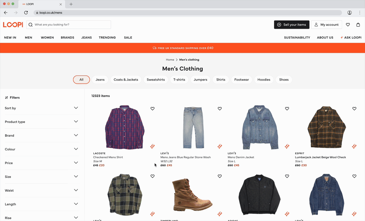
3 - Dynamic Filters & Search
One of the biggest issues was poor search and product discovery. The current static filters created frustration by showing irrelevant results which was leading to massive abandonment rates.
To tackle this, I introduced dynamic filters that adapted based on available products, preventing dead-end searches. I also added:
"Saved sizes" so users only saw relevant sizes from their first visit
Suggested items at the bottom of pages they were browsing
Enhanced site-wide search with recent searches, trending items, saved searches, and personalised suggestions based on behaviour
The goal was to completely transform product discovery from a frustrating experience into an intuitive, personalised journey.
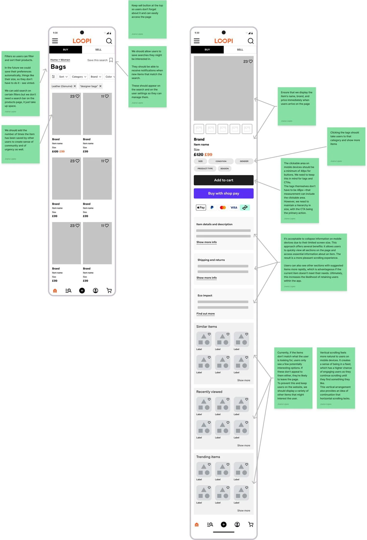
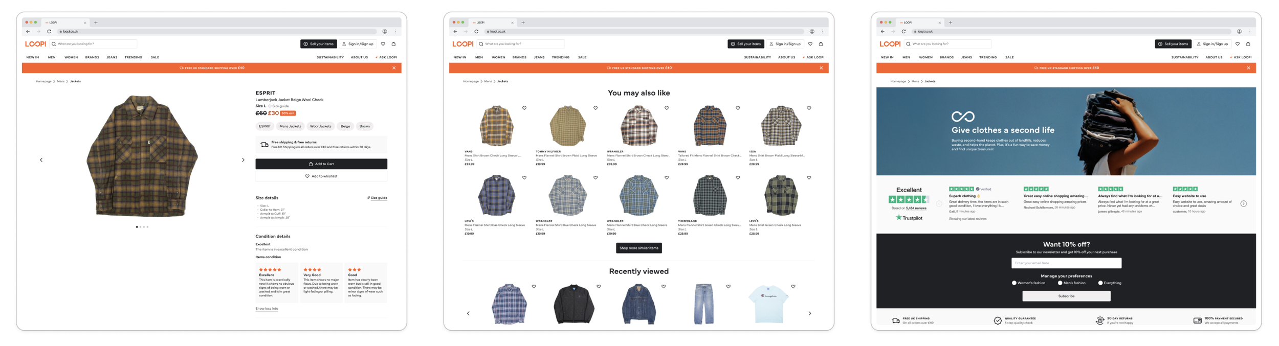
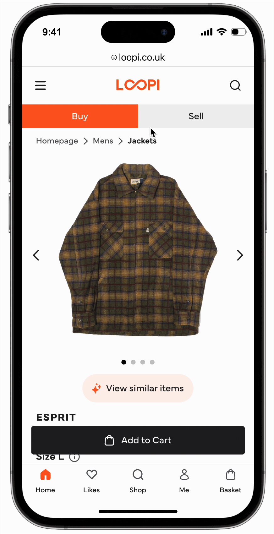
4 - Improved Information Hierarchy
The product pages overwhelmed users with disorganised information, causing high abandonment rates. In the second-hand market, details like measurements and condition are crucial and users need this information upfront to make confident purchasing decisions.
With this in mind, I restructured the PDP to prioritise what mattered most:
Clearer sizing and condition details at the forefront
Suggested items more prominently placed
Sustainability and Trustpilot banners to build trust and reinforce Loopi's environmental values
Fixed CTA that stayed visible until users scrolled past the description
This would hopefully help users make informed decisions whilst staying connected to Loopi's mission and building trust in the platform's legitimacy and quality.
Testing & Validation
One judgement call I made that's worth being transparent about: I decided to move straight from low-fidelity to high-fidelity without retesting the low-fidelity first. Given our deadline and my confidence that the main pain points from the first round had been addressed, I felt the risk was manageable, specially because we had a solid component library which meant any changes that came out of high-fidelity testing would be fast to implement.
Testing with a diverse group was non-negotiable because this was the only way to truly catch accessibility and usability issues across different needs and abilities so I made sure to speak to users from different backgrounds and profiles.
This approach paid off, but it's not a call I'd make in every project, and knowing when that trade-off is acceptable versus when it isn’t is very important.
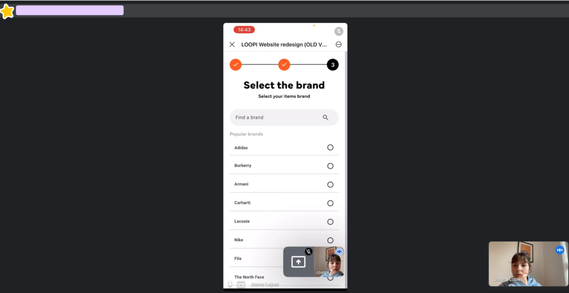
One of my testing sessions
Low Fidelity Testing
For the purpose of making testing as fast and efficient as possible, I conducted it internally with colleagues unfamiliar with the designs. The testing revealed some confusion around some changes made to the selling journey:
The "Before You Start" page users saw before starting the selling process was too content-heavy
Removing the category icons during the selling flow wasn’t well received by everyone
Popular brands were misinterpreted as the only options available
The offer summary screen confused users about next steps
The price visibility didn’t stand out enough on the checkout
Before you Start, Product type and Brand pages
Offer Screen, Payout Method and Summary pages
High-Fidelity Testing
I prioritised fixing the issues flagged in low-fidelity testing but, given our tight deadline, I made the call to move straight to high-fidelity designs without retesting the low-fidelity first.
I was fully conscious that this was a bit risky, but given our thigh deadline and my confidence we'd addressed the main pain points, I thought this was the right move. Having a solid component library also meant that any changes would be much quicker to implement.
This time I also tested the designs with some of our top users who'd volunteered to be part of the process, which was great. The feedback was very encouraging:
The "Before You Start" improvements made this page clearer
Both desktop and mobile navigation tested well with users easily finding the filters and sell button
The sell flow changes were effective and well received by both internal testers and our users
Three of the sessions I recorded during the high fidelity testing, both on mobile and desktop
The proposed PDP showed all the item details at the top, with similar items and sustainability info further down but most users just weren't scrolling that far.
Although the testing was very positive, one critical issue emerged
I noticed that users kept missing the "similar items" section on product pages, especially on mobile. Even though they navigated everything else with ease, they simply weren't scrolling far enough to discover related products.
This insight led to one of the most impactful features we built and was a good reminder of why testing with real users is so important.
Smart Search wasn't in the original brief: I identified the discovery problem during the usability testing.
I noticed users kept missing the similar items section on product pages, especially on mobile, and the static filters were creating dead-end searches that led directly to abandonment. I made the call to build it anyway, working with engineering to scope an MVP version we could ship within the timeline.
AI Powered Smart Search
Recognising a gap mid-project, building the case for solving it, and working out how to do it within constraints, is something I take seriously as a lead.
It would have been easier to stick to the original scope, but the easier decision wasn't the right one for users.
Desktop smart search on the product landing page and mobile smart search on the main product view
Making everything work together
Finally, after all the intensive research, design, testing, and iteration, all the pieces came together and we delivered a product we were very proud of.
For Buyers
The experience for buyers was now cleaner and more intuitive with a homepage that showed clear buy/sell tabs at the top on mobile, and a clear “sell your items: button on the desktop nav, this made navigation seamless from the start.
Mobile homepage and search
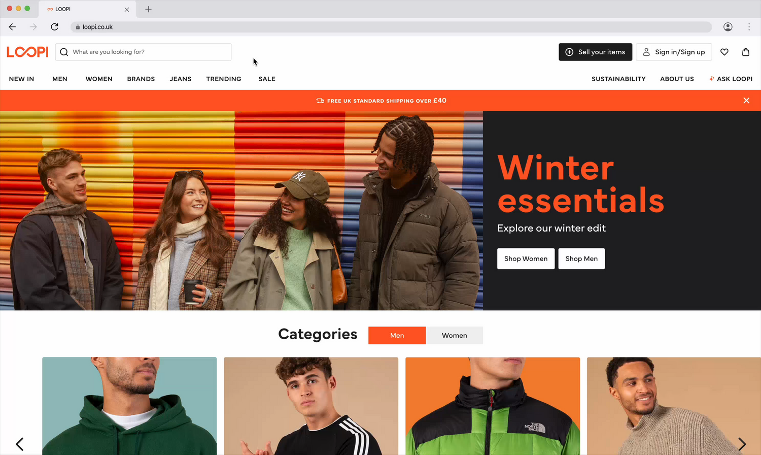
Desktop homepage
The enhanced site-wide search offers personalised suggestions, recent searches, and trending items and dynamic filters adapt to available inventory, preventing dead-end searches, whilst saved sizes mean users only see relevant results from their first visit onwards.
This type of personalised experience is arguably one of the most important things a second-hand platform can offer its users and something Go Thrift was previously lacking.
The selling homepage clearly outlines the process with collapsible sections, FAQs, and environmental impact messaging. The streamlined flow features inclusive gender selection, clean category navigation, and helpful brand suggestions.
The offer screen prioritises price transparency, whilst sustainability messaging throughout shows sellers how much CO2 and water savings their sale contributes to.
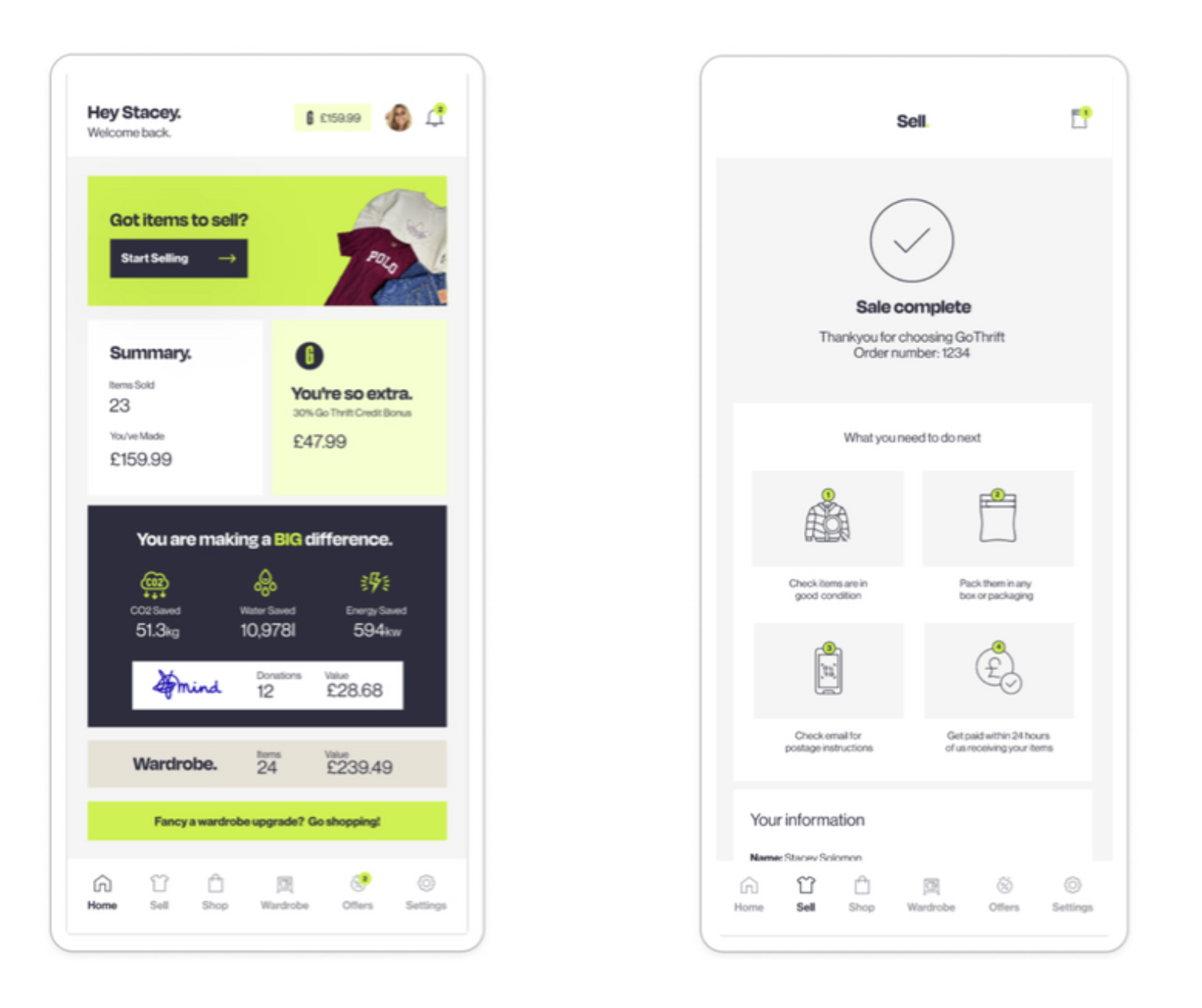
The payout options (cash or loopi credit) and optional donation steps create clarity, and the final confirmation screen celebrates their impact whilst encouraging users to explore the buying side.
For Sellers
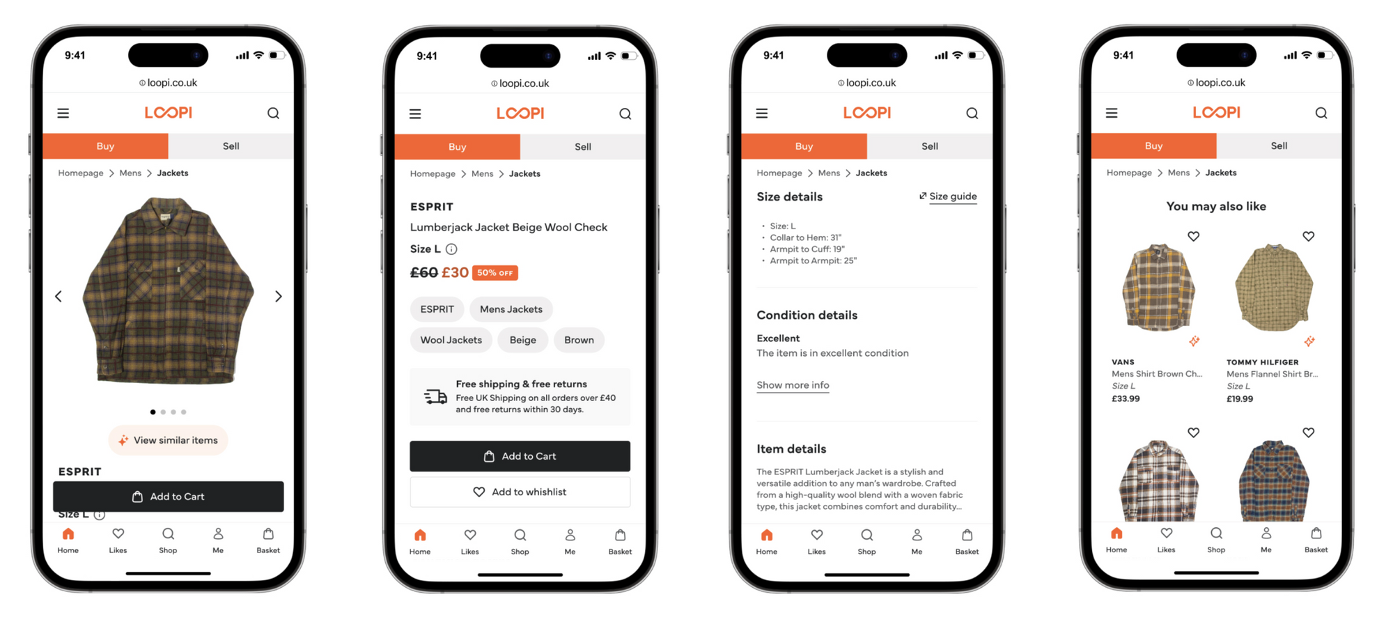
Product pages now prioritise what matters most in second-hand shopping: clear sizing, condition details, and sustainability impact, with Smart Search surfacing relevant alternatives right beside products.
Trustpilot banners build trust, whilst fixed CTAs keep purchasing intuitive, specially on mobile.
Mobile sell flow, from the homepage to the completion of a sale
Connecting both sides
Bottom banners on both buy and sell pages encourage cross-navigation, reinforcing that Loopi is one unified platform.
The consistent design system, accessible components, and cohesive brand identity tie everything together, making circular fashion feel approachable, rewarding, and effortless.
The main product page with the new AI Powered Smart Search feature, fixed CTAs and important product information.
I also created a dedicated Sustainability Page to promote environmental awareness and share practical eco-friendly tips, reinforcing Loopi's mission beyond just transactions.
A full sustainability report was also planned for future release.
Impact
Before launching I worked with the founders to agree on what success actually meant. We aligned on order growth and seller conversion as the numbers that mattered most for the business at this stage.
Despite a rocky start with critical bugs and analytics delays, the redesign delivered measurable impact across engagement, conversion, and business metrics.
A few days post-launch, a critical bug prevented users from adding items to carts, and delays in onboarding analytics platforms limited early data access, but once issues were resolved in mid-February, the platform's performance improved significantly.
↑ 40%
Task completion rate
More users are successfully finishing the selling flow, which was previously very clunky.
20%
Faster selling flow completion
Users now complete the selling process 20% faster, and since completion rates rose alongside this, it points to a smoother flow.
+28%
Boost in conversion rates
The new streamlined experience has reduced friction and abandonment
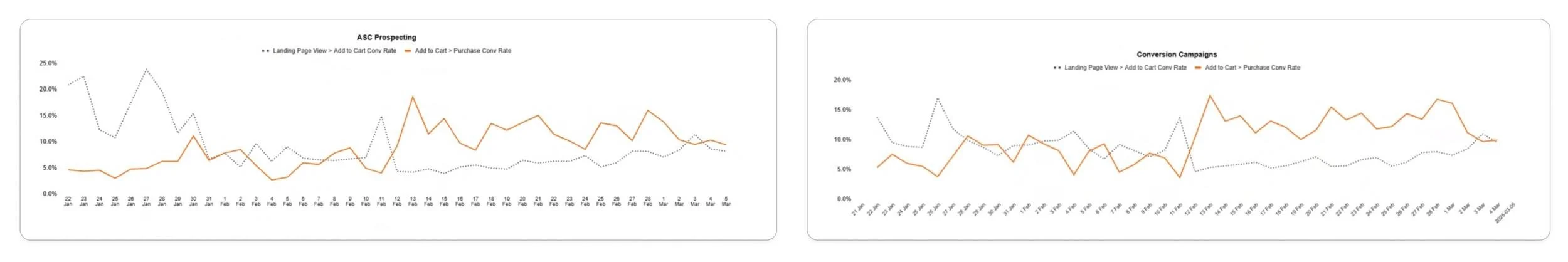
You can see a huge spike after February, with momentum continuing strong in the months that followed.
Beyond the Metrics
The feedback from business and engineering teams was equally important. Having a full-time designer led to:
Better collaboration processes between design, product, marketing, and engineering
Clearer communication through proper documentation and handoff tools
Stronger feature planning with design thinking embedded from the start
What I left behind
When I joined Loopi there were no design processes, no handoff standards, and no shared language between design and engineering.
When I left, there was a documented design system connected to code via Supernova, a component library with full state coverage, a testing and validation process, and a way of working between design and engineering that worked. Whoever comes in next can build on what's there rather than starting from scratch, which I’m very proud of.
Next Steps
As I’ve said before, this project was intense ✨ - tight timelines, no processes, rocky launch issues, you name it, but despite it all, we still delivered a platform that improved the user experience and had a very positive business impact.
But, as with any MVP, compromises were made. The plan for the next phase was to refine and expand the platform:
Add more inclusive categories (e.g. unisex) to be more inclusive, something I care deeply about
Introduce saved filters and "save your size" for personalised browsing
Implement photo search for finding similar items or outfit inspiration
Launch blog & community section to highlight volunteering and sustainability efforts
Continue refining the design system, including dark mode support
And much more!
Bonus: Our launch video, directed by my design pal Amie
What did I make of this project?
This project taught me a lot about what leading design in an early-stage startup actually requires. It's less about being perfect and more about adapting and creating the conditions for good decisions to happen.
The numbers are obviously extremely positive and show that the rebrand worked but what I’m the most proud of is what I managed to achieve under so much pressure and such a thigh timeline.
Would I do anything differently?
Yes. Looking back, the biggest thing I'd change is how I used AI. At the time, Figma Make was still in its infancy and AI models weren't nearly as capable as they are today. Using AI for research analysis, real code component generation and usability analysis would have saved me weeks.

We built a platform that's not only more engaging and accessible than the previous one, but also better aligned with Loopi's mission of placing circularity and sustainability at the heart of the brand. 💚